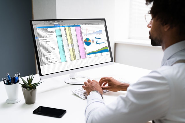
Adding a Simple Pivot Chart
After you've created a pivot table, a pivot chart works directly with the table's output. A pivot table has two main menus to configure and design output: "Analyze" and "Design." The "Analyze" tab contains features to add charts to your pivot table worksheets.
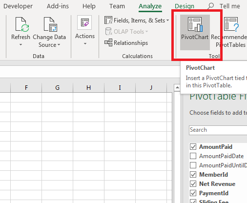
(Pivot Chart button)
You only see the main menus when you select the chart in a worksheet. If you don't see these two menus, click the "Pivot Table" button in the quicker to activate them.
Click the "PivotChart" button to open a configuration window where you can set up a pivot chart based on the data in your spreadsheet.
(Pivot chart configuration)
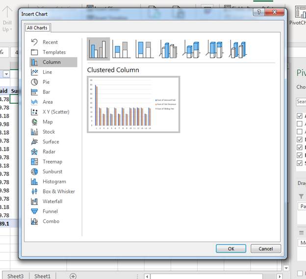
The configuration window that opens asks you to choose a pivot chart type. Just like standard charts, pivot charts have numerous types. Some charts are better suited for a specific type of data than others. For instance, a line chart helps you track trends in your data by displaying data points using a line from one point to the next. This might be easier to review and detect trends compared to a bar chart. A bar chart displays values in a way that lets you quantify data more easily. If you later figure out that you don't like the chart that you chose, you can change it to another type.
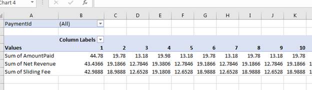
For this example, the data displays membership payments for the month of February. You could use a pivot chart to see a subtotal for each day of February to assess which days of the week (or month) are most profitable. This can then lead to further investigation into better marketing. This example will a column pivot chart to the worksheet.
When you click the type of chart that you want from the left panel, the upper section of the window shows you options for the design. Each pivot chart type has subtypes including 3D designs. Choose one of these options, and then click the "OK" button.
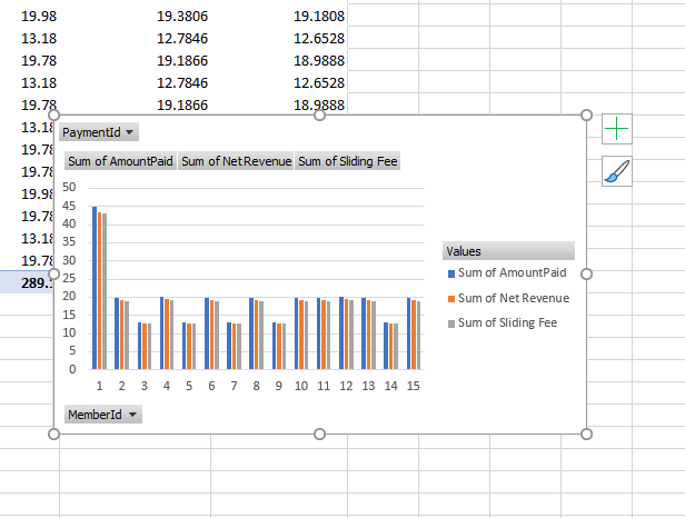
(New chart created)
After you create a pivot chart to the worksheet, you can review it and ensure that the information provided properly represents the data. This example has a clustered column chart added to the pivot table worksheet. Each sum value created in each example is used to represent data in the chart. Notice that it's not just pivot table data imported from your data source displayed. A pivot chart will also pick up data from calculated columns.
This pivot chart for this example is a clustered column chart that does not show data in a good way. Because each sum value is close to the other, the columns just look like they have the same value as the others. You can change a chart's type by right-clicking on the pivot chart and selecting "Change chart type" from the context menu. A configuration window opens where you can change the type.
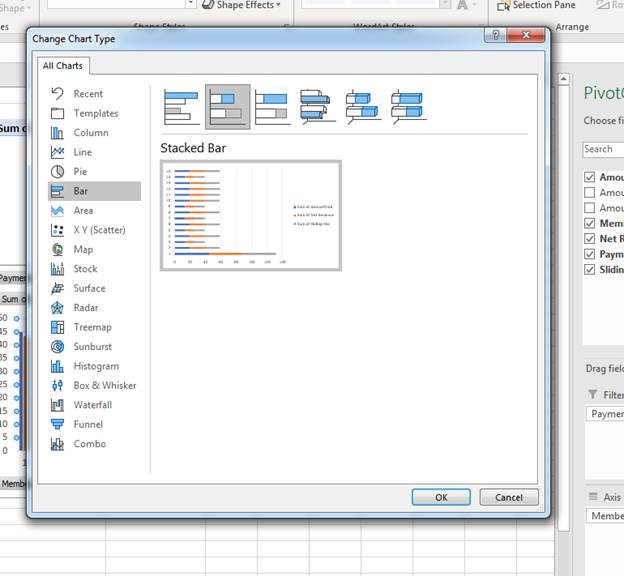
(Change chart type)
A stacked bar chart is better for this type of data, because you can now see the small changes in revenue based on the calculated field. Click "OK" to save the changes.
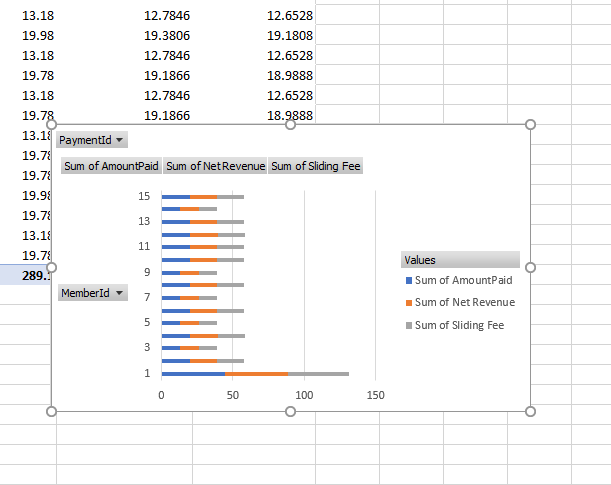
(Stacked chart change)
If you have filters set up in your pivot chart worksheet, you they will show as dropdown menus in the pivot chart. Click any one of the labels that has a dropdown arrow next to it, and you'll see the options to set your filter. When you apply a filter, you can then filter data in your pivot chart as well. These filter options are another reason to use pivot charts with your tables. They have some of the same functionality that you get with a pivot chart.
Adding Additional Chart Elements
After you add a simple pivot chart to your worksheet, you can then design it and add elements to it. When you work with standard charts in Excel 2019, many of these elements are already added including titles, x and y axis, and legends. Many of the elements included in a standard chart are skipped with the creation of a pivot chart. You can manually add these elements to your charts from the "Design" main menu available when the pivot chart is selected. The options that you can add to a pivot chart can be seen when you click the button "Add Chart Element" in the "Chart Layout" section.
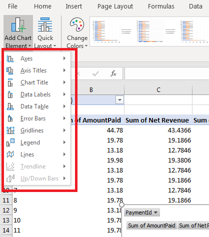
(List of chart elements)
Click any one of these elements to see a submenu of options. For instance, you might want to add a vertical and horizontal axis. With these two elements added to the chart, you can then add an axis title for both the x and y axis to identify the data contained for each one.
Choose any one of these additional elements, then click an option from the submenu. Excel adds the new element to your pivot chart. For instance, in the "Axes" submenu, choose a vertical axis and it's added to the pivot chart.
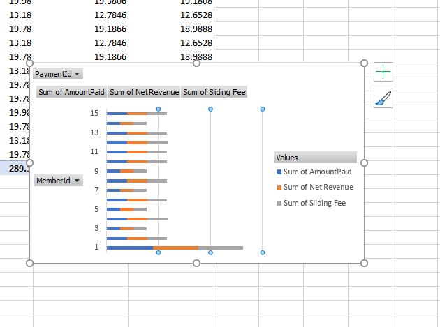
(Vertical axis added)
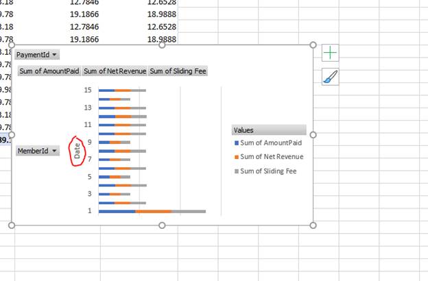
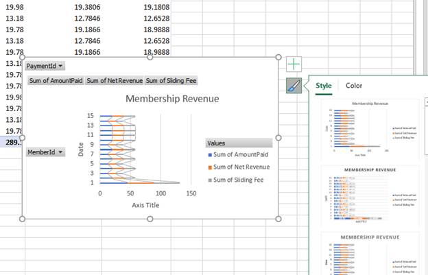
With a vertical axis added, you should add a title to it so that your viewers can understand the information displayed in the y axis. The values start from 1 to 15, but it's unclear what these values represent. You know that it represents the day of the month of February, but a third-party that reads this pivot chart would not know what the numbers represent without a title. You can add a vertical and a horizontal axis title in your chart to better explain the data.
Click "Add Chart Element" again and select "Axis Titles." In the submenu, select either a horizontal or vertical axis title. For this example, a vertical axis title is added to explain the vertical data in the pivot chart.
(Vertical axis title)
Default text is added to the title, and the orientation is set to vertical to indicate to the reader that it's a title for vertical data. Double-click the title and enter your own title. When you finish adding the text, click any other part of the pivot chart and the new text is now the title for your axis. In the example, the title "Date" is configured for the vertical axis so that readers understand that the numbers for each data point is the date.
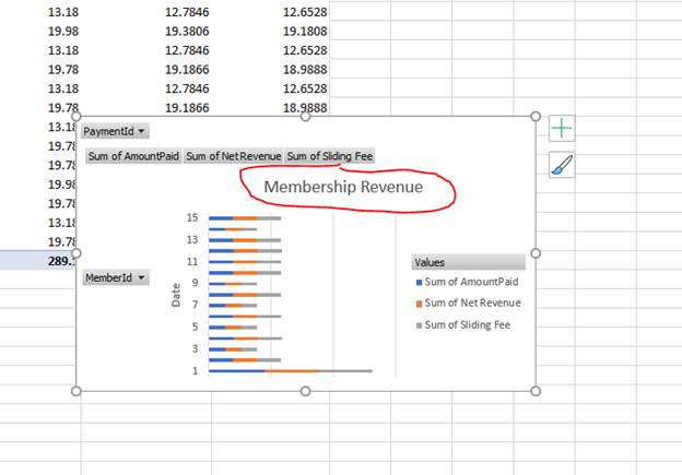
With labels set up on axis lines, you now need a pivot chart title. Looking at this pivot chart, you know the data is to subtotal and track memberships. However, if you send this to a third party, the reader might not be able to understand the data or the chart information. A chart title lets readers know what type of information is stored in the pivot chart without trying to decipher the information in the pivot table.
To add a title, click the "Add Chart Element" button again and select "Chart Title." This displays a submenu where you can decide where you want the title to display. Most pivot chart designers choose to place the title at the top above the data. Choose "Above Chart" and a placeholder title displays.
(Chart title)
Double-click the placeholder text and type a new title in the text box. This pivot chart has "Membership Revenue" as the chart title.
Changing a Chart's Layout
Excel has a default layout that it sets for a chart design that you can see when you add a pivot chart to your worksheet. After you add a pivot chart, you aren't stuck with the default design. Excel 2019 has several layouts that you can choose from. The features for these layouts are found in the "Design" tab in the "Chart Layout" section.
Click the "Quick Layout" button in the main menu and a dropdown of options displays.
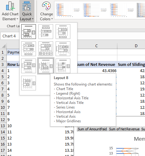
(Layout options)
Hover your mouse over each layout, and Excel displays a list of elements and options included in the layout. Not every layout will fit the design of your pivot table. Some designs will display numbers in columns, so this layout will have skewed numbers in columns that are hard to read. However, several designs add good features and a unique format from the standard, default layout.
When you hover your mouse over a layout, Excel 2019 gives you a preview in the pivot chart so that you know what it will look like if you change the layout. After you choose a layout, click it in the dropdown menu and Excel immediately replaces the old design with the selected layout.
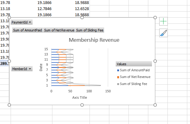
(New layout applied)
Notice that the lines in this pivot chart now have a different style. It adds lines that connect the columns to each other so that you can see if there is a negative or positive trend in data points.
Changing Styles and Colors
When you hover your mouse over the pivot chart, a paintbrush button displays on the right side of it. This is the icon that has options to change the colors and style of your pivot chart. Click the icon and a list of styles displays. Also, you can see these styles in the main menu in the "Chart Styles" section. The paintbrush button makes viewing the styles easier as you can scroll down and view them one-by-one.
(Change style and color menu)
The first tab is the "Style" section of the pivot table design option window. Scroll down the list and you can see a small preview of the style should you apply it to your pivot chart. If you can't see the preview because the thumbnail is too small, you can hover your mouse over the style that you're reviewing, and it's temporarily applied to the pivot chart. The style Is not permanently applied to the pivot chart unless you click it. The top style is the one currently applied to the pivot chart, so should you ever change your mind you can simply click the first style and return to the original one that Excel assigns to the pivot chart when it's first created.
Excel also has numerous color schemes that can be applied to a pivot chart. Just like styles, a default color scheme is applied to a pivot table when you create it. You can customize each element with its own colors, but this can take a lot of time especially when you have a large chart with numerous added elements and designs. Instead, you can use a premade Excel color scheme that will apply an attractive color combination across the entire pivot chart.
Just like styles, you can get a quick preview of what your pivot chart will look like by hovering your mouse pointer over a specific color scheme and Excel 2019 displays a preview in the pivot chart. Again, the changes do not take effect unless you click the color scheme to choose it. Should you decide to change the color scheme back to the original, click the first color scheme to change the pivot table back to the default colors.
Switching Rows and Columns
After you create a pivot table, you might want to switch the way data is displayed. Sometimes columns should be rows and rows should be columns. You don't have to completely redo your entire table and redesign it. Instead, you can use the "Switch Row/Column" button to change the pivot table's rows and columns. This button is in the "Data" section of the "Design" tab in the main menu.
After clicking the button, rows are switched to columns and columns are switched to rows. The change includes labels and data.
(Switched rows and columns)
The pivot table will reverse its data as well. In some cases, this will make a better pivot table and pivot chart. In other cases, this change might make the pivot table and chart unreadable. You can click the button again to reverse the change.
Pivot charts are a good complement to your pivot tables, especially when you want to display a visual representation of your data. It also helps third-party viewers understand your data without digging into each section of the pivot table. These charts can be customized with elements added to them after their creation to make them fully represent your information.