
Tables display static data in rows and columns similar to an Excel spreadsheet, but charts display a graphical representation of data stored in a spreadsheet. As a matter of fact, PowerPoint 2019 uses Excel to display dynamic charts in a slide. Charts are unique to tables in that they show a visual display of data that makes it easier for a user to understand. Tables are beneficial for plain data where you just need to show a list of records, but a chart can display data in numerous forms including a pie, line, bar, area, radar and many more.
Adding a Chart
PowerPoint charts can be simple bar charts or complex area and line charts. After you create a chart, you can always edit it later. Should you add a chart that you later feel doesn't express the data well in your slide, you can later change it and still use the same data. To get a feel for the way charts work in PowerPoint, it's best to add a simple chart and work with more complex ones after you understand the way charts are set up.
After you create a new slide, the "Insert Chart" icon is displayed in the blank object template automatically added to the slide. You can identify the right icon by hovering your mouse over each icon until you find the one that displays the "Insert Chart" tooltip. The chart icon is the middle one located on the first row.
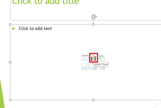
(Insert chart icon)
After you click the chart icon, a configuration window opens where you choose the type of chart that you want to present in your slideshow.
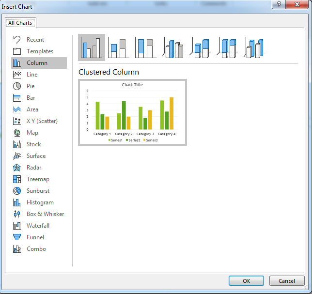
(Select chart type)
One of the simplest charts to work with is a bar chart. It's the first option when you open the configuration window. All chart options are shown in the left panel. Click each one to see a sample of what the chart will look like in the center panel. Above the preview, notice that you have several other chart options. These options set the sub-type for the chart. The icons are also a preview of what the chart will look like. Bart charts have three sub-types, and then you can also choose to make the chart 3D. Each chart has the option to show it in 3D.
For this example, the first bar chart is chosen. Click "OK" after you choose a chart type, and the object will display on your slide. In addition to a new chart added to the slide, an Excel spreadsheet window also opens. You'll type your data into Excel where it will be transformed visually on your chart.
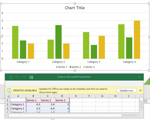
(New chart added to a slide)
Charts display data visually, but you need to enter data before PowerPoint knows how to display the bars in a bar chart. PowerPoint displays a template along with an Excel spreadsheet. The template has default bars and labels shown in the default theme color. This template shows you what the chart will look like after you add data to it.
The Excel spreadsheet is also automatically created with labels and temporary data. When you change this content in the Excel spreadsheet, it's then changed in the slideshow. This makes the data shown in your chart dynamic. Should you decide to change your chart in the future, the data will update in the visual graph representation as well.
Changing Chart Properties
When you add a chart, PowerPoint uses the them currently configured on the slideshow to determine the colors for each section. After a chart is added to a slide, the "Design" tab is activated, and several chart property options are shown in the top menu.
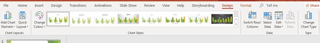
(Design menu for charts)
The "Chart Styles" section of the menu has several layouts for your chart. The first one selected is the default, but PowerPoint 2019 offers several other styles. These same styles are the ones that you saw in the first configuration window when you chose the type of chart that you wanted to use. Click one of the alternative styles, and PowerPoint automatically applies it to the selected chart.
Click "Change Colors" and a dropdown menu displays with several other color schemes that can be used with your chart.
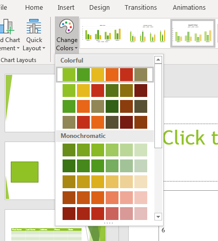
(Chart color scheme options)
Choosing colors for a chart is different than choosing colors for other objects. With other objects, you choose one color for the object. With charts, you have colors for several components in the chart, so you choose a theme. Theme colors are pre-chosen for you, so you just need to choose the one that you feel is most attractive for your presentation. Each line item in the dropdown is a color scheme.
You might also choose to change the layout for your chart. Click the "Quick Layout" button to display a list of options for your chart.
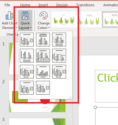
(Chart layout options)
Notice that each layout option shows bars, labels and titles at different locations. These layout options let you set the way the chart will display including its text. For instance, by default a chart title is shown at the top, but you can remove it or show it with a subtitle. Legends for each color can be shown at the bottom, top or right section of a chart.
Any layout, color scheme or chart element can be added using the "Design" tab. But after you've determined your layout and color scheme, you must add data to your chart.
Adding Data to a Chart
After you stylize your chart, it's time to add data to it. The Excel spreadsheet stays open as you change styles. If you closed the Excel spreadsheet, you can re-open it in the "Design" tab. Click the "Edit Data" button and a dropdown displays. Click "Edit Data in Excel" and the Excel spreadsheet associated with the presentation opens.
Before you add data, it's important to understand the way PowerPoint displays data. The Excel spreadsheet shows rows and columns. The rows are chart categories, and the series are columns.
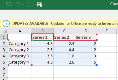
(Chart rows and columns)
The categories are the main section of a chart. For instance, if you have a chart representing months of sales, a category would represent one month. Series sections represent sections of categories. You could have only one section, or you could have several. For instance, if you have a graph that has several types of sales within a month, a series would represent each type of sale.
Any numbers changed in the spreadsheet will be changed in the PowerPoint 2019 chart. You can also add a category or a series by adding it to the Excel spreadsheet and then highlighting it as you edit your chart. Changing data in the Excel spreadsheet will reflect in your PowerPoint chart. You can delete and add content as needed, and it then changes will display in your PowerPoint 2019 chart. Because charts are dynamic, you can reuse them as needed by just editing data.
Charts are a great way to display data in a visual way and express information that is easy for a reader to digest. You can add them easily using PowerPoint, and since it uses Excel as a way to store data, you can also create your own spreadsheets to build charts.