A PivotChart is like a PivotTable in that it summarizes the data from a worksheet. However, where a PivotTable is simply a table with data listed in it, a PivotChart is a graphical representation of the data.
Creating a PivotChart
To create a pivot chart, go to the Insert tab.
Go to the Charts group.
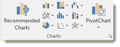
Here you can see Recommended Charts, graphical representations of the types of charts you can add, as well as the PivotChart button.
Click PivotChart to display the dropdown menu, then click PivotCharts again.
You will then see the Create PivotChart dialogue box.
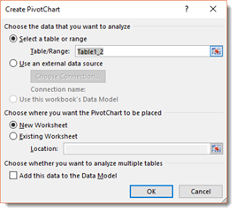
The range of cells should already be filled in for you, just as it was with PivotTables.
Also, just as with PivotTables, you can decide if you want to place your chart in a new worksheet or an existing one. We are going to choose a new worksheet.
Click OK.
We can now start building our pivot chart.
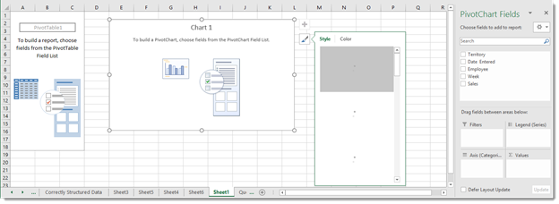
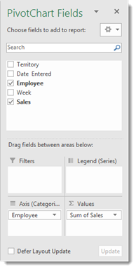
Just as with PivotTables, we are going to go to the PivotChart Fields panel on the right to design our pivot chart.
Drag and drop the fields from the top section of the panel into the sections located in the bottom half of the panel.
These sections are Filters, Legend (Series), Axis (Categories), and Values. The Axis is essentially the row, and the Legend is essentially the column.
Below you can see the fields that we dropped into the sections.
We can see our pivot chart in the worksheet.
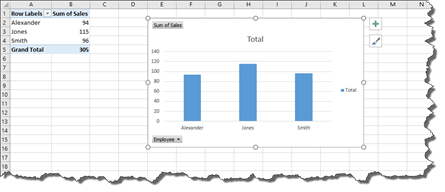
Notice that a pivot table also appears. You can either hide the columns of the pivot table so you cannot see them, or you can move the pivot chart to its own worksheet.
To do this, go to the Analyze tab under PivotChart Tools. Click the Move Chart button.
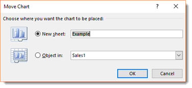
You will then see the Move Chart dialogue box.
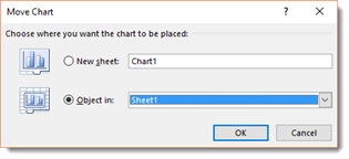
Put a check beside New Sheet, then enter a name for the new sheet.
Click the OK button.
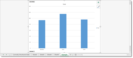
The chart then appears in its own worksheet.
Changing the Fields
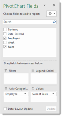
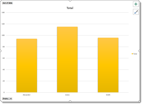
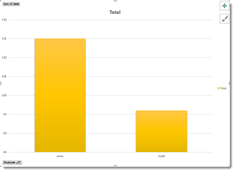
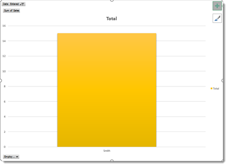
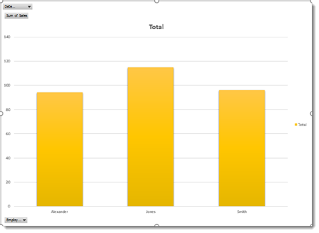
In our current pivot chart, we have the Employee and Sum of Sales fields.
The employees appear across the bottom of the chart.
Their sales are represented by the vertical bars.
By looking at the bars, we can tell that the employee Jones made the most sales. We know this because his bar extends higher than the rest.
If we want to change the fields that are displayed � or add more fields, we go to the PivotCharts Field pane on the right.
To remove a field, drag the field from the bottom half of the panel to the top half.
To add a new field, drag the field from the top half of the panel to the bottom half. Drop it into the section where you want it to appear.
Formatting PivotCharts
To format a pivot chart, you will use the two buttons that appear at the top right corner of your pivot chart. They are pictured below.
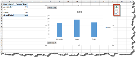
Click on the button with the paint brush on it to choose a style and color for the bars in your chart.
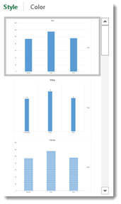
As you can see in the snapshot above, when you click on the Style tab, you can pick a style.
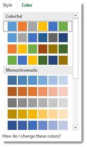
Click on the Color tab to pick a color. Select a row of colors to pick a color scheme.
Click on the button with the paintbrush to close the window when you are finished.
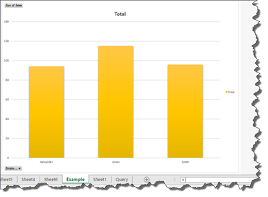
We added a new style and color to our pivot chart below.
Now let's click the button with the plus sign (+) on it.
This shows you the available chart elements.
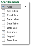
The chart elements that you are using have checkmarks beside them.
Put a checkmark beside any chart element that you want to add to your pivot chart.
Uncheck any elements that are currently checked, but you want to remove.
When you are finished, click the button with the plus sign again to close the window.
Changing the PivotChart Type
The bar chart is the default pivot chart layout. However, you can easily change the pivot chart type once you have created your pivot chart.
To change the chart type, click on the pivot chart so that it is active.
Click on the PivotChart Design tab under PivotChart tools, then click the Change Chart Type button.
You will then see the Change Chart Type dialogue box.
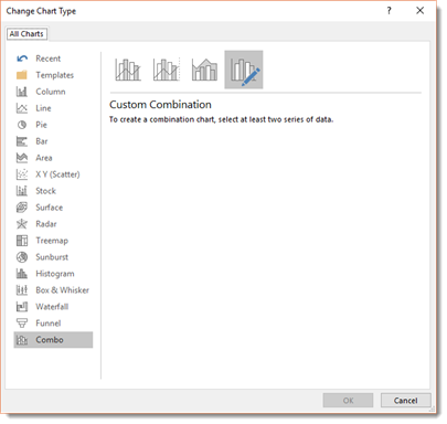
On the left side of this dialogue box, you will see the different types of charts that you can use.
Click on one of these. We are going to click on Pie.
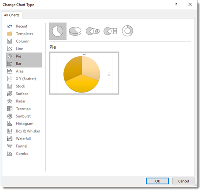
On the top right side of the dialogue box, you will see the graphical representations of the different pie charts that you can add.
Below this, you will see a thumbnail image of how your chart will look.
We do not see anything here we want to use, so we are going to click Line on the left.
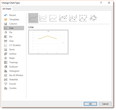
Once you find the chart that you want to use as we have done above, click OK.
Now that we have a new chart type, we may want to format it.
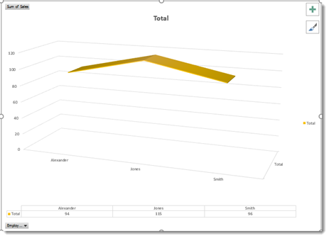
We are going to click the plus button, and remove the data labels element. However, when we do this, we will not be able to see the actual sales anymore, so we are going to add a data table element.
Adding Filters to a PivotChart
Filtering data on pivot charts is almost just the same as filtering data in pivot tables.
Let's learn how to do it.
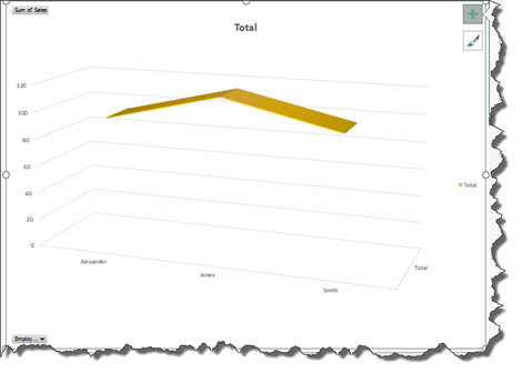
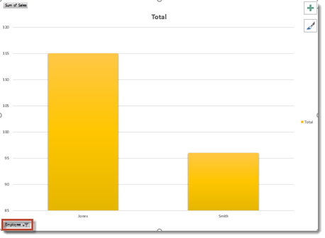
Our pivot chart is pictured below.
Currently, our chart shows us all of the items we have listed, but we might not want all of those items showing in our chart. To filter the data and determine what items are displayed, click the Item button in the lower left corner. Naturally, you may not have a field named Item in your chart, so you will just click the Employ button in the lower left hand corner of your chart.
When we click the button, this is what we see:
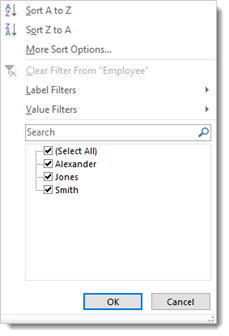
You can see checkmarks beside all of our items. Uncheck the items that you do not want to appear in the chart.
Click OK when you are finished.
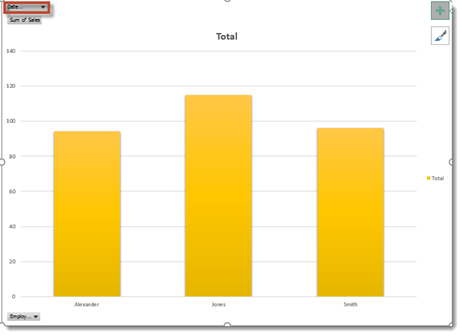
As you can see, the employee named Alexander has had his sales numbers filtered out of our chart.
If you look at the Item button in the lower left corner, you will see a Filter icon to let us know the data has been filtered.
Sorting Data in a PivotChart
We can also use the Item button to sort our items alphabetically, either ascending or descending.
Click on the Employ button.
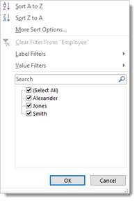
Choose Sort A to Z or Sort Z to A. You can also click More Sort Options to sort by values.
Filtering Data by Fields That Don't Appear in the Chart
You can also filter the data in your chart using data fields that do not appear in the chart. We did this with pivot tables.
To do this, go to the PivotChart Fields panel on the right.
Drag the field you want to use to filter the data into the Filter section in the bottom half of the panel.
We have chosen to filter our data by Date Entered.
Now go back to your chart. Click the Date Entered button (or the button for the field that you are using to filter the data) located at the top right of the chart.
Choose how you want to filter the data.
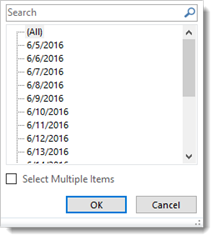
We are going to filter it by sales entered on 6/5/2016.
Click OK.
Making the PivotChart Buttons Hidden
Take a look at our pivot chart below.
As you can see, we have several buttons visible, such as the Item and Date Received buttons.
These buttons are fine when we are working with the chart. However, if we wanted to print the chart, we might not want those buttons to show.
If you do not want the buttons to show when the chart is printed, it is a good idea to hide them.
To hide the buttons, go to the Analyze tab in the PivotChart tools and click the Field Buttons dropdown menu in the Show/Hide group.
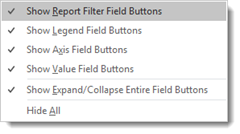
You can choose which buttons you want to hide by placing a checkmark beside them, or you can select Hide All to hide all the buttons.
Moving a PivotChart
Just as with PivotTables, we can also move PivotCharts.
To move a pivot chart, select the pivot chart, then go to the Analyze tab and click the Move Chart button.
You can choose to move the pivot chart to a new sheet, or you can move it to another sheet within the workbook.
Click OK when you are finished.
Deleting a PivotChart
To delete a pivot chart, first select the pivot chart that you want to delete, then press Delete on your keyboard.
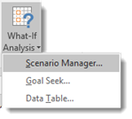
The What-if Analyses
It would be a big mistake for anyone to chalk Excel up to a fancy calculator that simply creates fancy spreadsheets and performs calculations. It is much more than that. It can also perform what-if analysis. A what-if analysis lets you explore possibilities by entering possible values into the same equation so you can see the possible outcomes in the cells of your spreadsheet.
There are all types of what-if analyses that Excel can do. However, we are going to cover three:
-
Data tables. This lets you plug in different values to see the effects on the formula cells.
-
Manual What-If Analysis. This lets you to discover what it takes to reach a certain objective.
-
Scenarios. This lets you set up and test different cases (best case scenario).
Manual What-If Analysis
A what-if analysis does just as the name applies. It allows you to ask what-if about your data. What if the data changed? What would be the results?
Take a look at our worksheet below.
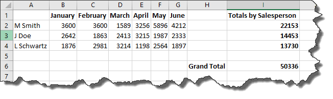
In this worksheet, we have two different types of data cells. We have input cells. These are cells where we have inputted data. They are highlighted below.
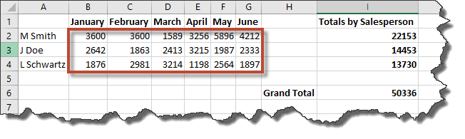
We also have formula cells. The data in these cells represent the calculation of a formula.
The cells highlighted below represent the sum of sales for each salesperson.
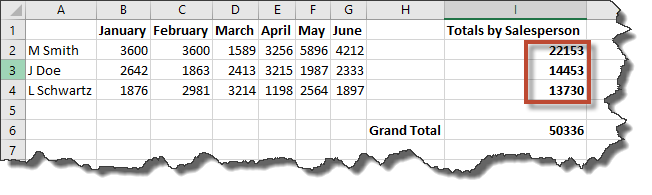
We also have a cell that represents the grand total of all sales.
To perform a manual what-if analysis, we can change the data in the input cells to see how the changes affect the formula cells.
It is perfectly fine to use this method to perform a what-if analysis. However, it requires changing the data in your worksheet, then changing it back. It can be time consuming, and there are better ways, as you will learn over the course of this article.
Data Tables
Excel 2016 supports two types of data tables: a one variable data table and a two variable data table. The one variable data table substitutes a series of possible values for a single value in a formula. A two variable table substitutes a series of possible values for two values in one formula.
If you are lost as to what we mean at this point, do not worry. Let's walk through it step by step. We are going to do a what-if analysis with a one variable data table.
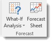
To start a what-if analysis, click the Data tab, then go to the What-if Analysis button in the Forecast group.
Choose Data Table from the dropdown menu.
You will then see this dialogue box:
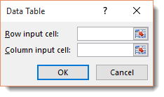
The dialogue box above has two text boxes: Row Input Cell and Column Input Cell.
If you are creating a one variable data table, you choose one cell in your worksheet to use as either the Row Input Cell or as the Column Input Cell.
If you are creating a two variable data table, then you fill in both text boxes. One cell becomes the Row Input cell that substitutes values you have entered across columns of a single row � and vice versa.
Let's create a one variable data table to start with.
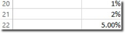
The spreadsheet shows sales forecast for a convenience store.
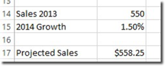
In cell B17, pictured above, we have calculated our projected sales by adding last year's sales and the amount we expect it to grow.
Here is the formula we used.
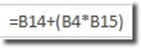
Because we went to the Formula tab and clicked Create from Selection, then chose Left Column (pictured below), our formula reads:=Sales-2016+(Sales_2016*Growth_2014).
Now, note that we have entered various growth rates in cells B20 through B22 . We are going to insert these various values into the growth formula.
Here is how we do it.
Copy the formula from B17 into C18 by going to cell C18 and typing the equal sign, then clicking on cell B17. By doing that, you have created the formula =Projected_Sales_2014.
Hit Enter.
Next, select the cell range B20:C22.
Go to the Data tab and click What-If Analysis, then Data Table.
Click on cell B15 in the Column Input Cell, then click OK.
The projected values are then listed.
Now click cell C18, then click the Format Painter. Drag it through cell range C20-C22.
Scenario Manager
In Excel, the Scenario Manger lets you create sets of different input values to produce different calculated results. These sets of input values are called scenarios, such as Best Case, Worst Case, and Most Likely Case. For example, you could use scenarios to produce a sales goal for your employees for the next quarter. You could also use it to create forecasted budget.
Creating Scenarios
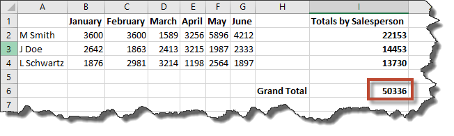
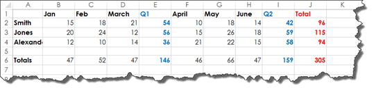
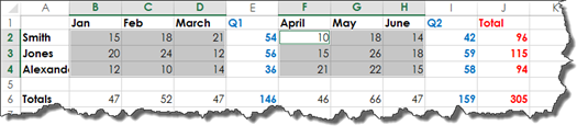
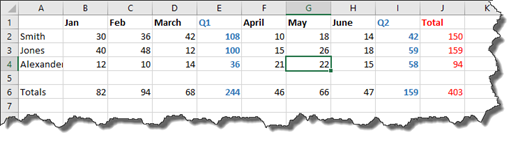
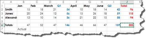
In our worksheet pictured below, we have the sales data for each employee broken down by month, the Q1 and Q2 totals for each employee, then the total sales for each employee. In addition, we have the total sales per month for all employees found in row six.
We could take the information in this spreadsheet and change it by doing a manual what-if analysis. For example, we could say what if Smith sold five more in February and sold 23 instead of 18. How would that affect his total sales, as well as the total sales for the company?
However, doing that would have us change the value of actual data. We could use Undo to change the value back after we have finished, but what if we want a record of our what-if scenarios?
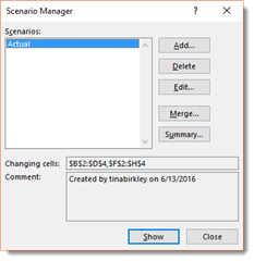
We can create these records by using the Scenario Manger. You will find the Scenario Manager by clicking on the Data tab and going to the What-If Analysis button. Select Scenario Manager.
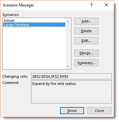
The Scenario Manager is pictured below.
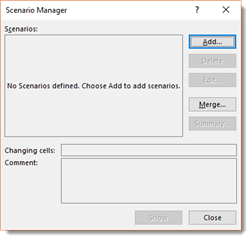
To use the Scenario Manager, we first want to select all of our values. However, we do not want to select totals because those will change as our values change.
Now, we are going to open the Scenario Manager.
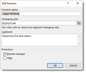
Click the Add button in the Scenario Manager.
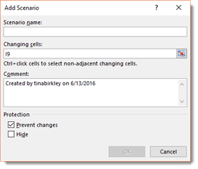
The cells we have selected appear in the Changing Cells field. These are the cells whose data will change based on different scenarios.
Enter a name for the scenario in the Scenario Name field. We are going to name ours Actual.
In the Comments section, we can add comments about the scenario. You can see ours below.
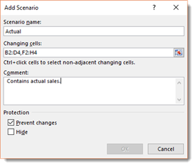
NOTE: A scenario can't have any more than 32 changing cells. If you have more than 32 changing cells, you will have to create different scenarios by selecting smaller groups of changing cells.
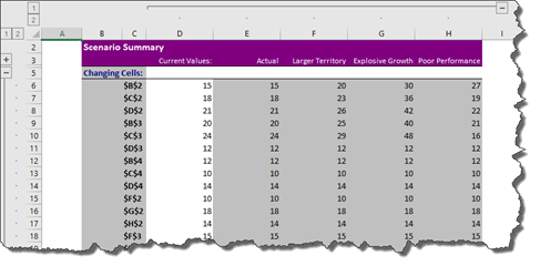
Now we can see the different changing cell values, as shown below.
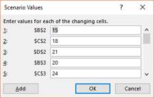
Click OK.
The scenario is then saved.
Now let's input different values into our changing cells.
Most Likely Case Scenario
To do this, we are going to select our Actual scenario in the Scenario Manager, then click Add.
We are going to say what if we expanded each employee's sales territory by five miles. What if that allowed them each to make five more sales each month.
We are going to name this scenario Larger Territory.
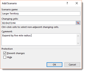
Click OK.
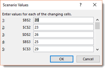
Now we can enter in the values so they reflect five more sales per employee per month, as pictured below.
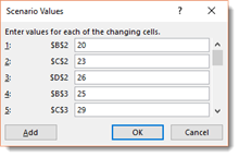
Click OK.
The scenario is saved.
Now, that scenario shows the increase in sales that we think might be likely if the territories were expanded. But we also want to see a scenario if expanding the territory led to double sales growth.
Best Case Scenario
We are going to create another scenario for this. We are going to select the Actual scenario, then click the Add button.
Here is the new scenario we are creating:

Click OK, then enter the values, as shown below. Remember, these values should be double the original values (from Actual).
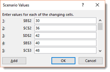
Click OK again.
Worst Case Scenario
Next, we are going to create one more scenario that shows the values if the territories are expanded, but few additional sales are made.

Click OK, then enter the values.

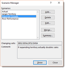
Click OK, then click Close when you are done creating scenarios. As you can see if you look back at the scenarios we created, we created Best Case, Worst Case, and Most Likely scenarios.
The Next Step: Displaying Scenarios
Now that we have our scenarios created in the Scenario Manager, we want to be able to display the different scenarios so we can examine them.
To do this, open the Scenario Manager, then click on the scenario that you want to view.

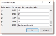
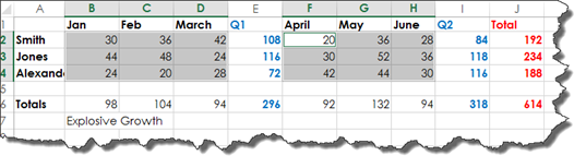
We are going to view the Explosive Growth scenario, then click the Show button.
If we look at our changing cells, we can see the values have changed.
If the change in values change the totals, then the totals are changed in the worksheet.
If you close the Scenario Manager, the values that are displayed in your worksheet will reflect the scenario that you were viewing. To show the actual values, click on the Actual scenario in the Scenario Manager, then click Show.
Editing Values in Scenarios
If you want to edit any of the values for any of the scenarios, click on the Edit button in the Scenario Manager.
Click the OK button.
Change any values that need to be changed, then click the OK button.
How to Know Which Scenario You Are Viewing
It is easy to know which scenario you are viewing in your spreadsheet if you have the Scenario Manager open. However, if the Scenario Manager is not open, you could easily get confused as to what scenario you are looking at.
To fix this, let's open the Scenario Manager again.
Choose a scenario that you created. We are going to choose Explosive Growth.
Click the Edit button.
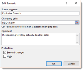
What we are going to do is add a cell to our range of cells in the scenario. This will be a blank cell. We will use the blank cell to label the scenario in our Excel worksheet.
To do this, place a comma after your range of cells, then click a blank cell in your worksheet. We clicked on B7.

Click OK.
Scroll down to the blank cell. Instead of entering a value, enter the name of the scenario. We are going to enter Explosive Growth.
Click OK.
Now when we view a scenario, we can easily tell which scenario we are viewing.
We will want to do this for each scenario that we created.
Merging Scenarios
Scenarios are specific to a worksheet in a workbook. If you click on a different worksheet in your workbook, you will see that the scenarios you created for the other worksheet do not appear in your current worksheet.
If you want to merge scenarios from one worksheet with the scenarios from another worksheet, go to the Scenario Manager.
Click the Merge button.
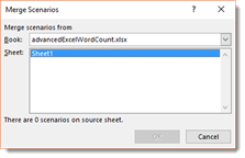
Select the worksheet whose scenarios you wish to import into the current worksheet, then click the OK button.
NOTE: You can also copy scenarios from other workbooks by selecting the name of the workbook in the Book field.
Deleting Scenarios
To delete a scenario, go to the Scenario Manager.
Select the scenario that you want to delete, then click the Delete button.
Beware! Once you click the Delete button, the scenario is deleted. There will not be a warning box or a dialogue box asking if you are sure. Once you click the Delete button, the scenario is permanently deleted.
Creating a Summary of Scenarios
When you create a summary of scenarios, you can see the scenarios all at once instead of viewing them one at a time using the Scenario Manager.
To create the summary, we are going to go to the Scenario Manager, then click the Summary button.
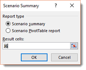
Choose if you want a Scenario Summary or a Scenario PivotTable report.
We are going to choose Scenario Summary.
Now, we select which cell on our worksheet that we want to focus on.
Take a look at our worksheet again.
We picked J6 because it is the grand total of sales.
Click OK.
You will then see the Scenario Summary Report.
Take time to notice that the Scenario Summary Report opens in a new worksheet.
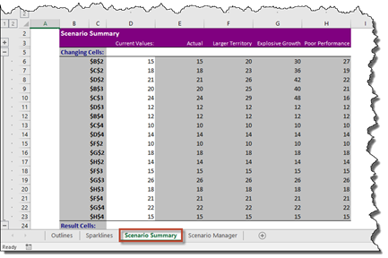
Using this worksheet, you can compare the different outcomes based on different scenarios.
If we zoom out a little and take a look at the Scenario Summary Report, you will notice that it adds outlining. This allows you to control the data that you view.