Once you're finished designing your composition in Edge Animate, it's time to publish it. You have several options when it comes to publishing, including export formats and options and display options for the web.
In this article, we will cover:
-
Publishing your composition
-
Publishing options
-
Overflow options
-
Creating a Down-Level Stage
-
Adding a preloader
-
Embedding a composition into an existing web page
Publishing Your Composition
Edge Animate creates all the files that you will need to publish your composition to the Internet. These files include HTML, JavaScript, image files, etc. You don't need to worry about a thing.
To publish a composition, go to File>Publish.
Next, find the folder that contains your Edge Animate composition. You will see a folder named Publish.
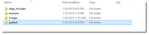
Open the folder.
You will see a folder named Web.
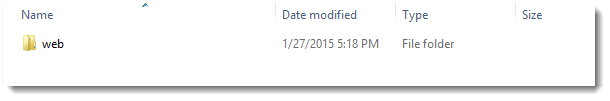
Open the Web folder and you will see all your files.
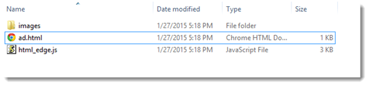
As you can see, there is an HTML page, which is the page that is displayed in a browser. There is also a JavaScript file, as well as an Images folder. The Images folder contains all the images that you used in your composition. You can open the HTML file, and your composition will play in your browser window.
Exploring Publishing Options
In the last section, we learned how to publish your composition. When you publish a composition, it is not published directly to the Internet. Instead, it is published as a format to a folder. We chose the HTML format so we could view our files in a web browser or integrate them with a web page. However, publishing for the web is only one option. There are also two more.
Go to File>Publish Settings.
You will then see the Publish Settings dialogue box.
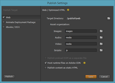
On the left side of this dialogue box, you can choose a publish target.
You can publish your composition to:
-
Web . This will be checked by default. The files will be published for web browsers.
-
Animate Deployment Package . This publishes to a .OAM file that you can import into InDesign. It can be used with the Adobe Digital Publishing Suite.
-
iBooks/OS X . This publishes to a WDGT file. You can then import your composition into iBook Author, then publish to iTunes.
There are additional settings on the right for the Web:
-
Target directory is the location of the published files � or where you want them to appear.
-
Use Google Chrome Frame for IE 6, 7, and 8 makes it so your composition can be viewed in non-HMTL5 browsers.
-
Frameworks via CDN will publish your files with a reference to a JavaScript library. Edge Animate uses the JavaScript library on Google.
-
Publish Content as Static HTML makes it so elements are in the HTML markup and not hidden in JavaScript.
About Overflow Options
When you view your composition in a browser window, you may notice that elements that extend off the Stage are visible when you view them in the browser. Of course, you don't want that to happen. You may have an image on the Stage, but only have half of it on the Stage, because that's all you want displayed as part of the composition. If the entire image is displayed in the browser, it can ruin the look of the entire composition.
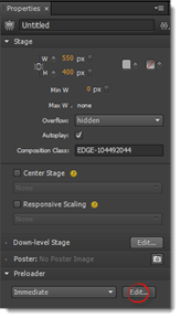
The Overflow property in Edge Animate gives you control of items that are off the Stage. You will find the Overflow property in the Properties panel.
Click to select the Stage element in the Elements panel.
The Overflow property in the Properties panel is circled below:
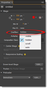
You can choose from the following options:
-
Visible shows all elements, even if they're off the Stage.
-
Hidden shows content on the Stage only.
-
Scroll adds browser scroll bars to the Stage.
-
Auto adds scroll bars when content goes off the Stage.
Let's take a look at how it works.
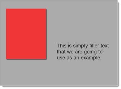
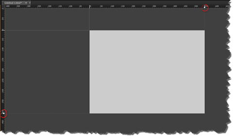
In the example below, our element extends off the Stage.
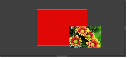
If we set the Overflow property to hidden, then preview the composition in a browser window, only the portion of the image that is on the Stage is shown.

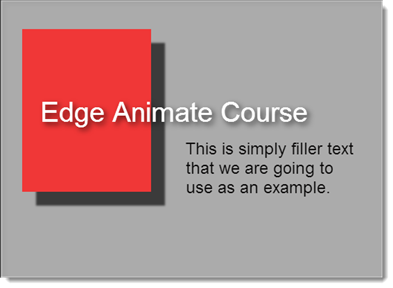
However, if we choose the visible property, even the part of the image that is off the Stage is displayed in the browser window:

Creating a Down-Level Stage
The animations and interaction that you create in Edge Animate will not appear in older, non-HTML5 browsers, such as IE 6 and 7. This means that viewers who still use the older browsers will not be able to view your composition. Edge Animate allows you display alternate content in the form of a static image to viewers with older browsers by offering you the ability to create a down-level Stage.
To create a down-level Stage, click to select the Stage element in the Elements panel.
Next, go to the Properties panel and click the Edit button for Down-Level Stage.
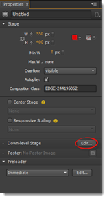
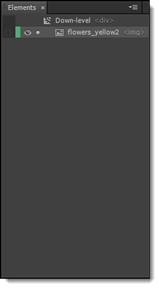
You are then taken to the Down-Level Stage, as shown below.
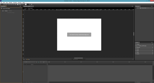
When you're in the Down-Level Stage, most of the tools and timeline are grayed out. You are only allowed to add static images, as well as text.
You can also see a notice that you haven't yet set up your Down-level Stage.
To set up the Stage, drag an image from the Library panel onto the Stage.
If you want to add text, you can do so using the Text tool. Simply click on the Stage to insert text.
The elements that you add to the Down-Level Stage appear in the Elements panel as a child of the Down-Level symbol.
Using a Single Frame as Down-Level Stage Image
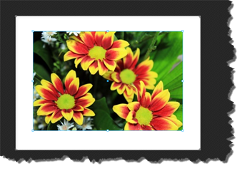
You may want to use a frame from an animation that you've created as your static image. For an example, take a look at our composition below. This is at the beginning of the timeline.
This is the Stage at a later frame in the animation.
This is what we want to use as our static image by capturing the frame and creating a poster image.
To do so, we will move the playhead to frame we want to capture.
Next, we click the Stage element in the Elements panel.
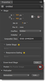
In the Properties panel, we click the camera icon that appears next to Poster, as circled below.
We then see this dialogue box:
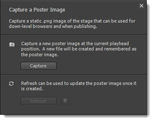
Click the Capture button.
Now, go to Edit Down-Level Stage in the dialogue box shown below.
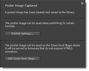
This lets you know that the poster image was saved to your library. If you want to go ahead and use this image for your Down-Level Stage, click the Edit Down-Level Stage button.
Creating a Hyperlink
You can hyperlink elements on your Down-Level Stage to other content, such as more non-HTML5 content or a URL where they can download a HTML5 browser.
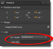
To create a hyperlink, edit your Down-Level Stage, then select a text element on your Stage that you want to use to create the hyperlink.
Go to the Properties panel.
In the Link section, select newWindow so clicking on the link opens up a new browser window. Enter a URL for a website in the Link URL field.
Adding a Preloader
It goes without saying that the larger your composition is, the more time it will take to load in a browser window. Although that's okay, and there's no such a thing as a composition that's too big, you do want a way to let your viewers know that the composition is loading. You don't want them thinking there's something wrong, causing them to give up and look elsewhere.
A preloader is a visual indicator that lets your viewers see the download process. It can contain detailed information about the data received � or it can be simpler such as the spinning wheel. Either way, a preloader lets your viewers know that your composition is loading.
To add a preloader to your composition, click the Stage element in the Elements panel.
Next, go to the Properties panel.
Go to the Preloader section, then click the Edit button.
You will then be taken to the Preloader Stage, as shown below.
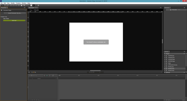
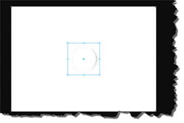
Click on the Insert Preloader Clip-Art button.
Choose a graphic from the menu.
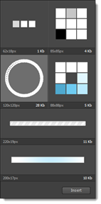
Click the Insert button.
The graphic is then centered on the Stage.
The graphic is also saved to your images in the Library panel as an animated GIF.
Now you can return to the main Stage, then preview your composition in a browser window.
Embedding a Composition into an HTML Web Page
Let's learn how to embed your composition into an HTML page of a website.
Locate the folder for the website on your computer. Remember, you want to locate the folder for the website, not the folder for your composition.
Open the folder. The index.html file is the file that opens in the browser window.
Double click on the index.html file to open it in a browser window.
Publish your Edge Animate composition for the web once you have added a Down-Level Stage and preloader.
Go to a text or HTML editor such as Adobe Dreamweaver.
Open the HTML file for your composition, as well as the index.html file for the website.
In your composition's HTML document, copy all the code that appears between
<!- - Adobe Edge Runtime- - > opening tag and the <! - -Adobe Edge Runtime End- -> closing tag. You will find these just before the </head> tag. It will look something like this:
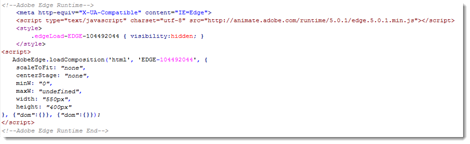
This is the part of the script that represents the Edge Animate runtime, and it points to the JavaScript file where your animations and interactivity is stored.
Now, go to the HTML file for the website. Paste the code between <head> and </head>. This will put your composition at the top of the page. Of course, you can place your composition wherever you want on the page. We are just using the top of the page as an example. In our example, our composition will replace the header image at the top of our page.
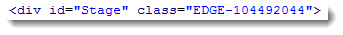
Now, go back to the HTML file for your composition. Locate the <div> tag for the Stage.
It will look something like this:
Go to your website's HTML page. Replace the entire bit of code for the header image with the code you just copied from your composition. Again, remember, you can place your composition wherever you want. We are just using it for the website header.
Now, copy all the files and folders in your composition's web folder into your website's folder � the same folder that contains your website's HTML page.
Creating a Responsive Design
Responsive design is defined as an approach to building a web page so that the web page can determine the viewer's screen size and orientation, then change the layout of the web page to match the screen size. Without responsive design, a website that's designed for a 1600x900 resolution monitor might not appear correctly on another device, such as a 7" tablet. However, when a responsive design is created, your composition detects the size of the display, then adjusts itself so your layout is preserved and your composition displays properly in the browser window.
In this article, we will discuss how to:
-
Set the Stage for a responsive design.
-
Prepare elements for a responsive design
-
Position your elements relative to the Stage
-
Use Global or Applied coordinates
-
Select a layout preset and change the default layout settings
Setting the Stage
The first step in creating a responsive design is to make the Stage scalable.
To do this, go to the Properties panel. Click the toggle for Width and set it to %. Change the value to 100%.
In addition, go to Max W and deselect the 'none' option, then set the Max W to 960 px.
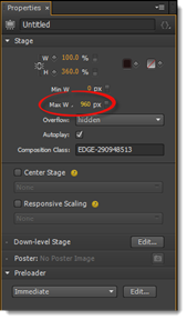
You can use the ticks that now appear on the ruler to see how your composition looks when shown in different sized browsers.
Taking Care of the Elements
Now that you have the Stage set for responsive design, it's time to take care of the elements as well. The last thing you want is for the images to get cut off when the container (browser window) gets smaller.
Go to the Elements panel. Hold the Shift key down and select all the image elements.
Next, go to the Properties panel.
Go to the Position and Size section and click the toggle for W to change to %.
Now, go to the Background Image section and click the toggle for Height. Change it to %.
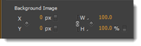
Keep all the images selected. Click on the H property and select Auto.
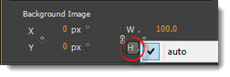
This forces the height to stay proportionate to the width.
Next, set the Y value in the Background Image to 50%.
You now have your image elements and Stage set up for responsive design.
About Relative Positioning
You may have some elements on your Stage that you don't want to move. Perhaps you have buttons at the top of the page. You want these to stay in their position no matter what. To make that happen, we are going to use the coordinate space picker in the Properties panel.
First, select the element(s).
Go to the Properties panel.
Choose the corner of the Stage where the element is closest to in order to keep them at a fixed distance from the corner.
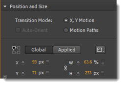
Global and Applied Coordinates
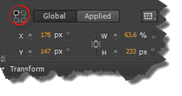
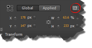
Next to the coordinate space picker you will see two tabs that represent two modes: Global and Applied. You can set the position and size of an element in either mode; however, let's understand what each is.
Coordinates are calculated relative to the Stage in Global mode.
However, coordinates are calculated relative to the element's coordinate space in Applied mode. What that means is this.
If you select an element and click on Global mode, the position may be X= 178 px, Y = 247 px. This reflects its position from the top left Stage corner.
But if select an element and click on Applied mode, the coordinates will change to R=179 px, T=147 px. This reflects its own coordinate space. It is 179 pixels from the right edge of the Stage, then 147 pixels from the top edge of the Stage.
Layout Presets
You have a lot of options when it comes to positioning and resizing elements and properties for a responsive design. It can get confusing and complicated. However, Edge Animate provides different presets that you can use to make your work easier. These presets are for common resizing behavior for images. These can be very useful when creating a responsive design.
To access the layout presets, go to the Elements panel. Press Shift+Click to select all images.
Next, go to the Properties panel. Click the Layout Preset button that appears to the right of the Global and Applied tabs in the Position and Size section.
You will then see the Layout Preset dialogue box:
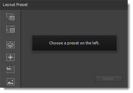
Presets are listed in the left column.
Select the Center Background Image.
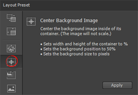
Click the Apply button.
All of your selected elements are now fixed at 960 px by 360 pixels. In addition, their X and Y coordinates are set at 50% of the container. This means the images will stay in place, but will be cropped as the container (or window) is resized.
Layout Defaults
The default settings when you create and position new elements are to use pixels as the measurement and to measure from the upper left corner of the Stage. However, this can be changed by going to the Layout Defaults panel in the Tools panel, as circled below.

When you click on the button, you will then see the Layout Defaults panel:
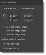
In addition to setting the unit of measurement and the point of reference, you can also choose to use 'img' tags for images, as well as set the height and width to auto for images.
Whenever you make changes to the layout defaults, the changes are made for the current composition only. They are not saved for use with future compositions.
Explore and Create
Take some time to explore the different layout presets and layout defaults to see how they affect your responsive design. Go to File>Preview in Browser and resize the browser to see the changes. You can also use the ticks on the Stage.