Creating a New Site in Muse CC
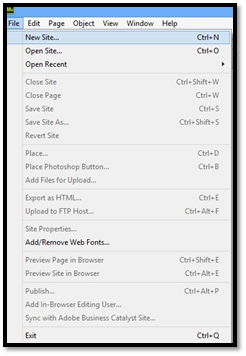
To create a new site in Muse CC, you can do one of two things.
1. Click Site under Create New on the Welcome Screen.
2. Go to File in the Menu bar, then click New Site, as shown below.
You'll then see the New Site dialogue box.
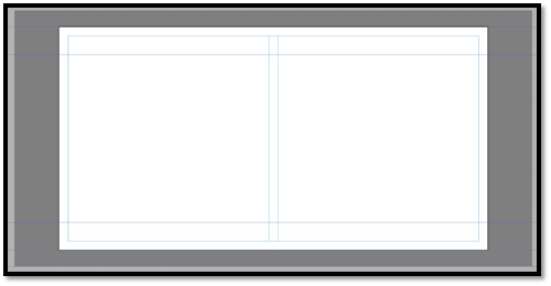
In this box, first choose a layout in the Initial Layout section. You can choose desktop, tablet, or phone.
Next, specify the page width and the minimum height for the page.
Specify how many columns you want, as well as the width of the columns (measured in pixels).
Specify the gutter as well. The gutter is the space between columns. Again, this is measured in pixels.
In the Margins section, specify your margins. The margins are the space from the border to the elements on your page.
In the Padding section, specify the padding. The padding is the space from the border of a column to the contents.
Click OK when you are finished.
You'll then see the Plan View in Muse CC. The Plan view is one of four views in Muse CC.
The views are:
1. Welcome Screen
2. Plan view
3. Design view
4. Preview
Plan view is shown below:
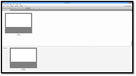
Using Plan View
Plan view is where you will plan your site.
Take a look at the enlarged snapshot of the Plan view interface below. Familiarize yourself with its features.
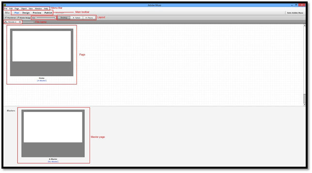
You'll use Plan view to create pages and Master pages. It will also play a big role when you start to create your site's navigation system.
Saving and Backing Up Your Site
Before you go any further, let's go ahead and save the new site you've created. To do this, go to File on the Menu bar, then Save Site As (File>Save Site As).
Enter a name for your new site.
Click Save.
To create a backup of your site, go to the location where you saved your site. Click the file to select it, then right click and select Copy. Deselect the file, then right click and select Paste. Rename the file using the current date so you know when you created the backup.
You'll need a backup to your site if anything happens to the original file such as corruption or changes that you decide you no longer want to make. Create backups on a regular basis as you work on designing your website.
Planning Your Site Navigation
Your site's navigation system is how the people that come to your site will get from one page to another. Most people that come to your site will land on your home page, or the first page of your site. By default, this page is always named the index page.
But how will they get to the other pages of your site?
This is where your navigation system comes into play.
It's a very important part of your site, so it's also important to plan for it, which we've already done. Now it's time to take those plans to Muse CC and make them a reality.
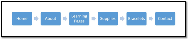
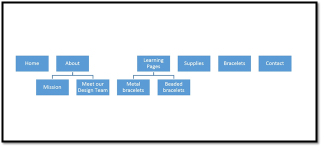
Your site's navigation is broken down into levels:
-
Top level
-
Secondary levels
-
Sub levels
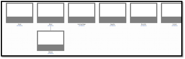
As you can see in the diagram above, the Home, About, Learning Pages, Supplies, Bracelets, and Contact pages are our top levels. In other words, these are the pages we want showing in our navigation system when someone lands on our Home page. These are main pages in other words.
The secondary level pages are pages that relate to their top level parent. It's very similar to topics and sub topics in the last section.
Plan out your pages to decide how many you'll need.
Follow these steps:
1. Decide on your top level navigation. These are pages that are doorways to the rest of your site with each doorway being a different main topic. Again, each top level page deals with a different topic. The top level navigation also includes site information (About) and instructions on how to contact you (Contact). These aren't mandatory, but they are common and best practice.
2. Next, organize your sub topics into pages. Group them under the appropriate top level topic.
Take time to write all this down on paper or in a graphics program such as Adobe Proto. In the next step, we are going to take this to Muse.
Planning Your Pages in Muse
Now that you have your site navigation planned, it's time to start putting together your website plan in Muse.
Let's look at the Plan view again.
As you can see, the page that you created when you created your site is your Home page. The Home page is a top level page. Let's add our other top level pages.
To do this, click on the Home page in Muse CC to select it.
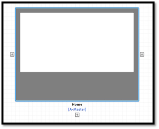
When you select it, you'll see three plus signs, one on each side of the page and one below it (as shown above).
To add a top level page, click a plus sign either to the left or right of the Home page. We want our Home page listed first on the left hand side of our navigation, so we are going to click the plus sign to the right of it.
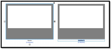
This adds another top level page (above). It's named Untitled-2 by default. Change it to the page name you have listed in your navigation plan. Ours is About.
Now, we can click the About page to select it, then add another top level page. We are going to add all our top level pages in this manner.
Now, we'll add our secondary pages below our top level pages.
Let's look at the plan we created for our navigation system again.
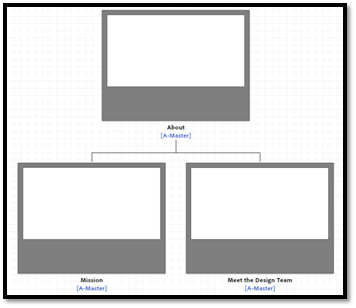
We can see that the About page has secondary pages. To add these secondary pages in Muse, click the About page, then the plus sign below the About page.
We are going to add the Mission page.
The About page has two secondary pages in our plan, so we are going to click the Plus sign to the right of the Mission Page to add our Meet the Design Team page.
If we need to add sublevel pages to either the Mission or Meet the Design Team pages, we can click the plus sign below the respective pages.
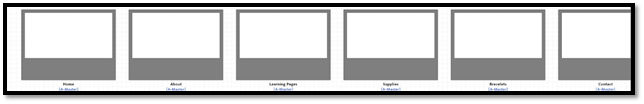
Keep adding pages and levels until your website is planned out in Muse.
Making the Move to Design View
Once your site is planned out in Plan view, you can double click any page to open that page in Design view.
Design view looks like this:
At the top of the Design view window, you'll see the Menu bar. The Menu bar contains tools and commands to help you design your web pages.

Below the Menu bar is the main toolbar. You'll use the tools in the main toolbar a lot as you work on your pages.

Right below the main toolbar is the Control bar.

Below the main toolbar is tabs. The active tab shows the page you are working on. As you can see, on the far left, you have your site map � or the Plan view of your website.

The panels are located on the far right side of the window. These contain tools and features you'll find in the Menu bar and Control bar. You can access the panels by going to Window in the Menu bar.
The rulers run vertically and horizontally along your page. You can use these to help you align page elements.
The canvas is the area in white below. Your canvas is where you'll design your page. The grey area is background that appears to the left, right, top, and bottom of the page in browser windows.
Working with Master Pages
As you design the pages for your website, you'll notice that there are some elements that you put on every page. For example, you put your logo on every page, your business name, and even your navigation system. Your website design and layout is probably the same for most, if not all, of your pages too.
However, placing these things on each individual web page can be time consuming. Can you imagine having to recreate your layout for ten different pages? Or having to place your logo on every page you create, time and time again? It can start to become tedious and a headache.
Master pages eliminate the need to place common elements on each page as you design them individually. You can think of a Master page as a template. You place common elements on the Master page, such as layout, logo, business name, etc., then use the Master page to design those individual pages. It saves you a lot of time and work.
Creating a Master Page
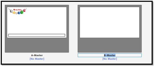
Let's go back to Plan view for just a minute. At the bottom of the window, you'll see a Master page is already created for you.
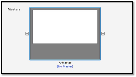
Double click on the Master to open it in Design view.
Now you can add elements that are common to multiple pages to the Master. You can even create multiple Masters, as we'll learn to do later in this article.
Setting Fill Color for the Content Area
We are going to use our Master to create the basic layout for our site since we are going to use the same layout for most of our pages.
The first thing we are going to do is learn to add a fill color to the content area � or the white area � on the page.
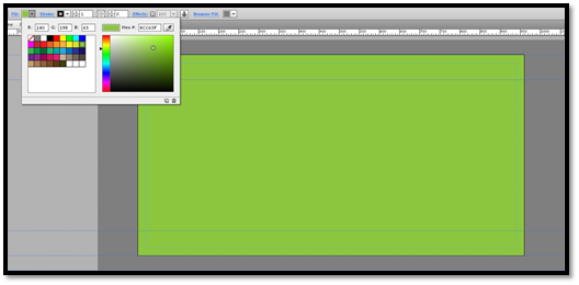
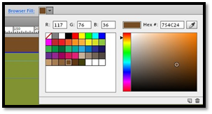
To set a fill color, click the color dropdown menu next to Fill in the Control bar, as shown below.
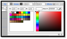
Choose a color from the Color Picker or swatches (on the left).
We've made our fill color green.
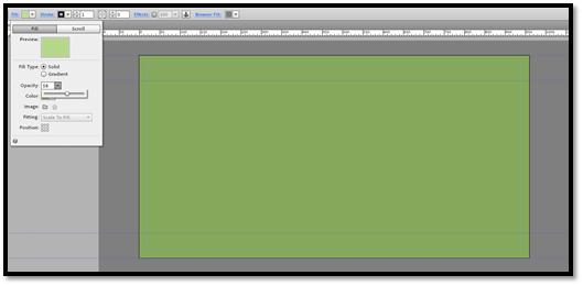
Now, let's say we like green, but we want to change the opacity.
Click on the word Fill in the main toolbar to do this.
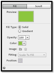
Change the value in the Opacity field.
We've changed ours to 58.
NOTE: You can follow these steps for Master pages or other pages. Just double click the page in Plan View to go to Design view, then follow these steps again.
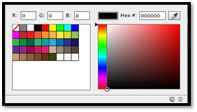
The Color Picker lets you create custom colors that you can use in Muse CC. To use the Color Picker, adjust the sliding bar on the left to the type of color you want. For example, our slider is on red.
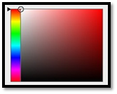
|
Now, click and drag the little circle to create the shade you want. As you can see in the snapshot below, the color we've created is previewed for you above the Color Picker.
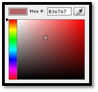 |
|
To add the custom color you've created, click the New Swatch button from the dropdown menu. This button is found in the lower right hand corner. We've circled it in red in the next snapshot.
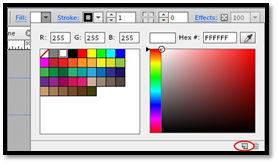 |
Add a Fill Color from a Logo or Image
Let's say you want your fill color to match a color in a logo or image you are going to use on your website.
To add a color from a logo or image, click the Fill dropdown menu. Select the eyedropper tool on the far right, then click on an image you've already imported into Muse. Select the color from the image that you want.
NOTE: You can follow these steps for Master pages or other pages. Just double click the page in Plan View to go to Design view, then follow these steps again.
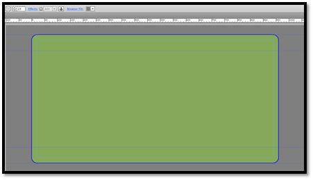
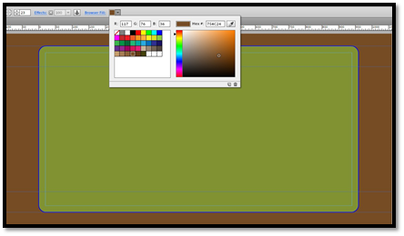
Add a Border
Border goes along the edge of your canvas and can help your canvas stand out � or even "pop."
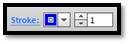
To add a border, click the Stroke dropdown menu on the Control bar.
Select the color you want to use for your border.
We are going to use blue.
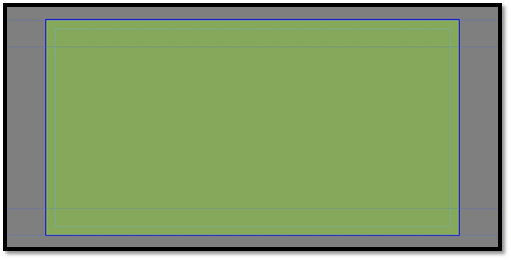
Next, click on the text field that's to the right of the color dropdown menu and enter a value. This value represents the width of your border. This text field is pictured below:
We are going to change the value to 2.
You can see our border in the following snapshot.
Now click the word Stroke in the main toolbar. It's written in blue. In Muse CC, you can click on words in the Control bar that are written in blue to see more options.
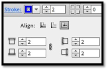
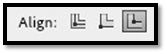
Choose how you want to align the border.
You can align it with the inside edge of the canvas, outside edge of the canvas, or center it on the edge of the canvas (pictured in that order below).
Finally, click Make All Stroke Weight Settings the Same button.

When you click it, it then looks like this:

Now you can enter new values in the boxes. By entering new values, you can vary the stroke weight for different sides of the canvas.
NOTE: You can follow these steps for Master pages or other pages. Just double click the page in Plan View to go to Design view, then follow these steps again.
Create Rounded Corners
Once you've created and applied a border, you can then create rounded corners for those borders to give them a different look or feel � or to make them match the look and feel of your website.
Once you've created your border, click one of the rounded corner buttons on the main toolbar, as shown below.

Next, enter a radius of the corners in the text field next to the buttons. The border's corners are then rounded.
You cannot set a different radius for different corners.
NOTE: You can follow these steps for Master pages or other pages. Just double click the page in Plan View to go to Design view, then follow these steps again.
Add Special Effects
If you've ever used Adobe Photoshop or even MS Word, you might have already played with special effects that you can add to objects and images. One of those effects might have been a drop shadow, which creates an illusion that the object or image is floating above the page.
Muse CC offers you three effects that you can apply to your pages. You can use drop shadow to make your page look like it is floating above the browser window. You can use bevel to give it a 3-D look. In addition, you can also use glow. Glow is a lot like drop shadow. However, glow works best with dark backgrounds.
Add a Drop Shadow
Click the word effects in the Control bar, then click the Shadow button. It's the one located on the left (pictured below).
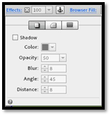
Click to put a checkmark in the box beside Shadow.
Adjust the settings if you want.
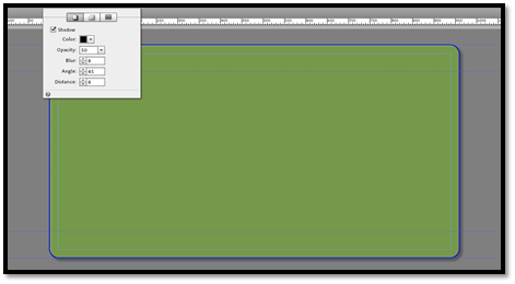
You'll then see the shadow applied to the page.
NOTE: You can follow these steps for Master pages or other pages. Just double click the page in Plan View to go to Design view, then follow these steps again.
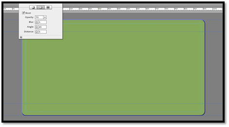
Add a Bevel
Click the Bevel button  , then click to put a checkmark in the box beside Bevel.
Just as with drop shadow, adjust the settings if you want.
The bevel is then applied.
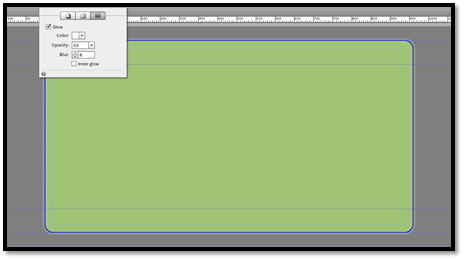
Add a Glow
Click the Glow button  , then click to put a checkmark beside the word Glow.
Just as with drop shadow and bevel, adjust the settings if you want.
The glow is then applied to your page.
NOTE: You can follow these steps for Master pages or other pages. Just double click the page in Plan View to go to Design view, then follow these steps again.
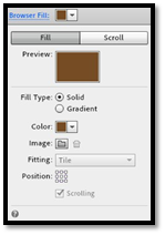
Add Background Fill
The page, also known as the canvas, only takes up a part of your browser window. The rest of your browser window will either be plain white or another color. This color is called the background fill color. You can also select an image to be the background fill. However, the image must be in one of the following formats: GIF, JPEG, or PNG.
Adding a Solid Background Fill Color
Click the Browser Fill dropdown menu, then select the color you want.
The fill is then applied.
We changed ours to brown.
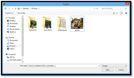
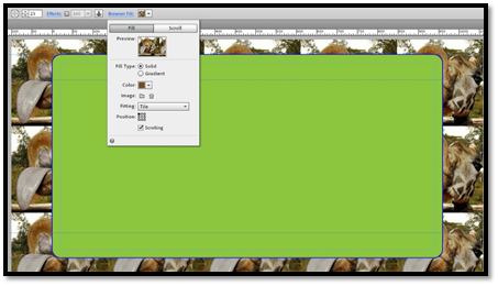
Adding a Background Image
To add a background image instead of a background color, follow these steps.
Click on the word Browser Fill in the main toolbar.
Next to Image, click the button that looks like a file:  .
.
Locate the image on your computer that you want to use as the background image. Click on the image to select it, then click the Open button.
You'll then see that the image appears as the background. However, it may not be positioned as you want it or in a way that looks the best.
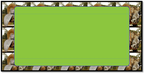
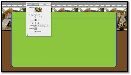
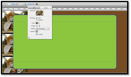
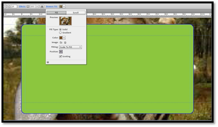
To fix this, click Browser Fill again, then click on the Fitting dropdown menu. This menu will allow us to adjust the tiling. A tile is a background, pattern, or design that covers the entire web page. In this instance, the pattern is the image we've selected.
Choose Original Size if you want to turn off tiling.
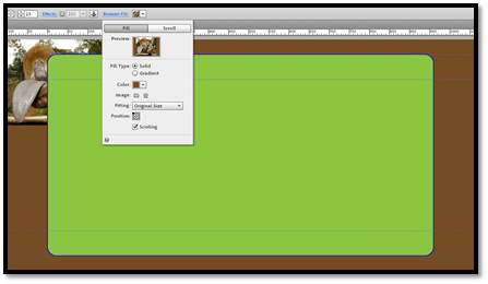
Choose Tile to tile in both directions:
Or Tile Horizontally:
Or Tile Vertically.
You can also Scale to Fit. When you choose this, Muse scales your image to it fits on the page.
If you choose Scale to Fill, Muse scales your image so it fills the background of the page. Your image may become distorted when you choose this.
You can also reposition the background image. To do this, click the word Browser Fill in the main toolbar again and go to Positioning.
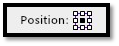
You can choose to position the image at the top left, top center, top right, middle left, middle center, middle right, bottom left, bottom center, or bottom right by clicking on the appropriate square.
NOTE: You can follow these steps for Master pages or other pages. Just double click the page in Plan View to go to Design view, then follow these steps again.
Adding Headers to Master Pages
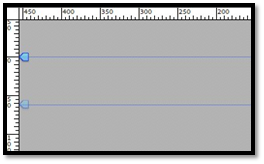
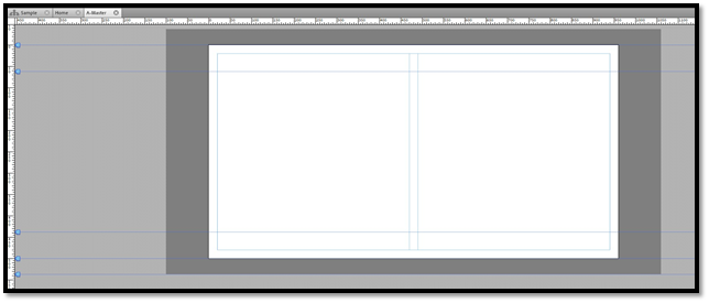
The header of your site appears between the two blue guide lines in Design view. The top guide line is the Top of Page guide. The line beneath it is your header guide. You can drag this up or down on the page using the blue arrow on the left to either extend or decrease the width of your header.
Your site header typically appears on every page of your website, which is why you add it to your Master page. It includes your site's logo, your company name, and even your navigation if you choose.
For now, let's learn how to place a logo in the header area of your site.
Go to File>Place.
Find your logo in the location where it's stored on your computer. Remember, the file must be a JPEG, GIF, or PNG formatted image.
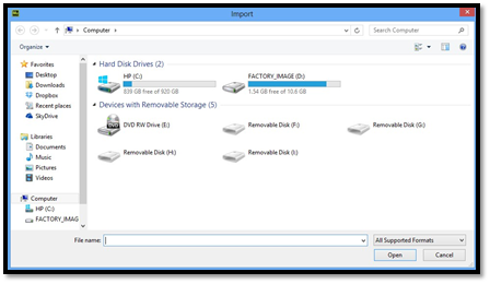
Click Open.
You'll now see a place gun attached to your mouse cursor with a miniature version of your logo.

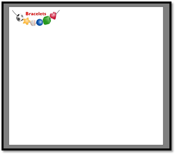
Click the location on your page where you want to place the logo, as we've done below.
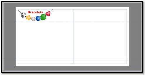
Now, adjust the header guide if necessary.
You can also resize your logo.
Now, click Preview in the main toolbar. You can see your logo on your web page.
Adding Footers to Master Pages
Footers go at the bottom of your web pages. Since they typically go at the bottom of every one of your pages, you place a footer on Master pages.
Footers include legal and copyright notices, but can also include bottom navigation and other information.
To place a footer on your Master page, click the Rectangle tool in the main toolbar. It looks like this:

Now, drag to draw a rectangle at the bottom of your page.
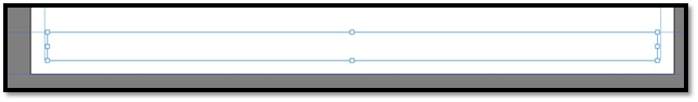
Once again, you can use then adjust the guides. The top guide is the footer guide. You can drag it up or down to extend or decrease the size of the footer. The next guide is the Bottom of Page guide, which we'll learn about later. Finally, the bottom guide is the Bottom of Browser guide.
Look at the snapshot above to see the footer we drew using the rectangle tool. As you can see, it has handles around it: one at each corner and one on each side. We can resize the rectangle by clicking the Select tool in the main toolbar. It looks like this:

Next, drag on any of the handles to resize the rectangle. Y
You can also add a fill and stroke color, as well as effects, to the rectangle if you want by selecting the footer with the Selection tool, then selecting a fill color from the Control bar.
Flexible Width Footers
The footer you drew above was a fixed width footer. In other words, the dimensions of the footer are fixed and do not change no matter what. However, you can also create a flexible width footer that will expand or decrease in width depending on the size of the screen the visitor is using.
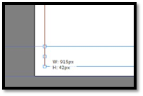
To create a flexible width footer, click the Selection tool and drag on the left side handle until you see a red line, as pictured below.
Follow the same steps for the right side of the footer.
Creating Additional Master Pages
As we said earlier in this article, you can create as many Master pages as you want. If you have different page layouts for different groups of pages on your site, creating multiple Master pages can save you a lot of time.
To create a new Master page, go to Plan view and mouse over the Master page.
Click the plus sign to the right of the Master page, and a new Master is created.
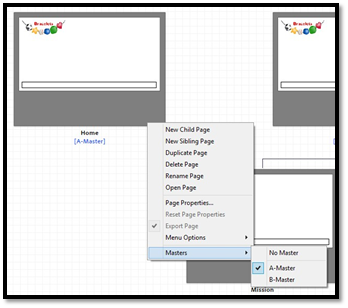
Assigning Pages to Masters
Once you've created your Master pages, you'll want to assign pages in your website to the individual Masters. To do this, right click on a page in Plan view, then click on Masters. Select the Master you want to assign to the page, as shown below.