Composition in photography is a tricky subject. What you decide to include in the picture and what you decide to leave out plays a big role in the success of an image. Essentially, composition is everything.
But, composition is also very subjective. The camera is a tool that allows a photographer to show the world as they see it, and each photographer brings their own unique perspective. For every compositional rule, there's at least a dozen good reasons to break that rule.
If you've have printed out a single image in multiple sizes, you've probably noticed that different print sizes will crop the image a bit differently. Aspect ratio describes the relationship of the image's width to height. Just like choosing a standard or widescreen DVD, aspect ratios in photography determine how wide the photograph is.
Aspect ratios are written like this:
width:height
A 1:1 image is square, because the width is the same as the height. The iPhone camera, by default, has a 4:3 aspect ratio, which is rectangular, but more square than other aspect ratios. A 16:9 aspect ratio is much wider.
There's no "right" or "wrong" when it comes to aspect ratio, but you should be aware of using aspect ratio in your compositions. A square-shaped image will have less space to work with, while a wider image will include more of the scene in the image.
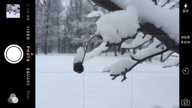
In the native-camera app, the only way to change the aspect ratio is by switching from the photo to square mode. Using ProCamera, however, entering the menu allows you to tap through the different options-including 1:1, 3:1, 4:3, 3:2 and 16:9.
Photography is a way to capture how you see the world. Point-of-view in photography plays a big role in doing just that. Our brain takes cues from our eyes to judge aspects like distance and size. For example, an object that's larger is likely closer, and smaller objects farther away. Overlapping objects also give the brain clues as to which one is closer.
Lines also offer big visual clues as to what's happening in an image. If you stand in the middle of the road, you'll see that the edges appear to curve towards each other into the distance-your brain knows that those lines are straight, but that distance creates the way they appear to bend. This is referred to as linear perspective-our brains will judge how far away something is by the way that lines (like a road or a row of trees).
Linear perspective can also wreak havoc on a photograph. If you look up at a tall building, the sides of the building will appear to tilt in together. If, instead, you shot from a different perspective and were far enough away to capture a skyline image, the building would appear to be straight again. That doesn't mean shooting up at a builing is wrong, but that you get a different effect with it. The same concept is why most real estate photographers take their photos from about waist-level-to prevent the walls for appearing to tilt.
By altering your point-of-view, you can change the way those visual cues appear. For example, taking a picture of a road while standing in the middle of it results in a completely different image than that same road shot from an airplane looking straight down. The photograph in the middle of the road will appear to have more depth, since those converging lines give the brain clues on distance. The photo taken from above won't have that same depth, because the visual cues aren't there.
The way our brains perceive visual cues shapes the way images are composed. For example, if the things closest to the camera appear largest, you don't want to take a portrait from stomach-level (unless perhaps you are taking a maternity portrait). Taking a portrait at eye level or sometimes a bit above eye level offers a more flattering perspective instead, emphasizing elements like the eyes because of how objects closer to the camera appear largest. (Shooting from below eye level for portraits also gets an unflattering up-the-nose shot).
When most people snap a photo with their iPhone, they take it at eye level. But, often one of the easiest ways to create a more interesting composition is to change the height that you take your photo from-like kneeling or climbing on a ladder. If you always take photos from eye level, your photos will all start to look similar, no matter what you are photographing.
If you take a photograph at the subject's level, that gives the image a more intimate feeling. For example, if you are photographing a child, kneeling to the child's height allows you to present everything as they see it, not the way adults see. The same concept applies to taking pictures of a still life object. Product photos, for example, are often taken straight-on because it helps the viewer feel like they can just reach out and grab it.
Kneeling, or even laying on the ground on your stomach, will also add more objects to the foreground, or the front of the picture. Adding more objects to the front of the picture like grass or rocks in a landscape photo creates interest and adds more depth, since those large objects close to the camera give the brain another visual clue.
Composition is just as much about what you include in the image as where you include it. By default, most people tend to center whatever it is they are taking a picture of. Every compositional rule in photography can (and often should) be broken sometimes, but taking images by default is a good way to get boring photos. If you find that you always take photos from eye level or you always center the object, stop and ask yourself why you are taking the photo that way. If you can't think of a good reason, that's a good sign you should try to get creative with your composition.
The rule of thirds is one of the most well-known photography "rules." If you imagine that the image is divided into threes both horizontally and vertically, the rules of thirds suggests placing the subject on one of those lines. The rule of thirds looks like a tic-tac-toe grid over the image:
To turn on the rule of thirds guidelines, go into settings and click "Photos and Camera." Turn the option called grid on. Then, open up the camera app again. See the lines that now divide your image? That's the rule of thirds. If you keep the grid on, you'll be reminded of how placing the subject on one of those intersections is often the best approach. You can turn the grids on and off in the settings on the ProCamera app as well.
In landscape photography, the rule of thirds often helps photographers consider where they place the horizon line, instead of defaulting to the center. If the landscape is more interesting visually, try placing the horizon on the upper 2/3 line. But if it's the sky that's the most interesting (perhaps because of a sunset or a unique pattern in the clouds), try placing the horizon on the bottom 1/3 instead, which will include more of the sky and less of the land.
But, doing anything simply by default will limit your creativity-always using the rule of thirds is just as bad as always centering your images. So, when is it a good idea to center the subject instead?
Placing the subject in the center will help to emphasize patterns. For example, say you are taking pictures inside a beautiful cathedral with matching arches on each side of you. By centering the image, those arches will be at the same place in the image on the opposite side. That helps make the pattern in the repeating arches much more apparent. Centering images to emphasize pattern isn't just limited to manmade objects-using a centered composition will also highlight the symmetry in a butterfly's open wingspan, for example.
Centering images sometimes help tell a story. Placing the subject in the center also tends to create a more simplistic feel. Many portraits often break the rule of thirds to limit how much of the background the viewer sees.
Lines are a powerful compositional tool. The right line, placed in the right spot, can make for a powerful, dynamic image. In the same way, including a pattern will help draw the eye in, creating an image that's far from boring. As you consider your composition, look for lines and patterns as a way to improve your photography.
Remember from earlier that lines are visual cues? Lines can offer more than just visual clues about distance. In general, including a line in the image will draw the eye to where the line is pointing. But, don't think lines are always traditional straight, uninterrupted lines. Rows of crops in a field, a road, a railroad track, a pier-much of what we see everyday forms a line in some way. Just where you place that line in the image will have a big impact on the feel of your composition.
- A horizontal line creates a static, or unchanging, feeling. Horizontal lines are good tools for creating a classic or timeless mood.
- A vertical line is often considered to add a feeling of peace to a scene. Images with vertical lines also tend to portray growth. Or, vertical lines can simply be used to emphasize a subject's height.
- A diagonal line, on the other hand, reflects growth and change. Since diagonal lines are also visual cues the brain uses to judge distance, diagonal lines can help make a two-dimensional image appear to have more depth.
Patterns also adds visual interest to an image (and a pattern can be multiple lines). But besides drawing the eye, pattern also contributes to the emotion the viewer has when seeing the image. Humans are creatures of habit, and seeing patterns offers a sense of calm. Look for simple patterns as you shoot-a line of trees, a set of arches on a building, three birds in a row on a wire. Texture, like the ripples on the sand or a rocky shoreline, is also a good way to incorporate a bit of pattern.
In the same way that lines and patterns create a stronger composition, color can work as a compositional tool. Color can be used to disrupt a pattern, like in the example of the third bird that's a different color.
But you can also decide what to include in an image and what to leave out based on the colors in a scene. Colors that are both complementary (opposite each other on the color wheel) and analogous (next to each other on the color wheel) can work well in the same image. For example, green and blue are analogous colors-if your subject is green, but there are other blue objects in the scene, you may choose to include only the green and blue objects in the image and to crop out everything else.
Why use color in composition? Single colors have strong ties to emotions, but so can color schemes. An analogous color scheme, like the green of grass and blue of the sky, is often associated with a calmer image. Complementary colors, on the other hand, can be used to create a strong contrast and draw the eye to one element of the image. These opposite colors, unlike analogous colors, often feel more unsettling when used together in an image.
Point-of-View, the rule of thirds, lines, patterns and color can all be powerful compositional tools. But, put them all into a single image and you'll have a cluttered image with no strong subject. As great as these tools are, nothing is a good compositional tool too. Using negative space, or empty space, in an image, helps draw the viewer's eye to the subject. When your subject is the only identifiable object in the frame, it immediately draws all the attention.
To keep photos simple, you should also consider what's in the background of your image. A distracting element badly placed in the background can quickly destroy an otherwise good composition. When taking a portrait, for example, make sure there are no tree branches or sign posts that appear to sprout out of the subject's head-taking a step over is usually a quick fix.

For every compositional rule, there's at least a dozen reasons to break it. Composition is difficult to learn, because composition is really about how you see the world-and there's no one right way to compose an image. But that doesn't mean you can't improve your compositional skills.
The key to improving your composition is to never do anything by default. If you always take photos from eye-level, for example, next time you shoot consider how the shot will change if you kneel or use a step stool. If you always center your subject, consider using the rule of thirds the next time you shoot.
Frame what inspires you-but before you press the shutter release, consider the compositional tools at your disposal, and whether using them would improve your image. Once you've identified what inspires you about the scene, consider:
- How a different point of view (higher, lower or to one side or the other) would change the shot
- If you should use the rule of thirds and place the subject off-center, or highlight symmetry by centering the subject
- If there are any lines and patterns in the scene that you could emphasize with your composition
- If you could adjust the composition to include only similar colors or only high-contrast colors
- If you need to adjust your composition to eliminate distractions and draw more attention to the subject
The next time you start to take a photograph, pause and consider how the different compositional tools could be used to help the viewer to feel just as inspired by the scene as you do.