A chart is simply a visual representation of data. Crystal Reports gives you the ability to insert various types of charts into your reports using data that you specify.
When you add a chart to one of your reports, the chart is placed either in the Report Header or the Report Footer.
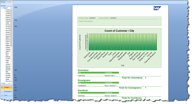
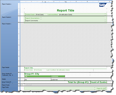
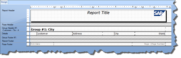
Take a look at our report below.
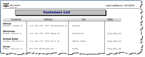
We are going to insert a chart into the Report Footer.
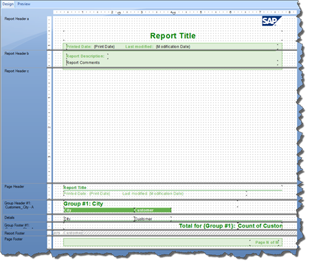
To insert the chart, first go to Design view.
Next, go to the Insert toolbar, then click on the Insert Chart button, as circled below.

Move your mouse to the Report Footer section. Click where you want to place the chart.
You will then see the Chart Expert dialogue box. Each tab that you see in the Chart Expert dialogue box will allow you to create and customize the chart that will be inserted into your report.
We're going to discuss each tab individually in the upcoming sections of this article.
Specifying the Data to Be Used in a Chart
The Data tab is displayed below. Under the data tab, you can choose a layout for your chart. The layout that you choose depends on the data in your report that you want to use to create a chart.
You can use:
-
Data in the Details section
-
Data in total and subtotal fields
-
Data in a cross-tab report
-
Data in an OLAP grid
The Data tab in the Chart Expert is pictured below.
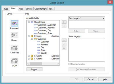
Choose a layout from the Layout column on the left side of the window.
Once you choose the layout, you will then specify the data to use in the chart.
The Advanced Chart Layout
An advanced layout lets you create a chart that's based on certain values. You'll find that most charts you create will be based on summary fields in your report, because it's that data that is typically best represented by a chart. However, with the advanced layout, you can actually create a chart without using summary fields. Instead, you can use values in the Details section of your report.
To create a chart using an advanced layout, you must have:
Conditions. You can have two conditions. Conditions are used to indicate when to plot a point. If you are plotting the cities where your customer lives, each time the city name (condition) changes, a point is plotted on the chart. You can plot a point for each record or plot one point for all records.
Values. The values indicate what information is plotted as points. If you wanted to show sales by city, the Sales field (in our report) would be the value.
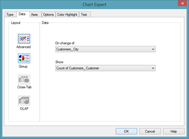
Take a look at the Chart Expert.
![]()
In the On Change Of section, you would add your conditions. You can click the Order button to specify a sort order for the conditions. Click the Top N button to specify the sort order for data to appear in the chart. For example, the top five cities or top five customers.
In the Show Values, you would add the values.
As you can see, because this is an Advanced Layout, we are specifying the field(s) in the Details section that will be used to summarize the data in our chart.
Currently, Crystal Reports is using SUM to summarize the data.
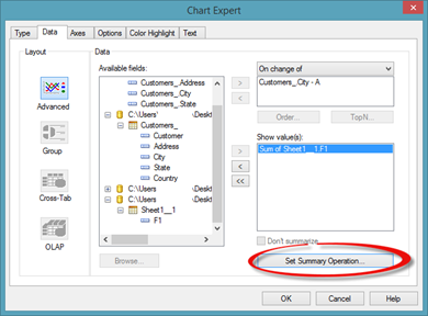
If we want to change that, click the Set Summary Operation button, as circled above.
The Edit Summary dialogue box then appears. This dialogue box lets you specify how the values shown in the chart will be calculated.
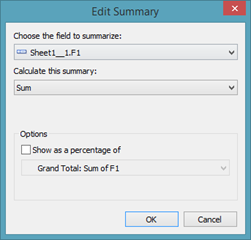
In the Calculate This Summary dropdown, we can select a new mathematical function.
In the Options section of the dialogue box pictured above, we can choose to show the sum as a percentage, just as we did when working with subtotal fields earlier in this course.
Click OK.
The Group Layout
The group layout lets you create a chart based on summary or subtotal fields.
Under the Data tab, select the Group layout if it isn't already selected.
From the On Change Of dropdown, select the group field that your chart will be based on.
From the Show dropdown, select the summary field to be used in your chart.
NOTE: For the purpose of this article, we will create our chart using the Group layout.
The Cross-Tab Layout
In order to be able to access the cross-tab layout, you must first create a cross-tab report. The cross-tab layout lets you create a chart using summary values from a cross-tab report.
To use the cross-tab layout, under the Data tab, click on Cross-Tab.
For On Change Of, select the field to base the chart on. You can click a secondary row or column in the Subdivided By list.
Choose the summary field for your chart in the Show dropdown list.
The OLAP Layout
The OLAP layout lets you create a chart on an OLAP grid. You will need an OLAP grid in your report to create a chart using the OLAP layout.
To use the OLAP layout, under the Data tab, click on OLAP.
For On Change Of, select the field to base the chart on. You can click a secondary row or column in the Subdivided By list.
Choosing a Chart Type
Once you've specified the chart layout, click on the Type tab in the Chart Expert dialogue box to choose the type of chart you want to use.
The types of charts available in Crystal Reports are the types of charts you would see in other software programs, such as Microsoft Excel.
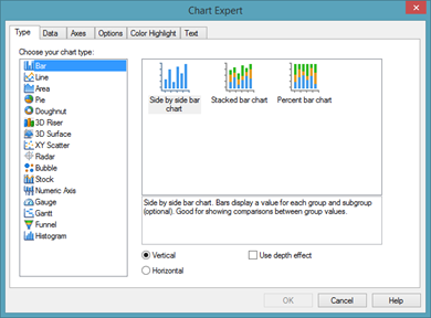
Choose the type of chart you want to use.
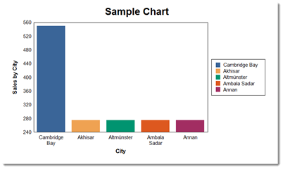
We have chosen a bar chart.
To give your chart a more 3-D look, put a checkmark beside Use Depth Effect.
The Axes Tab
Click the Axes tab in the Chart Expert. Under this tab, you can customize the scaling of the axes, the data points, and the legend.
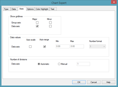
Most of the time, you can just go with the default formatting settings for the X-axis and Y-axis. However, if you need to change these settings for our report, you can turn the gridlines off or on, format the data values, and set minimum and maximum value ranges.
Each section under the Axes tab relates to a different part of the chart.
-
Use the Show Gridlines section to control where gridlines are shown at � either major or minor axes.
-
The Data Values section is for the labels along the axis. Auto Scale is for when you have a lot of labels that may be hard to read.
-
The Number of Divisions section is for when a number of charts are shown in your report.
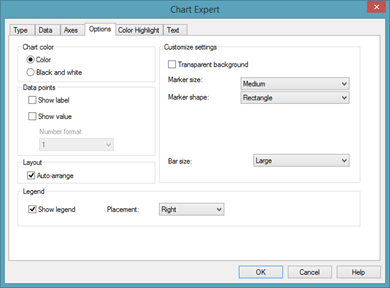
The Options Tab
Click the Options tab. The Options tab gives you options to customize your chart's look and feel. The options are self explanatory.
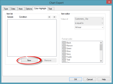
The Color Highlight Tab
Click the Color Highlight tab. This tab allows you to assign colors to elements of your chart, instead of using the default colors. We can also use this to highlight certain values in our chart.
![]()
For example, let's say we wanted sales numbers that were over $100,000 to appear in a special color.
Click the New button.
You will see a field used in your chart appear in the Item List section.
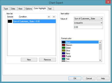
Next, go to the Item Editor section. Specify conditions for the field. When those conditons are met, the data will be formatted with a color highlight.
For example, we could specify that any values greater than 100,000 appear in a specified color that we'd choose in the Format Color Section.
The Text Tab
Click the Text tab. Under this tab, we can add a title for the report, a subtitle, a footnote, a group title, or a data title. We can also format the text for each of the titles in the report.
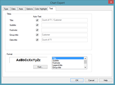
To change the text in a text field, remove the checkmark from the Auto-Text box, then type the new text in the text field.
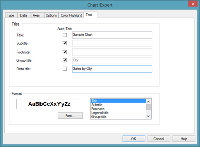
You can also format the text in the Format section.
Click OK when you are finished.
Your chart is then added to your report.
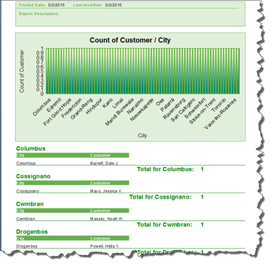
Our chart is pictured below.
Customizing a Chart
Once you have inserted a chart into your report, you can customize it even further to achieve the look and feel you want. You can do this either in Preview or Design view.
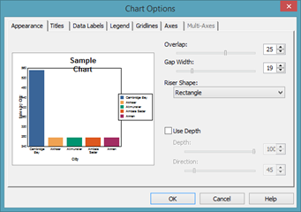
To customize data labels, axes, gridlines, titles, or the legend, right click on the report, and choose Chart Options from the context menu.
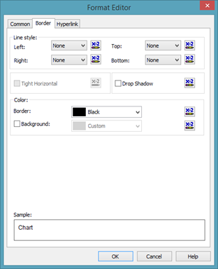
To add a border or create a hyperlink for the chart, right click on the chart. Select Format Chart from the context menu. You will then see the Format Editor dialogue box.
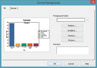
To format the background of a chart, right click on the chart. Select Format Background from the context menu.
The Report Wizard
Using the Standard Report Wizard
To use the Standard Report Wizard, go to File>New>Standard Report.
You will then see the Standard Report Creation Wizard.
![]()
Select the data sources that you want to use. You can either use existing connections, if you have already established them, or create new connections.
Once you have connected to your data sources, select the tables that you want to add to your report, then click the arrow button.
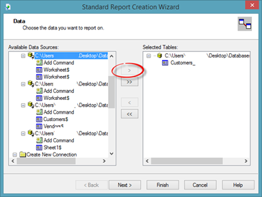
Click Next.
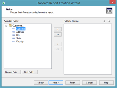
Decide which fields you want to add to your report. Select the field in the Available Fields column, then click the arrow button to move it to the Fields to Display Column.
![]()
Click Next.
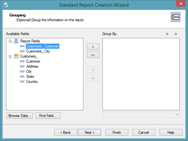
Add any groupings to your report.
Select the field that you want to group by in the Available Fields column, then click the arrow button to add the field to the Group By column.
We want to group by city.
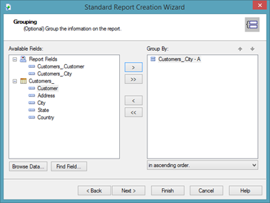
Click Next.
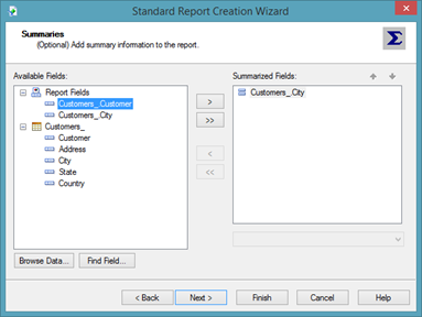
Now we can add summaries to the report. If you look at the Summarized Fields column above, you can see that Crystal Reports assumes we want to add a summary field for the City data field.
Instead, we want to add a summary field for the Customers data field. To do that, we select the Customers data field in the Available Fields column, then click the arrow button to move it to the Summarized Fields column.
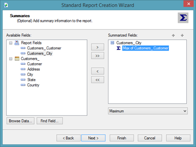
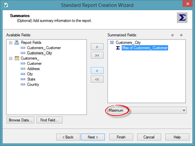
As you can see, Crystal Reports assumes we want the maximum value. However, we want the count.
Click the dropdown menu to select the function you want to use for your summary field.
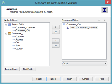
We've changed ours to COUNT.
Click Next.
![]()
Crystal Reports then lets you know that your group will be sorted by city. If you want, you can choose a group ordering.
Click Next.
If you want to add a chart to your report, select the type of chart, then fill in the requested information.
Click Next.
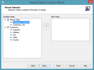
If you want to filter the data, choose a data field to filter by in the Available Fields column. Click the arrow button to move it to the Filter Fields column.
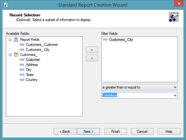
As you can see in the snapshot above, we are filtering are data by city. We want data displayed when the City field is equal to Columbus.
Click Next.
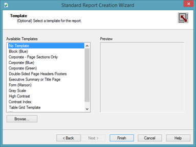
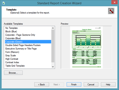
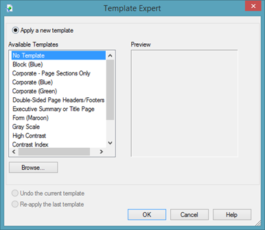
You can click on a template in the Available Templates field, then preview how the template will look in the Preview column.
Below we are previewing Corporate (Green).
You can choose No Template if you do not want to use a template.
Click Finish.
Your report then opens in Preview.
Save the report.
Editing a Report Created by the Wizard
Using the wizard can save you a lot of time in creating a report. However, you will find that you usually want to make some changes to the report after the wizard has created it.
The good news is that editing a report that was created by the wizard is the same as editing a report if you created it from scratch.
Take a look at the report the wizard created for us in the snapshot below.
As you can see, even though we didn't choose to add a chart, the wizard went ahead and inserted a graph. We don't want this in our report.
To remove it, we click on the graph to select it.
![]()
Next, either right click, then select Delete from the context menu, or press Delete on the keyboard.
Deleting the graph has left a huge hole in our report.
Let's go to Design view.
The graph was located in the Report Header C section. We are going to suppress that section.
Remember, to suppress a section, right click on the section, then choose Suppress from the context menu.
We now see diagonal lines through our Report Header C section, which means the section is suppressed.
Let's go back to Preview.
The empty space is now gone.
You can continue to make changes to your report until it looks the way that you want it. When you are finished, remember to save the report again.
Using Report Templates on Blank Reports
Using the Standard Report Wizard makes it easy to apply a template to your report. That said, though, you do not need to use the wizard if you want to apply a template to your report. You can apply a template when creating a blank report as well.
We are going to apply a template to the report.
To apply a template, go to Report>Template Expert.
This is the same window that you saw when you applied a template in the Standard Report Wizard.
Click on a template in the Available Templates column to preview it in the Preview column.
We have chosen Gray Scale.
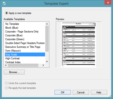
Click OK.
The template is applied, and you are taken to Design view.
Go to View>Print Preview to open the Preview tab.
Notice that our logo and text fields in the Page Header and Report Header have been removed. A lot of the work that we put into creating our report has been undone by applying a template. For that reason, it's best to apply a template early on in creating a report if you are going to create the report from scratch.
NOTE: You cannot go to Edit>Undo to un-apply a template. If you are going to apply a template to a report you have created from scratch, save a second copy of the report under a different filename in case you do not like the changes made when you apply the template.