Summarizing Data in Microsoft Access 2013
Introduction to Aggregate Queries
An aggregate query lets you determine statistics for a set of values. For example, you can determine the sum, average, and count. An aggregate query is also known as a Summary Query or a Totals Query.
Calculating a Group of Query Records in Design View
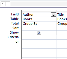
As with most things on Access, the best way to learn is by seeing it done and doing it yourself. That said, open the query that you created with two tables in it (titled "Books and Orders" or similar). Make sure you go to Design view.
You can resize the tables to make them more readable.
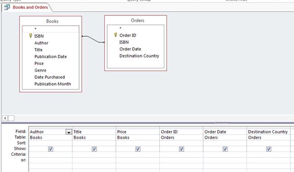
We already have our relationships established between the two tables we used. Click the Design tab and look for the Greek-looking E in the Show/Hide group, labelled Totals.
This adds a Total row on the bottom half of your query. Take a look at our snapshot to see what we mean.

Now, let's look at the Datasheet view of this query.
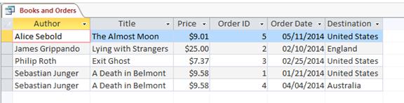
What we want to do is count the number of countries each book has been sent to. But instead of seeing multiple listings for each book, we only want to see one.
Let's go back to Design view to do this. Remember, we've already clicked on the Greek-looking E. If you haven't done that, you need to click on it when you get to Design view.
We need to remove some columns. We need to remove the Order ID and the Order Date columns, as they are not needed in our query, and will cause the results not to display correctly.
To remove these columns, select the two columns, and click "Delete Columns" in the Query Setup group on the Design tab.
![]()
Now, because we want to count the Destination Country, we want to group by Count. Go to the Destination Country column, click the downward arrow next to Group By, and choose Count.

Now, we can click Run to run the query. To run the query, click the exclamation point that's located under the Design tab in the Results group.
The results are shown below.
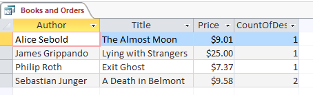
As you can see, both orders for A Death in Belmont have been collapsed (or grouped) into a single row, and the CountOfDestinationCountry has shown the value of 2, as there are two countries that have ordered the book.
Calculating a Group of Records in Datasheet View
Now let's learn how to do group records in Datasheet view.
Here's our query in Datasheet view. Let's add the sum to it as we did with the other one.

On the Home tab in the Records group, click Totals.
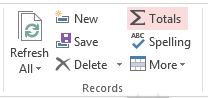
You'll now see the row added that says Totals.
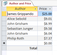
If you click in the empty cell in the Price column, a dropdown arrow will appear. Choose Sum.

You can see how it summed up the total cost of all books.
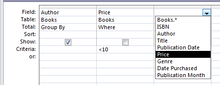
Grouping with Criteria
To group by criteria, go into the Design View for a table or query, and add the Totals row.
Choose Where from the Group By dropdown menu.

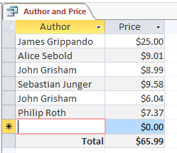
You'll then have to enter a Where statement in the criteria box. You might say that you want to show the author of a book where the price is under $10.00.
As you can see, the Price field is no longer showing. This is because we have set the total value to "Where" instead of "Group By".
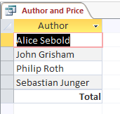
To keep the Price field visible, you can add another instance of the Price column. You can either select the Price column from the drop-down box on the Field row, as shown below, or drag it from the table at the top of the screen.
Open the Datasheet view, or click Run, to see how the results have changed.
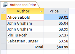
The query now shows the Author and Price, for all books less than $10, and the total row (which is different to the total from the previous query).
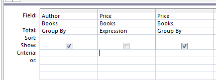
Grouping with Calculated Fields
To group by calculated fields, choose Expression from the Group By dropdown menu. If you do this, you can specify the total type as an expression.
Reports
Create Reports with the Report Tool
Access 2013 gives you the ability to run reports to view your data. The Report Tool is the quickest way for you to run those reports because you don't have to enter any information. It simply displays all fields from a table or query. That said, it won't create the polished looking report that you want if you want to distribute and share it, but it is a way to take a look at your data. If you want to modify the design, you can then save the report and make changes in Layout or Design view.
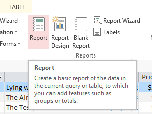
To create a report, select a table or query in the Navigation Pane that you wish to use to create a report. In this example, we've selected the Books table.
![]()
Go to the Create tab, then click Report in the Reports group.
You can now see the report in Layout view.
Now, you can save it if you want, then close the report and the table you used to create it. The next time you open the report, you'll see recent data from your record source (in our case, a table), displayed in the report.
The report will appear in the object pane in the Reports section.
Create Reports with the Report Wizard
You can also use the Report Wizard to create reports. If you use the report wizard, you can customize your reports more than you could with the Report Tool. For example, you can specify how data is grouped, plus you can use more than one query or table as a data source for your report.
To create a report with the Report Wizard, go the Report Wizard in the Reports group under the Create tab.
You'll see this window:
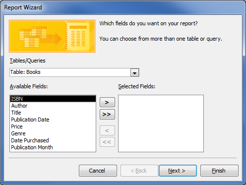
Select the fields you want displayed in your report from the Available Fields column. Click the arrow to move them to Selected Fields. You can use the Tables/Queries dropdown menu to select other tables and queries from which you can also select fields.
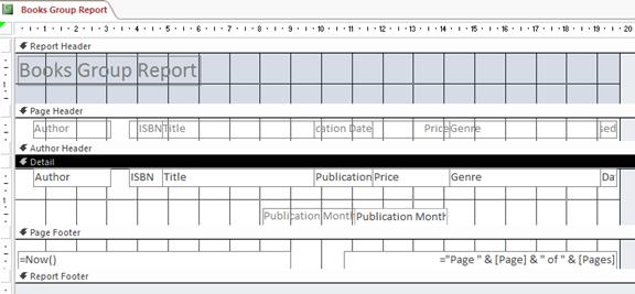
In this example, we'll move all fields across, except for Publication Month.
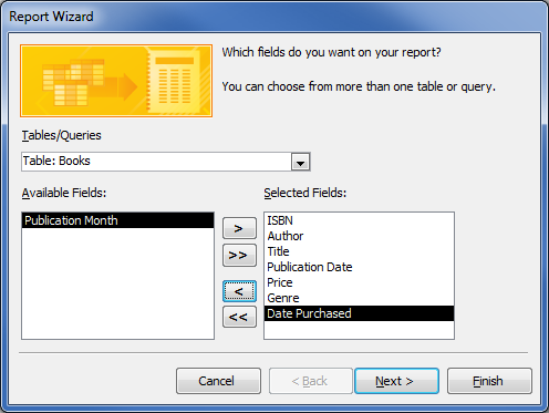
Click Next.
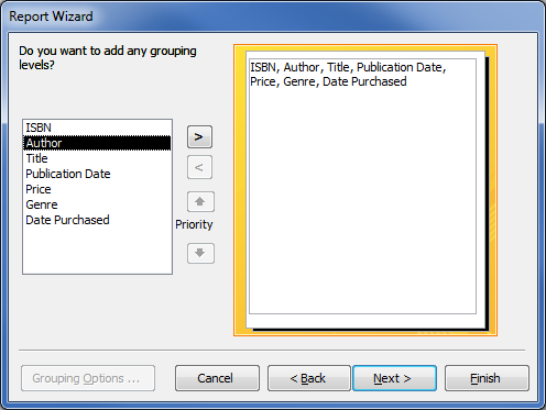
In the snapshot below, you can see the fields we've selected on the right. On the left, we can choose how we want to view the data.
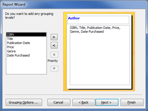
We've selected Author and moved it to the right, so that the report data is grouped by Authors, with the detail underneath.
Click Next. Now we can select how we want our data sorted.
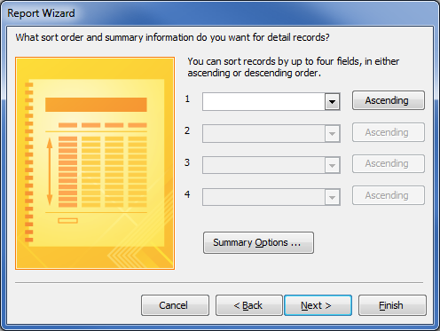
We can also click Summary Options to summarize data.

You can enter Summary Options and click OK, or click Cancel if you don't want to enter any. In this example, we've clicked Cancel.
Once you've exited from the Summary Window, click Next.
Select the layout of your report. You can check the circle beside Stepped, Blocked, or Outline to see how it will look.
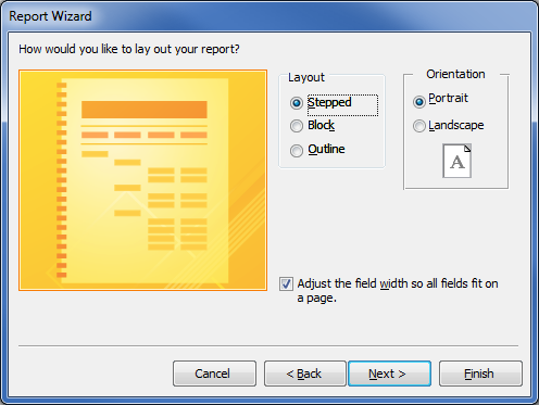
Select Block, and click Next.
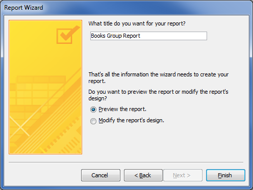
In the next window, name the report and click Finish.
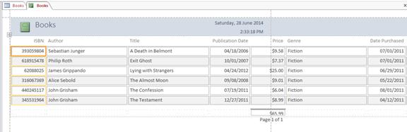
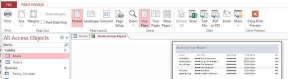
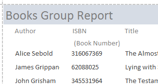
Here's the report:

You can see that some of the fields are displayed as ## instead of the actual values. This is because the columns are not wide enough to fit the data. This can be adjusted in the Design view.
Also, there is a grey highlighted row in the report. This is because the data is grouped by author, and that is the second row underneath John Grisham, who has two books.
Modify Reports in Design View
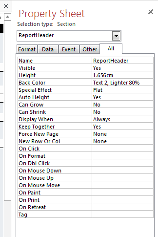
If you want to fine-tune the design of your report, you can do that in Design view. You can then add new controls and fields just by adding them to the design grid. Using the property sheet, you will have access to properties that you can set to further customize your report.
If your report is in Print Preview mode, click on Close Print Preview.
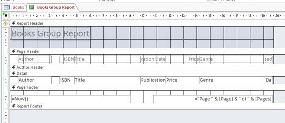
Go to Design view on your report by clicking the report's tab.
Now you can use the Property Sheet. If you don't see it, press F4, or go to the Design tab and select Property Sheet.
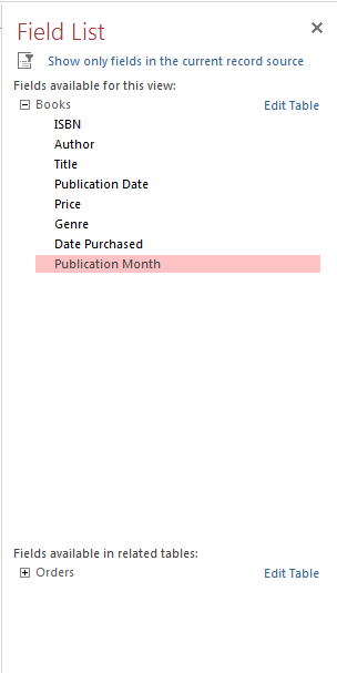
Now click on "Add Existing Fields" in the Design tab.

Now you can see the Field List pane.

If you want to add a single field, drag and drop from the Field list pane to the section on the report where you want it to appear. Hold down the CTRL button to add more than one field at the same time.
Click Show All Tables, then double click the field you want to add to the report. You can then move it around your report by dragging and dropping it.
Access automatically creates a text box control and a label control for each field.
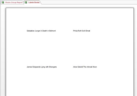
Create Mailing Labels
Open the report that you want to create labels for. Go to the Create tab and select Labels from the Report group.
Select a size for your label. You can also choose the manufacturer so it prints correctly on the labels.
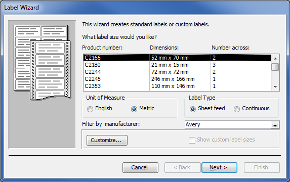
Click Next.
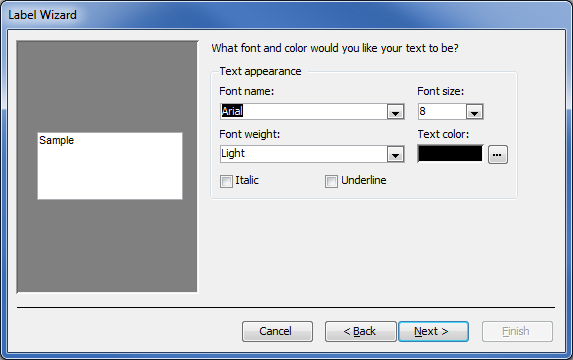
Select the font type and color, then click Next.
Select the fields you want to appear on your label, as we've done below. To add spaces, press Spacebar. To create a new line, press Enter.
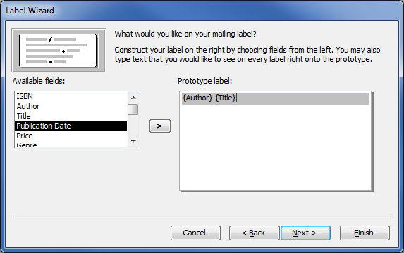
Click Next.
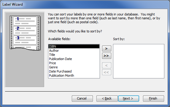
Now specify how you want Access to sort the labels.

Click Next. Name your labels, then click Finish.
Designing Your Report
Designing Your Report
Once you have your report created, you can now modify it to create a more attractive design for it. It helps if you sketch how you want your report to look on paper, then use Access to bring it to life. You'll find that saves a lot of time and aggravation.
After you do that, you'll want to figure out what you want to add to each section to customize your report. You may not want to add anything, and the simple report you created in the last section is exactly what you want, or you may want to get more creative.
Below are the different sections of a report, as well as the typical things that go into each section.
|
Section |
Where to Find It |
What Usually Goes In it |
|
Header |
At the top of the first page |
Report title, your logo, the date |
|
Footer |
On the last page of the report after the last line of data |
Totals, sums, counts, averages, etc. |
|
Page Header |
At the top of each page |
Report Title |
|
Page Footer |
At the bottom of each page |
Date, Page Number |
|
Group Header |
Before a group of records |
The field that is being grouped |
|
Group Footer |
After a group of records |
Totals, sums, counts, averages, etc. |
Layouts
Most reports that you see are arranged in one of two ways: with a tabular or stacked layout. However, Access wanted to make sure you could do even more to create whatever type of customized report that you want, which means you can arrange records and fields pretty much anyway you want.
Let's review the type of layouts and show you how to do them.
A tabular layout looks like a spreadsheet. Labels are across the top. The data is in columns below the labels. This type of report is automatically created when you create a report using the Report Tool. The report below as designed with a tabular layout.
A stacked layout looks like a form that you fill out whenever you fill out a job application, for example. Data has labels. The fields are stacked on top of each other. If you have a lot of fields and it's too many for a tabular layout because the width of all columns would be greater than the width of the report, a stacked layout may work better.
To convert your report from a tabular layout to a stacked, switch to Layout view. Then click the Arrange tab.
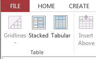
In the Table group, you'll see Stacked. Now you can select sections of your report and convert them to a stacked layout or do the entire report that way.
Working with a Tabular Layout
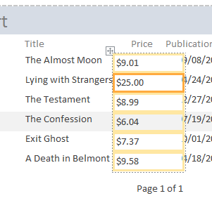
You can easily arrange and rearrange a tabular layout report in Layout View. You can drag and drop labels and columns. In the snapshot below, we are dragging the Price field so the full title of the books shows in the report. Just select, then drag and drop.
![]()
Change Height or Width of Fields or Labels
Using the Property Sheet (Property Sheet under the Design tab), you can also adjust the width and height of labels and fields.
![]()
To adjust the width or height of a field, select the field, as we've done above. The yellow means the field is selected.
Move your mouse over the field so that the two-directional arrow appears. Click and then drag your mouse to resize the column. This is helpful especially for those fields which do not display the data correctly.

Release the mouse and the field size will be changed.

You may need to adjust the column locations so that fields are not overwritten. Using a combination of resizing and moving fields, you can make your report look cleaner.
![]()
You can also change the size of fields by using the Property Sheet. Enter the new height or width of the field in the Property Sheet. Remember to include either "in" for inches or the inch symbol (").
![]()
Use the same steps to for labels.
Add Gridlines to a Tabular Layout
You can add gridlines to your report for when you print it too. Select a field or column.
Then go to the Arrange tab. Click Gridlines on the left and select how you want your gridlines to look.

Using Page Properties, you can add special features to your fields.
You can change the border color or even add a special effect and raise the fields for a 3D look. Click the box in the Property Sheet that says Special Effect to do this (after selecting a column).
Select Raised. You can also use sunken, etched, shadowed, or chiseled.
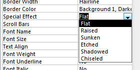
Here's what you'll see in your report:
Add Controls
To add a control, go to the Design tab. Click the control you want in the Controls group, then click on your report where you want to add the control.

You can then drag and drop to move the control and then resize it by dragging the borders of the control in for smaller and out for bigger. When you see a plus sign with arrows on each of the four ends, you can move the control. When you see a horizontal black line with arrows at each end, you can resize.
Below, we've added a checkbox control to our report:

To add an image, click on the Image button. You'll see a plus sign where your cursor should be and a miniature black and white graphic like the one above. Click the place in your report where you want to add the picture.
You'll then be asked to locate the picture on your hard drive.
Select the picture, then click Open.
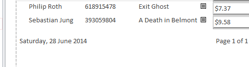
Add Page Numbers
To add page numbers to your report, go to the Design tab, then the Header/Footer group.

Click Page numbers.
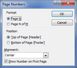
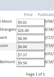
Select if you want your report to just show the page number of each page, or if you want it to display, for example, Page 1 of 6.
Then, select where you want the page number to appear � in the header or the footer. Also decide where you want it to appear on the page. You can choose:
� Left. Page numbers appear on the left side of the page.
� Center. Page numbers appear in the center of the page.
� Right. Page numbers appear on the right side of the page.
� Inside. Page numbers appear on the right side of the page for even numbered pages, and they appear on the left hand side for odd numbered pages.
� Outside. Page numbers appear on the left side of the page for even numbered pages, and they appear on the right hand side for odd numbered pages.
If you want the page number to show on the first page of your report, leave the Show Number on First Page box checked.
Click OK.
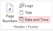
Add Date and Time
To add the date and time to your report, click Date and Time in the Header/Footer group.
You'll then see this window:
![]()
Select the format for the date and time. Then click OK.
The date and time will now appear on your report: