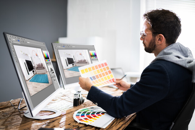
Color correction is an important part of any editing project. You use it primarily to remove color casts and ensure that each clip has a consistent look, lighting, and exposure. Without it, clips from different scenes, sources, or camera angles would seem disjointed or jarring.
Color Basics
The easiest way to correct for color errors is to have Final Cut Pro do it for you. It typically requires one click. However, it is important to understand what color balancing is, how it is done, what steps are taken, and in what order. For that reason, we are going to teach you how to do it yourself. Do not worry, though, manual color correction is pretty easy, too.
Before we begin, you should familiarize yourself with the following terms:
-
Luma is how we calculate the bright and dark areas of an image. They are measured in units called IREs. (IRE stands for Institute of Radio Experts.) The IRE scale ranges from 0 to 100, with 0 representing the darkest blacks, and 100 the brightest whites. Color values are not included in luma measurements. We will learn more about luma and how it is measured later on in this article.
-
Chroma refers to color without regard to luma values. It is discussed in terms of hue and saturation.
-
Hue means, quite simply, color. Red, blue, and green are hues.
-
Saturation refers to the intensity of a color.
Using the Color Board
You will find all of the tools you need to manually correct color errors in your project on the Color Board.
To reach the Color Board, go to Window > Go To > Color Board
The Color Board is pictured below.
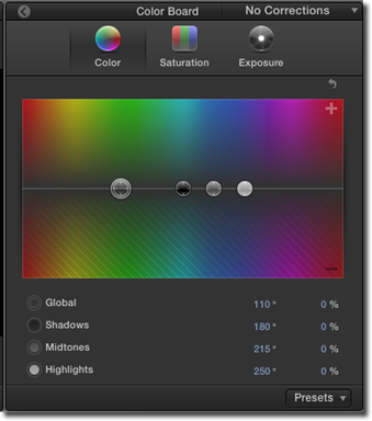
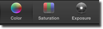
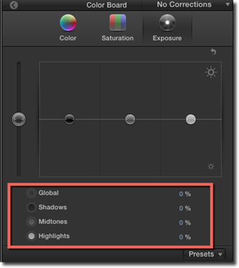
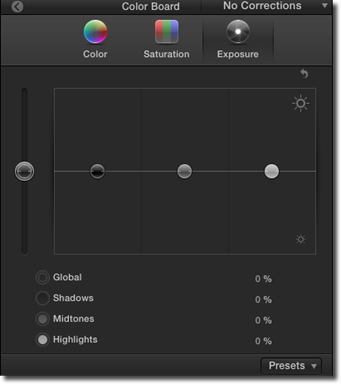
There are three tabs at the top of the Color Board. They are Color, Saturation, and Exposure. This is not the order in which we are going to use them, though.
When doing basic color correction, you should always follow a certain workflow. Begin with exposure, then move on to color, and finish with saturation.
Click through each of the tabs to become familiar them. As you can see, each tab and the tools associated with it is similar in layout and arrangement to the others. Indeed, they work in similar ways.
Below the tabs, there are four circles on a center line.
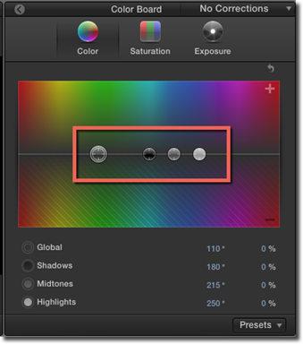
The center line represents, essentially, zero. It is the image exactly as uploaded and means that no corrections have been made.
The four circles are sliders. You drag them upward to INCREASE values and drag them downward to DECREASE values.
If you would click on the Exposure or Saturation tab, you would see the sliders can only move up or down with those tabs.
On the Color tab, they can also move left and right. We will show you why in a moment.
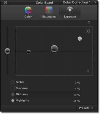
Click on over to the Exposure tab.
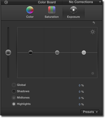
As you can see, the larger slider is off to the left, isolated from the others. It is the global control.
Dragging upward on it would be like dragging each of the other controls upward at the same time, increasing all values equally.
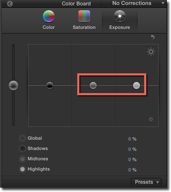
The three smaller circles represent what we call the "Tonal Range." They are shadows, mid-tones, and highlights.
The black one on the left adjusts values for shadows -- that is, the darker aspects of an image.
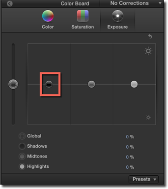
Dragging the slider upward makes them brighter, while dragging downward makes them darker.
The grey slider in the center is for mid-tones; the white one, highlights.
You can also alter the values in each tonal range by selecting its slider and using the up or down arrows on your keyboard.
The legend underneath the adjustment window will tell you exactly how much you have increased or decreased each value from its baseline.
Video Scopes
When evaluating the color, contrast, and exposure of an image, you should not rely entirely on your eyes. This is because our perceptions are often influenced by comparison and circumstance.
A well-balanced image might look dull next to an over-exposed one. Another image might seem too bright in dark circumstances, but too dark in brighter ones. In the same way, color casts can start to seem perfectly natural if we look at them long enough.
Luckily, Final Cut Pro X has some tools to help us overcome our physical deficiencies. These are called video scopes. They measure things like relative levels of luma and chroma in our images and then display it in easy-to-understand graphs.
There are three basic kinds of video scopes. They are:
-
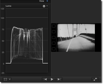
The Waveform Monitor, which shows relative levels of luma or chroma. It uses spikes and dips to represent the light and dark areas of an image. Spikes represent the lighter areas, while dips represent the darker ones.
-
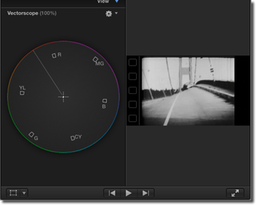
The Vectorscope, is essentially a color wheel. It shows you, at a glance, the hue and saturation of an image. The boxes inside the circle represent primary and secondary colors. R, of course, stands for red, MG magenta, CY cyan, etc. The distance from the center of the circle to its outer edge indicates the level of saturation. The center itself equals zero, while the outer edge indicates 100% saturation. The line between yellow and red is called the "flesh tone line."
-
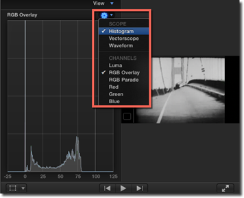
Histogram, which calculates the number of pixels of each color or luma level and then provides a representative graph. Each increment on the scale represents a percentage, while the height of each segment indicates the number of pixels that correspond to that percentage.
To show the Video Scopes in Final Cut Pro X, go to Window > Viewer Display > Show Video Scopes.
The Video Scopes will appear where the Viewer is located.
To change video scopes, click the gear shift icon, then select Waveform Monitor, Vectorscope, or Histogram.
The Color Correction Workflow
In this section, we are going to show you how to follow a proper color correction workflow. We are also going to show you how to use the Color Board, in cooperation with video scopes, to correct color errors in your videos.
Step One: Exposure
In the Timeline, select the clip you are going to edit. Even though your color balancing will be based on a single frame in the Video Monitor, any alterations you make will apply to the entire clip. For that reason, you may want to position the playhead at a point that best represents it.
Open the Color Board and click Exposure.
At this stage, we are only interested in the luma levels -- that is, the bright and dark aspects of the image. For this task, we are going to want to use the Luma Waveform Monitor.
Go to the Video Scopes. Click the gear shift icon, then make sure both Waveform and Luma have checkmarks next to them.
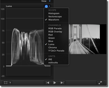
The Luma Waveform Monitor has a scale ranging from -20 IRE to 120 IRE, but you should never exceed the 0 to 100 IRE range. Doing so risks distortion � or colors bleeding into each other, blacks and whites washing out, and details diminishing. In some cases, the video signal could even seep into the sound signal and cause audio anomalies.
The spread between 0 and 100 is called the dynamic range. For a well-exposed video, you are going to want to use all of it.
Let's move back over to the Color Board. You can fiddle around with the global control if you would like, but it is rarely nuanced enough to handle this task. Move over to the shadows control, instead, and drag it down until the lowest points on the Waveform Monitor reach 0 IRE. You will see the black areas in the Video Monitor darken in real time.
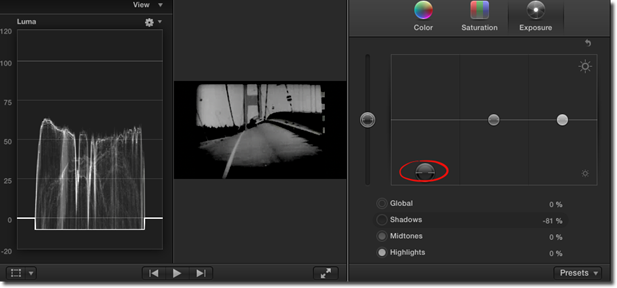
Now jump over to the highlights control and drag it upward until the highest points in the Waveform Monitor reach 100 IRE.
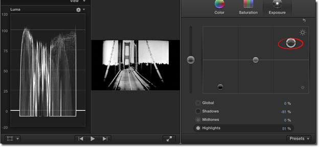
The mid-tones should be between 60 and 70 IRE, so go ahead and drag that control up or down until you are satisfied with the result.
Your clip should now have a nice contrast to it, or what cinematographers sometimes call "pop!"
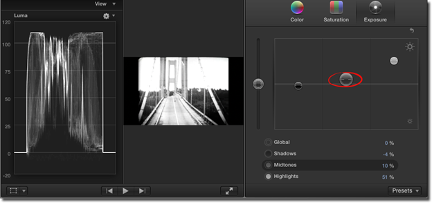
Step Two: Color Balance
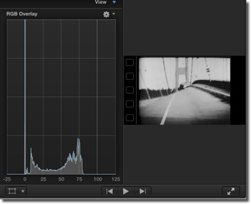
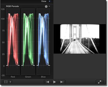
Now we are going to balance our colors and neutralize any color casts. We will still want to use the Waveform Monitor, but we are going to switch from Luma to RGB Parade. So click the gear shift icon in the Waveform Monitor and select RGB Parade in the dropdown menu.
RGB Parade is similar to Luma except the signal is broken down into three channels: red, green, and blue. We are going to use the Color Board to balance them.
Now look at the Color Board.
You will see the same four controls as on the Exposure tab -- global, shadows, mid-tones, and highlights -- except in this instance, they can move left or right as well as up or down. Indeed, you can drag them anywhere in the Color window. The concept is the same, however -- dragging a slider above the center line will increase the value, while dragging the slider below the center line will decrease it.
The goal is just to balance the red, green, and blue that you see in the Waveform monitor. You may have to finesse the slider a bit, shifting it slightly to the left or to the right or up or down.
As soon as you are satisfied that the channels are about equal, switch back to the Luma Waveform Monitor. You are going to want to check the exposure. It most likely shifted during the color balancing process. Adjust as needed, then return to RGB Parade. You may have to jump back and forth a few times, tweaking it, until you get it right.
Step Three: Saturation
In this step, we are going to use the Vectorscope. Click gear shift icon in the Video Scope, then select Vectorscope.
On the Color Board, click Saturation.
As stated earlier, the Vectorscope only shows you the colors (or chroma) in your image without regard to its luma values. It also shows you the intensity of those colors.
In this step, we are just going to make sure our colors are correctly saturated, and give our subject a healthier appearance. Use the controls in the Color Board as needed.
Automatic Color Balancing
Before it can automatically adjust your clips, Final Cut Pro needs to analyze them. The easiest way to do this is as you import them. Just make sure the "Analyze for balance color" box is checked.
If you have already imported a clip, Control-Click on it in the Event Browser and select "Analyze and Fix." You will then see this pop up window:
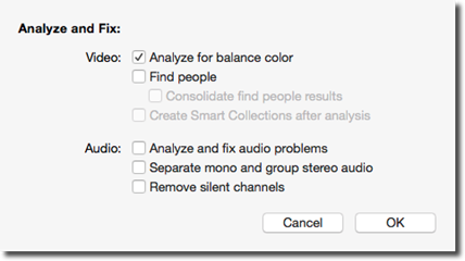
Put a checkmark beside Analyze for Balance Color, then click OK.
The process usually only takes a few seconds, but can sometimes take a minute or two. It depends on the length of the clip and the number being analyzed.
Matching Color
Matching color is a quick and convenient way to make your clips look like they all came from the same source. What you are doing is taking the color balance and exposure information from one clip, and applying them, instantly, to another.
To use this feature, select the clips you want to adjust in the Timeline. The effect can be applied simultaneously to as many clips as you like. All you have to do is select them.
Next, go to Modify>Match Color.
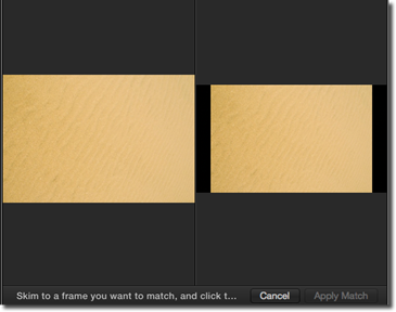
Two images will appear in the Video Viewer. The one on the right represents the target. It is the clip that you selected earlier, and that you want to edit. The one on the left represents the source. It shows whatever image the mouse pointer is over. You can even move your mouse pointer to see the image on the left change.
You can use images from anywhere on the Timeline or in the Event Browser. You can even import still images that have nothing to do with your project if they have a look that you like. To see its effect on the target, click on it.
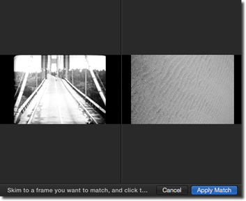
You can click on as many clips as you like until you are satisfied with the results. When ready, click "Apply Match" in the Match Color (Viewer) window.
Saving and Applying Presets
In the lower right-hand corner of the Color Board, you will see a button labeled "Presets." These are color settings Final Cut Pro created for you. You can easily apply them to your own clips. Just select a clip, open the Color Board, and click the Presets button. In the dropdown menu, click on the preset you want to apply. That is all there is to it.
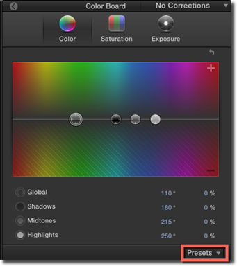
You can also create your own presets and even use them in other projects. All you have to do is select a clip in the Timeline, then open the Color Board and click the Presets button. Click Save Preset. Now enter a name for you preset, and click OK.
Using Color Masks
Color masks allow you to target a particular color for correction or enhancement.
To create a color mask, select the clip in the Timeline and apply a color correction to it.
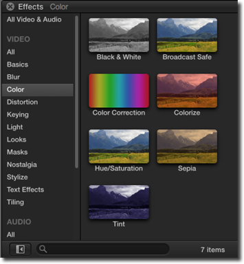
To apply a color correction, select a color correction from the Color category in the Effects Browser.
Go to the Color Board and further adjust the color. (You can also just adjust the color of a clip.)
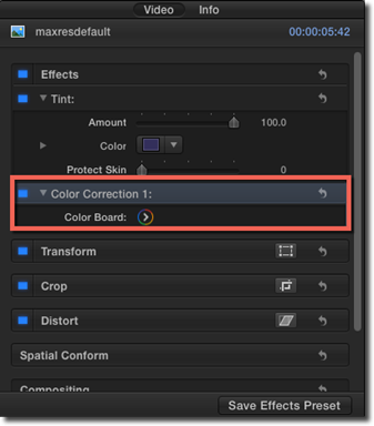
Now, go back to the Video Inspector.
You will see the Color Correction in the Effects section.
Click the Apply Masks button.
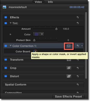
Choose Add Color Mask from the pop up menu.
In the Viewer, drag the eyedropper over the color you would like to isolate. As you drag the eyedropper, the image changes to reflect your selection.
If you would like to add another color to your selection, just hold down the Shift key and drag the eyedropper over it.
If you would like to remove a color shade from your selection, drag the eyedropper over it while holding the Option key.
You can also adjust the severity of the color mask edges by dragging the Softness slider in the Inspector.
Now launch the Color Board. You now have the option to correct the color inside the mask or outside of it.
Using Shape Masks
Shape is similar to a color mask, except it allows you to isolate a particular area for color correction, rather than a particular color.
The steps for creating a shape mask are almost identical to those for creating a color mask, except you would click the Add Shape mask button in the Mask pop up menu.
You will now see a shape over your image in the Viewer. The default shape is a circle.
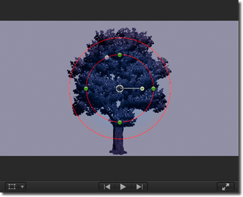
Use the handles to adjust the size or shape of the mask. The tiny circle in the center of the shape is called the pivot point. You can use it to move the mask anywhere around your image. By dragging the handle sticking out from the pivot point, you could rotate the shape.
Use the Color Board to edit or enhance colors using the shape mask. You can choose to correct colors inside the mask or outside of it. You can also animate masks using keyframes.