You would use this tool if you want more statistical analysis on your data. Excel 2019 isn't made for hardcore statistics. It's more of a simple data storage and analysis application based on formulas you create. Complex formulas can be difficult to create in Excel, and there is no reason to recreate what has already been done using the Analysis Toolpak. The Toolpak is mainly used by statisticians that want to perform calculations for t-tests, chi-square tests and correlations. With Excel, a non-statistician can perform these actions without knowing the formulas to create them. Even a statistician can take advantage of these tools by saving time writing formulas for complex analysis.
The Analysis Toolpak has several tools. Some are more commonly used than others, and some of them are better understood by laymen that just need simple analysis. The common ones that are closer to basic analysis will be explained in this article.
Installing the Analysis Toolpak
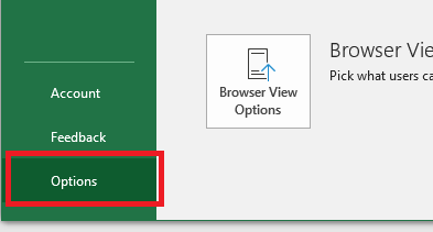
Installing the Analysis Toolpak is similar to installing the Solver tool. With your spreadsheet file open, click the "File" tab, which brings you to a window where you can set configurations on your global Excel interface. Click the "Options" button located in the left-bottom corner.
(Options button)
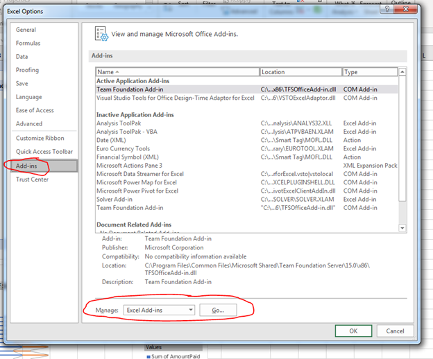
A window opens where you can configure Excel preferences including add-ins. Click the "Add-Ins" in the left panel.
(Excel 2019 configuration window)
The "Add-ins" window shows the currently installed add-ins, but it's also the place where you can install new plugins. In the "Manage" section, make sure the "Excel Add-ins" option is selected, and then click the "Go" button. A window opens where you choose the add-in that you want to install.
(Add-ins install choices)
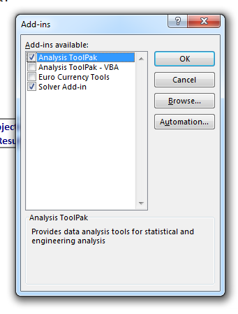
If you already installed the Solver add-in, you'll see that it's checked. To install the Analysis Toolpack tool, check the box next to its name and click "OK." If it's already installed, the tool will have a checkmark next to it. If it's already installed, you can click "Cancel" to close the window as well.
It takes only a few seconds for the Analysis Toolpak tool to install, and when Excel is finished installing it, you're returned to the main Excel interface. Return to the worksheet that contains your data, and you're now ready to use the tool for analysis.
Using the Analysis Toolpak
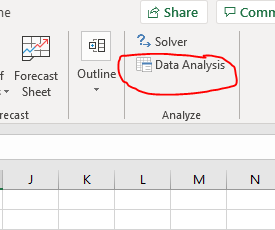
After installing the tool, the button to use it is found in the same location as the Solver tool. Click the "Data" tab in the main Excel interface, and the "Data Analysis" button can be found in the "Analyze" section of the menu.
(Data Analysis button)
Clicking the "Data Analysis" button opens a window where all analysis tools are shown. You choose one of these tools, and then a new window will open that asks you to enter configurations specific to the chosen tool.
(Choose a tool)
When you look in the list of tools, you might wonder which one to choose. The one you choose depends on your goals and the information that you want to analyze. After a description of common tools, then you can make a decision on the tool that is best for your spreadsheet and goals.
Descriptive Statistics: The Descriptive Statistics tool is probably the simplest and easily understood option for viewers who need to get a mean, median, variance and standard deviation. It also offers a variety of other statistic options, but these values are the most common users are interested in when they are looking for information from worksheet data.
The mean is the average value. It's a statistician's way of explaining the average. The median is the middle value in a set of numbers. Standard deviation explains how spread apart numbers are from the mean. It's a way to get an average with values that are close to this average to give you an idea of what is standard vs values that stand as outliers. Variance is related to standard deviation as standard deviation is the square root of variance. Variance is the squared value of the average of all values.
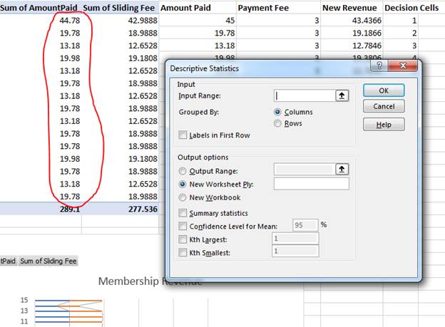
You can get a better idea of these values looking at an example. The example spreadsheet has a list of values that represent membership fees for the month of February. You can get an average from these numbers, a median and get an idea of what days are outliers using the Descriptive Statistics tool.
Click the "Descriptive Statistics" option in the Analysis Toolpak list of tools and click "OK." A window opens where you configure the tool.
(Descriptive Statistics configuration)
The Descriptive Statistics tool requires an input range and the location of where you want to display output. The cell range that contains the total amount of revenue made for each day will be analyzed. This cell range should be entered in the "Input Range" text box. These values are organized as a column, so the default "Grouped By" value of "Columns" can be left as is. If you have values in a row of cells, this value would be switched to "Rows."
This column of values has a header cell, so check the box labeled "Labels in First Row" so that the Analysis Toolpak tool knows to treat it as a header and not part of the data. The "Output Range" option lets you choose a range of cells where the tool will give you output after its analysis. You'll need at least 2 columns to print out a summary, so make sure the output range has enough room for Excel to print out results.
Finally, check the box labeled "Summary" statistics to get a brief summary of your analyzed data. Then click the "Confidence Level for Mean" and leave the default value at "95," which is already filled out for you. After you are done configuring the tool, click "OK" and Excel takes a few seconds to analyze data and display it in the output cell range that you specified in the configuration window.
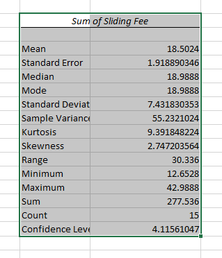
(Descriptive Statistics report)
The report gives you values for several statistical data points. The mean is the average and usually the most important value in this report that most reviewers are looking for. The average in this report is about 18.5, which means that the average revenue for the data range is $18.50 for the month.
Median and Mode in this report are the same number. The median is the middle value in the list of values. The Mode is the value that appears the most in the list of values. The standard deviation helps you identify outliers. You add the standard deviation to the mean, and then subtract the standard deviation value to the mean. This gives you a range of values that you can identify as standard revenue for the month of February.
The minimum and maximum are the highs and lows in your data range. The sum value is just the added values to give you a total, and the count is the number of values within the range. Use this Analysis Toolpak tool to get basic statistic information from your data, and it's one of the easiest tools to you. It's the most used of all the tools because it's simple data that can be easily understand by business owners.
The t-Test Tool
A t-test is beneficial when you want to compare two sample data points. In Excel 2019, it's useful when you want to compare two columns or two rows. For instance, you might want to compare values before and after an event or before and after a marketing campaign.
In the example spreadsheet, there are two columns with different revenue. The sliding fee column displays revenue based on the amount of revenue affecting the payment fee. The "New Revenue" is an altered version of revenue based on goal tools. You can do a comparison between the two columns using a t-test. You could write your own formula and set up each cell individually and manually, or you can use Excel's Analysis Toolpak tool.
Click the "Data Analysis" button to open a window with a list of tool choices.
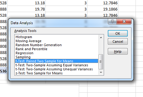
(Analysis Toolkit options)
Choose the tool named "t-Test: Paired Two Sample for Means" and then click the "OK" button. This selection opens a new configuration window where you set up the tool to work with your data.
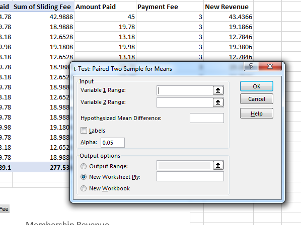
(T-Test configuration)
The "Input" section contains input text boxes where you choose the two columns to compare. In this example, the sliding fee column will be compared to the new revenue column to determine the basic difference between the two. Enter the cell range for the first column in the "Variable 1 Range" text box. Then, enter the second cell range in the input text box labeled "Variable 2 Range."
Change the "Output options" section to the "Output range" option so that you can see the report results in the same worksheet. After you are finished configuring the t-test tool, click the "OK" button to run the analysis. It only takes a few seconds for Excel to generate the report and display it in the selected output cells.
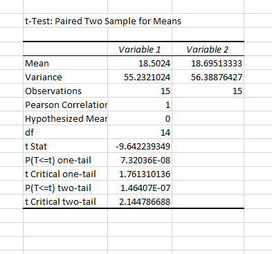
(T-Test results)
The most important output to get out of this report is the mean value. This value lets you see the average difference between the two columns. Using the comparison, you can determine which section has the best average between the two and lets you determine which column of values have the best output for your decision-making results.
Take note of the "P(T<=t) one-tail" value. This is your P value. If this value is less than .05, then your values are significantly different and possibly unrelated, so you should choose different cell range values to work with your analysis.
The ANOVA Tool
The ANOVA tools in Excel 2019 analyze variance. Variance is important in statistics because it determines outliers in data and gives you a bigger picture of relevant data. The ANOVA tool lets you identify if there is a relationship between two sets of data. For this example, the ANOVA single factor tool will be used, but you can use ANOVA tools for two-factor analysis similar to a t-test. The two-factor version of the ANOVA tool checks two independent variables, and you can indicate that you want to use a tool with or without replication. For simple analysis of two dependent variables, you use single factor. Take note that single factor is for dependent variables and any two-factor tools are used on independent variables.
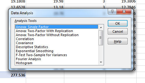
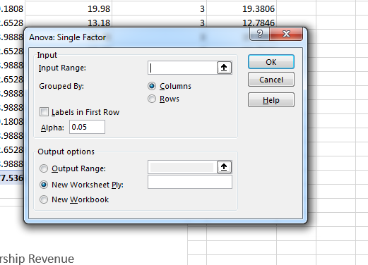
Click the "Data Analysis" button again. The same window opens where you choose a tool. Choose "ANOVA: Single Factor" and a new configuration window displays. This window is where you configure the tool's input to determine the report results.
(ANOVA configuration)
In the configuration window, you choose an input range. This range should be two adjacent columns. The sample spreadsheet has columns of revenue based on membership fees. Because they are dependent, this analysis tool is best for this worksheet data. Choose one of the column cell ranges, and then leave the "Columns" option in the "Grouped By" section.
Change the "Output options" section to the "Output Range" open and choose the cells where you want to display your output. After you are finished configuring your tool settings, click the "OK" button to run the report. Excel runs the report quickly when you only have a few values to analyze. The result is displayed in the selected output cells.
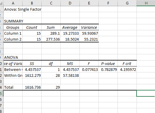
(ANOVA report)
The summary section displays a comparison chart of the two columns, but the value to take note of is the P value. Again, if this value is below .05, then you have unrelated data and these values should be adjusted. You would then need to choose a different set of records, select them and re-run the ANOVA report.
The Analysis Toolpak has numerous other reports, but these tools are the most common and most useful for users who are looking for some quick analysis on data. You can test other tools by selecting them in the data analysis tool selection window, configuring values located in your spreadsheet and running a new report.