This article continues with creating links and menus on your site as we look at methods you can use to link the pages of your website together.
Creating a Manual Menu
A manual menu is simply a menu bar that you create that is not based on the pages you created in Plan view. Manual menus don't have to include top level or secondary pages. What's more, most manual menus that are placed on sites feature links to "sub pages" of a page or pages that you'll only find by clicking on a manual menu.
Here's an example.
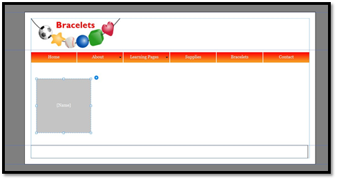
For our site, we've created a "Meet the Design Team" page. On this page, perhaps we tell about our design team as a whole. However, we might want to create a manual menu to put on that page that contains links to each person's bio who is on the design team. This is a menu that wouldn't appear on any other page and doesn't contain top level links.
This is how we do it.
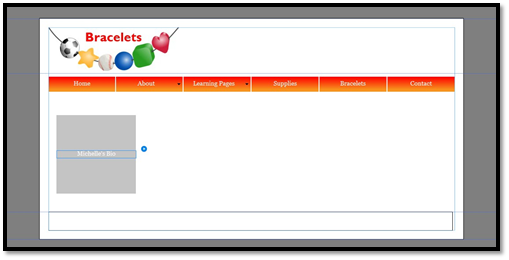
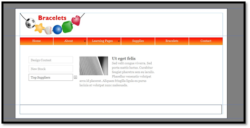
Go to the page in your site where you want to add a manual menu.
Insert a menu by going to Object>Insert Widget>Menu, then use the Selection tool to select it.

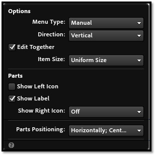
Click on the editing options icon.
In the Menu Type dropdown, click Manual.
Go back to the menu on your page.
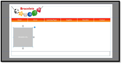
As you see, the menu now has just one button.
Use the Text tool to click on the text on the button and edit the label.
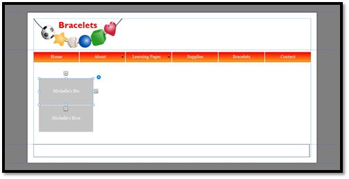
Use the Selection tool again to click on the menu.
Click a plus arrow to add a new button.

Use the Text tool again to edit the new label.
Repeat these steps until your manual menu is created.
Adding Hyperlinks to a Manual Menu
Now that you've created the manual menu, it's time to add the actual hyperlinks. The hyperlinks are what will take your visitor from the current page to the one that the button links to.
Use the Selection tool to select a button on the manual menu.
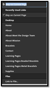
Click the Hyperlink dropdown menu in the Control bar.
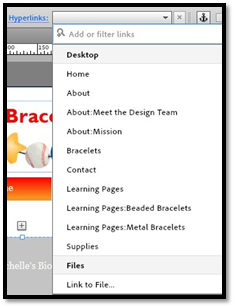
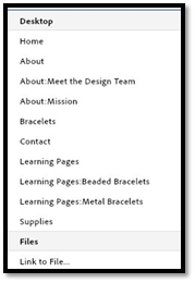
Select the page to link to. If it's not listed, you'll have to create it in Plan view, then come back and repeat these steps.
Now, click the word Hyperlink on the Control bar.
Enter a title for the page you are linking.
Keep repeating these steps to create links for your menu.
Creating Hyperlinks
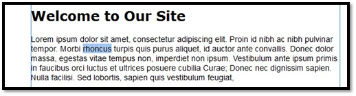
Hyperlinks are sections of text (either words, phrases, sentences, etc.) that are turned into a link. By default, these links appear in blue, then appear in purple after they're clicked.
Hyperlinks can link to pages within your website or to pages of other websites.
Link to Other Websites
To create a hyperlink to another website, use the Text tool to select the text you want to turn into a hyperlink.
Go to the Control bar. Type the address you want to link to in the Hyperlink text box.
Link to Pages In Your Website
To create a hyperlink to a page on your own site, select the text you want to turn into a link.
Next, click on the Hyperlink dropdown, then select the page you want to link to.
The link is created for you.
Linking to PDF, Word, and Other Files
You can also create hyperlinks to files for your visitors to click on.
To do this, use the Text tool to select the text you want to turn into a link.
Go to the Control bar. Type the filename of the document you want to link to in the Hyperlink text box.
For example: bracelets.pdf.
The link is created for you.
Changing Link Styles
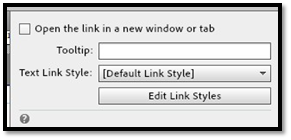
As we said, by default hyperlinks are blue until they are clicked on. Then they are purple. You can change these colors if you want.
To change the link style, use the Text tool to select the link you want to change.
Click on the word Hyperlinks in the Control bar.
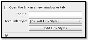
Click Edit Link Styles.
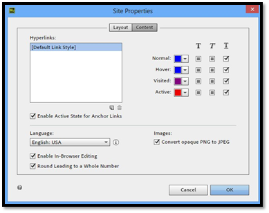
You'll then see the Site Properties dialogue box.
Select a new color for the link styles, then click OK.
Using Anchor Links
Anchors are used when you want to create links that take your visitor to another location on the same page. Most frequently, anchors are used on FAQ pages. The visitor will click on a question at the top of the page. When they click on that question, they are taken further down the page to get the answer.
In other words, anchor links are essentially links that take a visitor to a different spot on the same page.
To create an anchor link, you must first create an anchor. The anchor is the location on the page where your visitors will be taken when they click on the link. The anchor is the destination.
Creating the Anchor
To create an anchor, go to the area on your page where you want to place the anchor.
Click the Link Anchor button on the Control bar. It looks like this:

Click on the page where you want to set the anchor.
Now you'll see the Create an Anchor dialogue box.
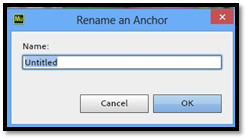
Enter a name for the anchor, then click OK.
Creating the Link
Widgets
A widget is an application that is installed on your web page. It occupies a portion of your web page and displays different types of information, such as news, photos, etc. Most likely, you've seen widgets on other sites before. Perhaps you've seen calendars, clocks, or sections where news is presented.
In this article, we're going to learn how to place the widgets on your web page using the ones Adobe Muse CC offers with the program.
Composition Widgets
Muse CC offers five composition widgets you can place on your website. Composition widgets display content in a large window with smaller containers so users can navigate through the content.
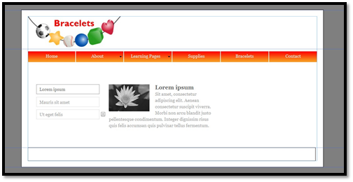
Adding a Featured News Widget
You use the Featured News widget to add news about your site. To add the Featured News Widget, open the page where you want to add the widget in Design view.
Next, open the Widgets Library panel (Widgets>Library Panel).
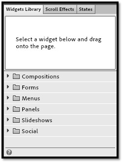
Next, expand the Compositions section by clicking on it.
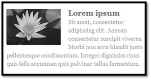
The widget above has three content containers. One of the containers is showing on the page at a time.
To the left of the content containers, you have the triggers. The trigger is what makes the content (above) change. A trigger might be a click or rollover. You can change the text on the triggers as well.
Resizing the Widget
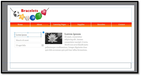
Use the Selection tool to click on the widget, then click the component of the widget that you want to resize.
In the snapshot below, we've selected a text frame to resize.
Now click and drag on a handle to resize.
The component and widget resize for you.
Customizing the Featured News Widget
You can customize the widget to specify things such as the type of trigger, the speed the widget plays, and much more.
To customize the widget, use the Selection tool to click on the widget, then click the edit options icon. It looks like this:

You'll then see the Composition Options menu:
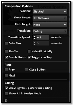
Here you can choose:
A position for the components. Stacked places each content piece on top of others. Staggered allows you to place each piece on the page. Lightbox displays the piece as an overlay.
A trigger for changing the content. On Click means the visitor must click the button to view the next piece of content. On Rollover means the content will change with the mouse pointer over the button.
Choose a speed and the speed for auto play (optional). You can choose from slow, medium, or fast, or you can set it to None and disable transition. In addition, you can set it to auto play so it plays on its own without being triggered, then set the speed to slow, medium, or fast.
Whether to keep triggers on top . This allow you to decide if the buttons remain on top of the content or are behind it if they overlap. You can also have it so the content is invisible at first, then appears when the visitor interacts with the trigger.
Show additional parts . Here you can add three additional triggers. They are a previous button, a forward button, and a close button.
Take time to explore the different options available to you with the widget, as well as how they affect the widget on your page.
Editing Content in the Widget
To edit the content in the widget, click on the Text selection tool, then click in the content of the widget.
Select the filler text that appears in the widget, and enter your own content.
You can also change the text on the trigger button.
We've edited the text on our triggers below.
To add additional text to the widget, click the plus sign. You'll see a new trigger button and content area added.
Adding a Form Widget
In addition to composition widgets, Muse CC also offers Form widgets. Form widgets are forms you can place on your site for your visitors to fill out.
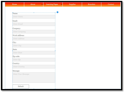
To insert a form widget, go to the Widgets Library panel. Click Forms, then drag the Detailed Contact form, and drop it on your page.
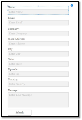
Resizing the Widget
Use the Selection tool to click on the widget, then click the component of the widget that you want to resize. Below we've clicked on a text field box.
Customizing Your Form
The snapshot above is the form that you drop onto your page. Now it's time to customize the widget to make it work for your site. This form could be a contact form for your web page, so you want your visitors to be able to use it.
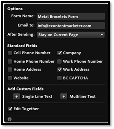
Click on the edit options icon.
Adobe Muse CC makes it really easy to get this form set up so it functions on your website.
Let's go through the options.
Form Name . This is the name of the form. If you were going to put it on your Contact page, you may want to name it Contact Form.
Email To . This is the email address that the form will be sent to when someone fills it out.
After Sending . Let Adobe Muse CC know what you want to happen after the visitor sends the form. You can leave them on the page with the form or send them to a different page. You can even send them to a file. For example, you could use this form to gather information before giving someone a free eBook. Once they fill out the form, you can direct them to the eBook file so they can save it to their computer.
Standard Fields . Put a checkmark beside the fields you want to appear on your form. Remove checkmarks from the ones you don't want to appear.
Add Custom Fields . You can also add your own fields. You can add a field that allows for a single line of text, such as with the Name field already on the form. You can also add fields that allow multiple lines of text, as with the Message field already on the form.
To edit text in the form, click the Text tool, then click on the text you want to edit. You'll see the blinking cursor appear.
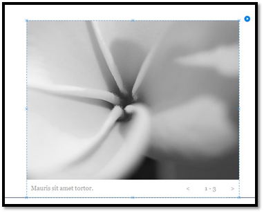
Adding a Slideshow
A slideshow is a series of images with captions. Slideshows are excellent to put on pages because you can put multiple images in the slideshow, but it only takes up the space of one image. Look at the slideshow below.
Resize the Slideshow
You can resize the images in the slide show, as well as the elements of the slideshow such as the triggers.
To resize an image, use the Selection tool and click on the image. Drag on a handle to resize it.
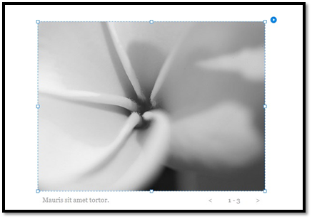
To resize elements, use the Selection tool. Click on an element, then drag to resize.
Customizing the Slideshow
As with the other widgets we've talked about in this article, you can customize the options for the widget by clicking on the edit options icon.
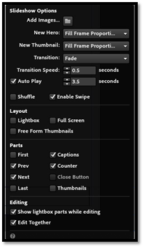
Add Images . Click the file folder to add images to your slideshow.
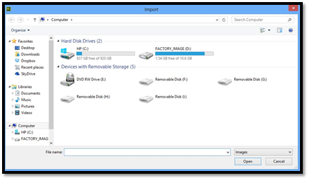
Locate the image, then click Open.
This will replace the current image on your screen with the one that you've selected. To add another image, click on a trigger (as selected above) to go to the next default image in the slideshow.
New Hero . Choose how the images appear in the slideshow.
New Thumbnail . Choose how the thumbnails appear in the slideshow.
Transition and Transition Speed. Choose a transition effect and the speed for the transition. You can also set auto play as we did with the Featured News Widget.
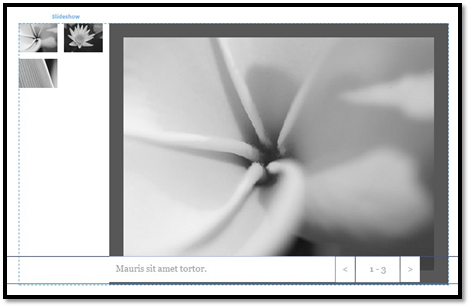
Layout. Choose the layout for your slideshow. Below is Lightbox.
This is full screen.
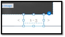
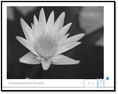
Parts. Select the parts you want to use in your slide show. You can choose to have captions. Captions are displayed by default. You can also choose to have thumbnails of the image. In addition, you can choose triggers such as Prev and Next or First and Last. You can also have a counter which tells you what image you're looking at in the series and how many total images there are. You can see the default counter for the slideshow below.