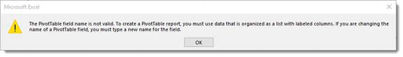
Before you can create a pivot table, you must create a data list with labeled columns. Otherwise, you will see this message:
A pivot table is a data summarization tool used in Excel. You can use a pivot table to summarize data that you've added to a table. A table may be too large to allow you to analyze certain parts. A pivot table allows you to basically extract those parts (while leaving them in the table) to come up with figures, view the data, etc. Remember, tables were called lists in previous versions of Excel.
The best way to learn about a pivot table is to see how to create one.
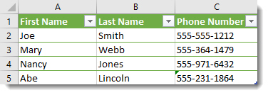
We've created the table shown below. In tables, columns are fields and rows are records.
We want a pivot table showing us how many phone numbers are on file for each employee.
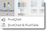
To do this, select the table, then go to the Insert tab and click the arrow associated with the Pivot Chart button.

Select Pivot Chart & Pivot Table from the dropdown:
The Create PivotTable dialog opens, as shown below.
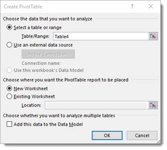
The Table/Range is selected for you. Select New Worksheet, then click OK.
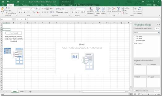
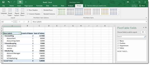
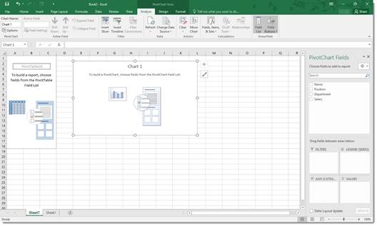
A new worksheet will open and you will see a pivot table (seen on the left in the example below), a pivot chart (center) and the PivotTable Fields list as a sidebar on the right side of the screen in. The latter is a list of all fields in your table.
There are three kinds of fields:
-
Category fields are fields that you can group.
-
Data fields are fields that contain data that you can add, subtract, multiply, or divide.
-
Arbitrary fields are fields that are neither data or category. The name field in our table would be arbitrary.
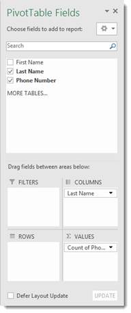
If you look at your Pivot Table Field list on the right, you can drag and drop from the "Choose Fields to Add to Report" section down to the "Drag Fields between Areas Below" section. Just drag and drop from the top part of the field list to the bottom part and place it in a category: Filters, Columns, Rows, and Values.
Your pivot table will appear in your spreadsheet as you do this. You can always drag and drop to a different section if you want.
Here's what we've done in the Field list on the right:
Look at what that's created.
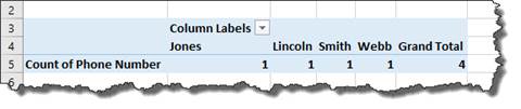
Now we can see how many phone numbers we had for each last name in our spreadsheet. We can also use the filter we created at the top to select a phone number to find out who it belongs to. You can add a filter for any category: First Name, Last Name, or Phone number.
Here's a better example because it shows you what a pivot table can do with your data.
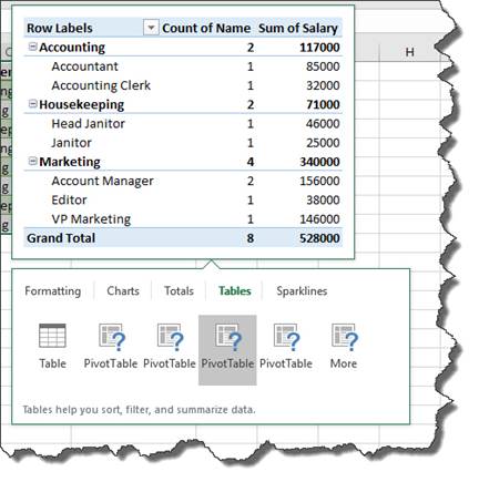
Below is our table.

Let's create a pivot table using the table above.
We want Position to be a Row Header, so we drag and drop to Row Labels. We want the values shown in the table to be salary, so we will drag and drop that to Values.
Look at what that's created.
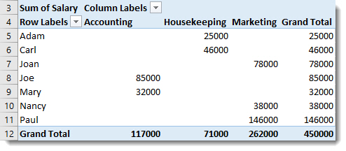
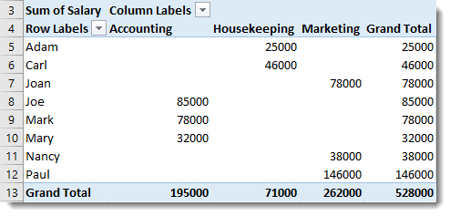
Now we can see the salary by department and by job description. If we had more than one salary per job description, it would total the salaries for us. Let's amend the chart to show you what we mean by adding another Account Manager.
As you can see, we added another Account Manager to our table.
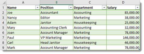
The totals in the pivot table reflect both salaries.
Tip: Make sure there aren't blank rows or columns before you begin. Otherwise, Excel will only create the pivot table/chart up to the blank row or column.
Pivot Tables via Quick Analysis
A quicker way to create a pivot table is using the Quick Analysis tool. To do this, select the data in a table that you want to use to create a pivot table.
The Quick Analysis tool button appears at the bottom right, as shown below.
Click the button and choose Tables.
Now, mouseover the PivotTable buttons to see a preview of the pivot table. Click on an option to choose it.
Formatting a Pivot Table
You can format a pivot table just as you would any other table.
To format a pivot table, click within the pivot table.
Then, click on the Pivot Table Tools Design tab.
You can choose a layout for the table, as well as a style.
Filtering Using Data Slicers
When we created a pivot table, we added a filter when we created the table. We can also, however, add a slicer to the table. A slicer will filter your data too. You just select the data you want in each slicer.
Let's show you what we mean using our first table as an example
Go to the PivotTable Tools Analyze tab, then go to the Filter group, as pictured below.
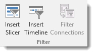
Click the Insert Slicer button.
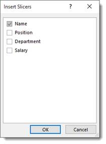
As you can see above, we chose Name.
Click OK.
Excel adds the slicer as a graphic object. You can move and format it as you would any other graphic object.
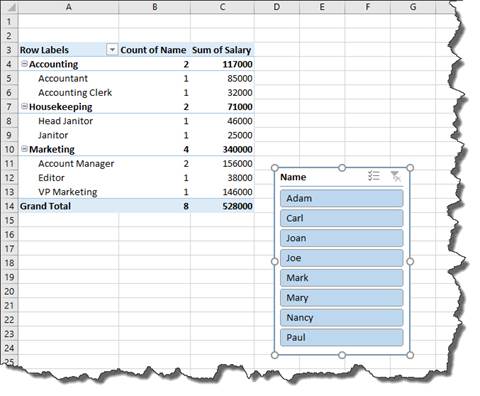
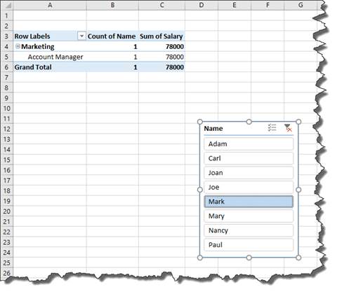
We can click on any name to filter the results. We chose Mark.
Pivot Charts
You can also create a pivot chart from a table.
Click the Pivot Chart button under the Insert tab. Select if you want to create just a pivot chart � or a pivot chart and table.
We're going to just create a pivot chart.
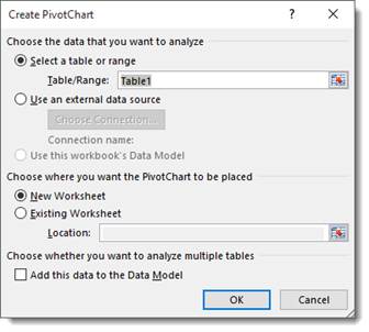
Select the table or range.
Next, select if you want it in a new or existing worksheet.
Click OK.
Now you can organize your pivot chart just as you did a pivot table. The only difference is you have two different categories: the axis and the legend.
Changing Field Settings for Pivot Tables and Pivot Charts
When creating pivot charts and tables, you may want to modify the fields listed in the Field list on the right so that the data that you want displayed is displayed in your pivot chart or pivot table.
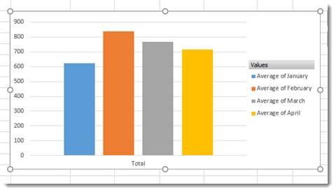
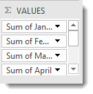
To show you how to do this, let's refer back to our pivot chart in the last section. In the Values section in the Field list, we notice that it's showing a sum for each month but we want to see averages.
To change the values to averages, click the downward arrows, then select Value Field settings.
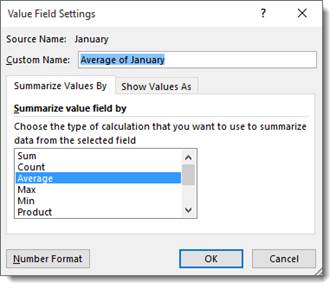
We've selected Average.
Click OK.
Below is our pivot chart. You can see the Field list to the right.