An aggregate query lets you determine statistics for a set of values. For example, you can determine the sum, average, and count. An aggregate query is also known as a Summary Query or a Totals Query.
Calculating a Group of Query Records in Design View
As with most things on Access, the best way to learn is by seeing it done and doing it yourself. That said, open the query that you created with two tables in it (titled "Books and Orders" or similar). Make sure you go to Design view.
You can resize the tables to make them more readable.
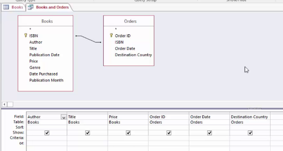
We already have our relationships established between the two tables we used. Click the Design tab and look for the Greek-looking E in the Show/Hide group, labelled Totals.
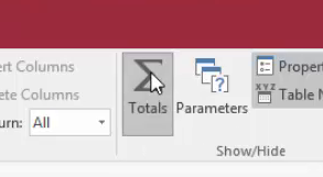
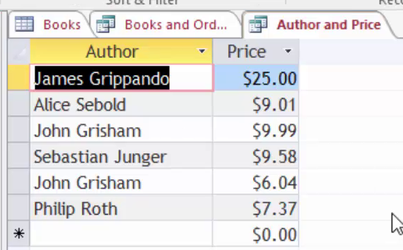
This adds a Total row on the bottom half of your query. Take a look at our snapshot to see what we mean.
Now, let's look at the Datasheet view of this query.
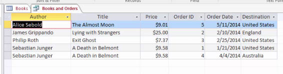
What we want to do is count the number of countries each book has been sent to. But instead of seeing multiple listings for each book, we only want to see one.
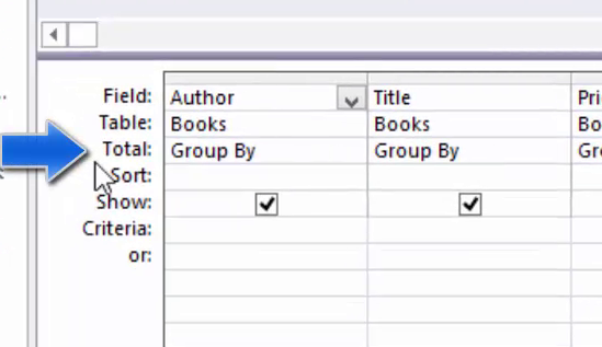
Let's go back to Design view to do this. Remember, we've already clicked on the Greek-looking E. If you haven't done that, you need to click on it when you get to Design view.
We need to remove some columns. We need to remove the Order ID and the Order Date columns, as they are not needed in our query, and will cause the results not to display correctly.
To remove these columns, select the two columns, and click "Delete Columns" in the Query Setup group on the Design tab.
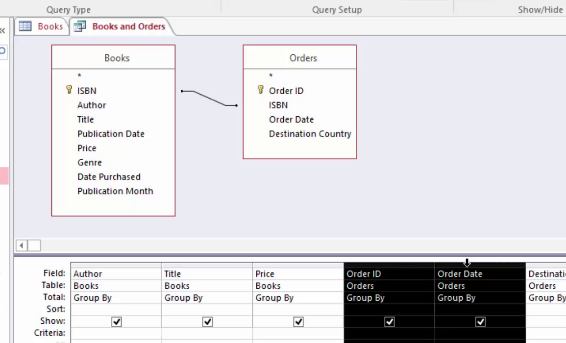
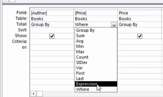
Now, because we want to count the Destination Country, we want to group by Count. Go to the Destination Country column, click the downward arrow next to Group By, and choose Count.
![]()
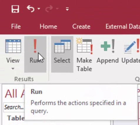
Now, we can click Run to run the query. To run the query, click the exclamation point that's located under the Design tab in the Results group.
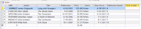
The results are shown below.
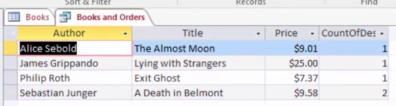
As you can see, both orders for A Death in Belmont have been collapsed (or grouped) into a single row, and the CountOfDestinationCountry has shown the value of 2, as there are two countries that have ordered the book.
Calculating a Group of Records in Datasheet View
Now let's learn how to do group records in Datasheet view.
Here's our query in Datasheet view. Let's add the sum to it as we did with the other one.
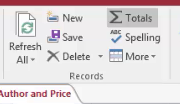
On the Home tab in the Records group, click Totals.
You'll now see the row added that says Totals.
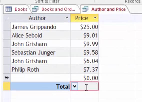
If you click in the empty cell in the Price column, a dropdown arrow will appear. Choose Sum.
![]()
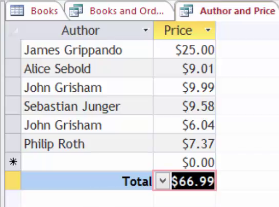
You can see how it summed up the total cost of all books.
Grouping with Criteria
To group by criteria, go into the Design View for a table or query, and add the Totals row.
Choose Where from the Group By dropdown menu.

You'll then have to enter a Where statement in the criteria box. You might say that you want to show the author of a book where the price is under $10.00.
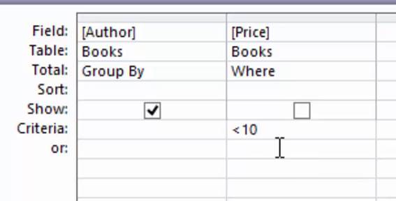
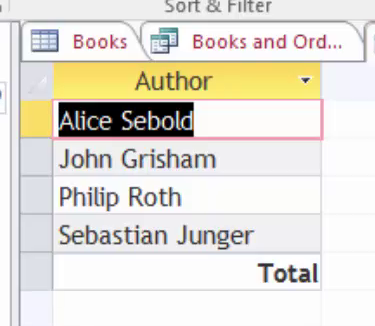
As you can see, the Price field is no longer showing. This is because we have set the total value to "Where" instead of "Group By".
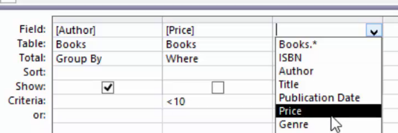
To keep the Price field visible, you can add another instance of the Price column. You can either select the Price column from the drop-down box on the Field row, as shown below, or drag it from the table at the top of the screen.
Open the Datasheet view, or click Run, to see how the results have changed.
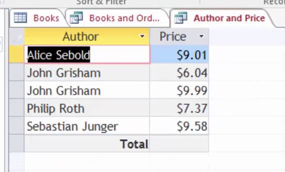
The query now shows the Author and Price, for all books less than $10, and the total row (which is different to the total from the previous query).
Grouping with Calculated Fields
To group by calculated fields, choose Expression from the Group By dropdown menu. If you do this, you can specify the total type as an expression.
Create Reports with the Report Tool
Access 2016 gives you the ability to run reports to view your data. The Report Tool is the quickest way for you to run those reports because you don't have to enter any information. It simply displays all fields from a table or query. That said, it won't create the polished looking report that you want if you want to distribute and share it, but it is a way to take a look at your data. If you want to modify the design, you can then save the report and make changes in Layout or Design view.
To create a report, select a table or query in the Navigation Pane that you wish to use to create a report. In this example, we've selected the Books table.
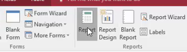
Go to the Create tab, then click Report in the Reports group.
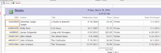
You can now see the report in Layout view.
Now, you can save it if you want, then close the report and the table you used to create it. The next time you open the report, you'll see recent data from your record source (in our case, a table), displayed in the report.
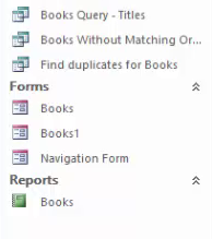
The report will appear in the object pane in the Reports section.
Create Reports with the Report Wizard
You can also use the Report Wizard to create reports. If you use the report wizard, you can customize your reports more than you could with the Report Tool. For example, you can specify how data is grouped, plus you can use more than one query or table as a data source for your report.
To create a report with the Report Wizard, go the Report Wizard in the Reports group under the Create tab.
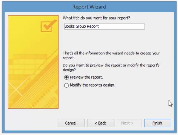
You'll see this window:
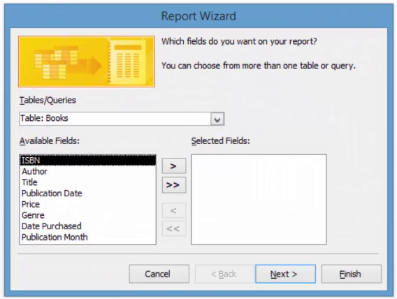
Select the fields you want displayed in your report from the Available Fields column. Click the arrow to move them to Selected Fields. You can use the Tables/Queries dropdown menu to select other tables and queries from which you can also select fields.
In this example, we'll move all fields across, except for Publication Month.
Click Next.
![]()
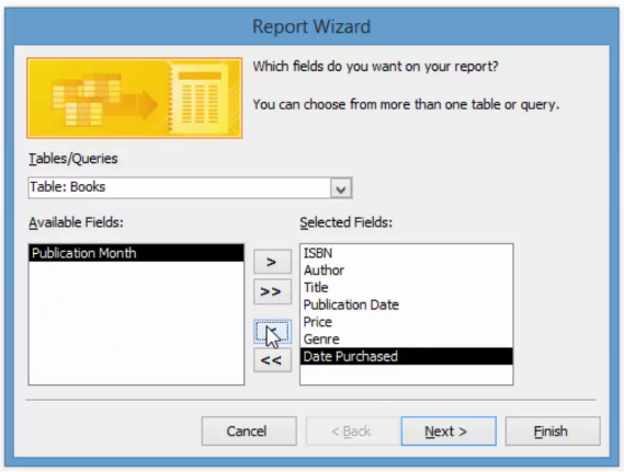
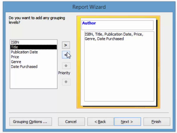
In the snapshot below, you can see the fields we've selected on the right. On the left, we can choose how we want to view the data.
We've selected Author and moved it to the right, so that the report data is grouped by Authors, with the detail underneath.
Click Next. Now we can select how we want our data sorted.
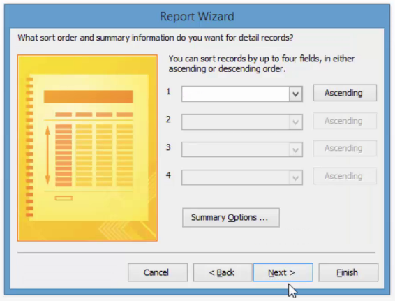
We can also click Summary Options to summarize data.
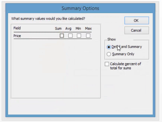
You can enter Summary Options and click OK, or click Cancel if you don't want to enter any. In this example, we've clicked Cancel.
Once you've exited from the Summary Window, click Next.
Select the layout of your report. You can check the circle beside Stepped, Blocked, or Outline to see how it will look.
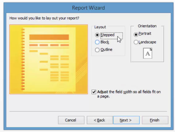
Select Block, and click Next.
In the next window, name the report and click Finish.
Here's the report:
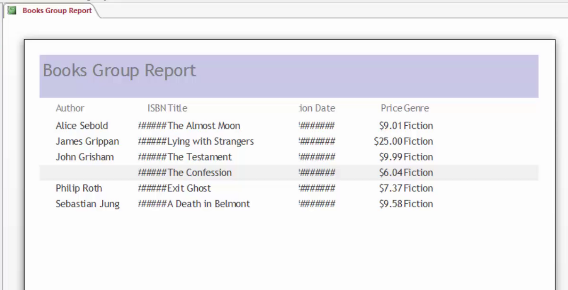
You can see that some of the fields are displayed as ## instead of the actual values. This is because the columns are not wide enough to fit the data. This can be adjusted in the Design view.
Also, there is a grey highlighted row in the report. This is because the data is grouped by author, and that is the second row underneath John Grisham, who has two books.
Modify Reports in Design View
If you want to fine-tune the design of your report, you can do that in Design view. You can then add new controls and fields just by adding them to the design grid. Using the property sheet, you will have access to properties that you can set to further customize your report. We're going to show you how to add additional fields.
If your report is in Print Preview mode, click on Close Print Preview.
Go to Design view on your report by clicking the report's tab.
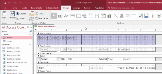
Now you can use the Property Sheet. If you don't see it, press F4, or go to the Design tab and select Property Sheet.
![]()
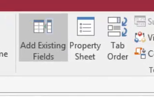
Now click on "Add Existing Fields" in the Design tab.
Now you can see the Field List pane.
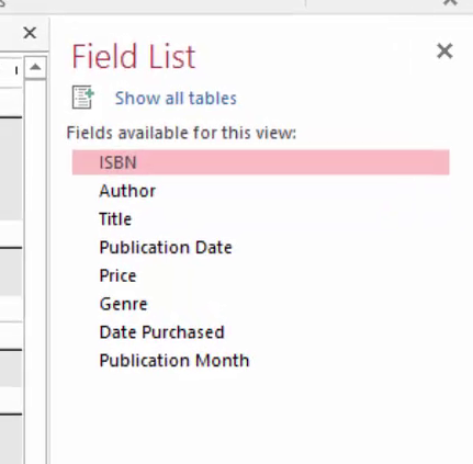
If you want to add a single field, drag and drop from the Field list pane to the section on the report where you want it to appear. Hold down the CTRL button to add more than one field at the same time.
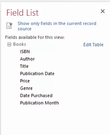
Click Show All Tables, then double click the field you want to add to the report. You can then move it around your report by dragging and dropping it.
Access automatically creates a text box control and a label control for each field.
Create Mailing Labels
Open the report that you want to create labels for. Go to the Create tab and select Labels from the Report group.
Select a size for your label. You can also choose the manufacturer so it prints correctly on the labels.
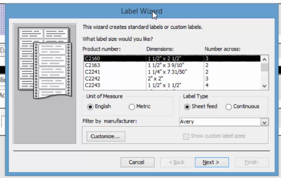
Click Next.
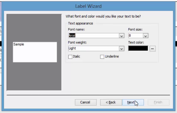
Select the font type and color, then click Next.
Select the fields you want to appear on your label, as we've done below. To add spaces, press Spacebar. To create a new line, press Enter.
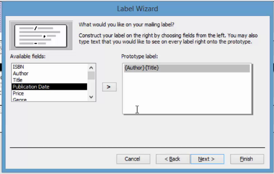
Click Next.
![]()
Now specify how you want Access to sort the labels.
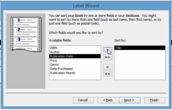
Click Next. Name your labels, then click Finish.
Group and Sort
To group and sort data in your reports, open up a report. We're going to use the basic Books report.
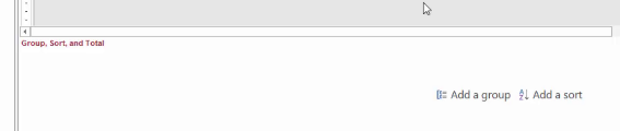
Switch to Design view and go to the Design tab. Click Group & Sort in the Grouping & Totals group.
![]()
This will appear at the bottom of your report:
Decide how you want to group and sort. This is really easy.
Click Add a Group, then add how you want to group.
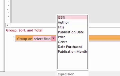
It will ask you what you want to group by (pick a data label in your report), and how you want to sort that group.
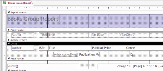
In this example, we are going to group by Author, from A to Z.
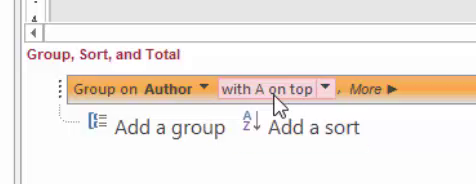
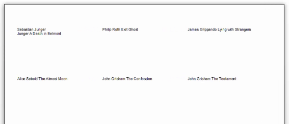
You can see how the report has been updated to add a grouping row for Author.
![]()
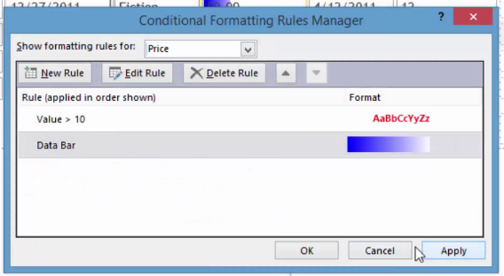
Conditional Formatting
Conditional formatting is used to change the appearance of a control. You can highlight data on your report when you do this, or simply change the format. Conditional formatting can be set for a text box or combo control box. It's called conditional formatting because the control must meet specific conditions in order for the formatting to be applied.
Let's show you how it works and how to do it.
Go to the Layout view of your report.
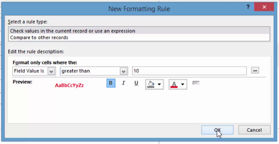
Now, click on the control that you want to apply conditional formatting. We've selected Price.
Under the Format tab, click Conditional Formatting in the Control Formatting group.
![]()
You'll now see this window:
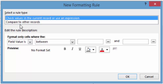
Click on New Rule. Enter your criteria as we've done below. Select the formatting that you want.
Click OK.
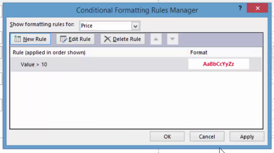
Then click Apply, then OK.
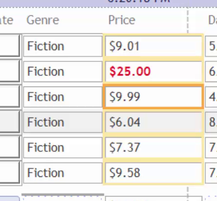
The conditional formatting is now applied to our report. All Price values greater than 10 have been made a bold red font.
Create Data Bars
Data bars show the value of your records by showing the contrast between the records. Look at the example below to get a visualization of what data bars look like:
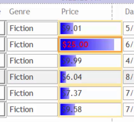
Data bars can only be applied to a bound control that has a numeric data type. They make it easier to compare values. When you want to apply data bars, you use the Conditional Formatting Rules Manager.
To apply data bars, go to the Layout view of your report.
Next, select the control for which you want to apply data bars, as we've done below.
Go to the Format tab, then click Conditional Formatting.
Click New Rule.
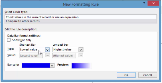
Select Compare to Other Records, as we've done above.
If you don't want to see the numeric values, click Show Bar Only
Now specify how you want to represent the shortest bar. For example, the lowest value will be the shortest bar. You can also select number or percent. Take a look at the tables below to understand this better.
Shortest Bar
Select:
What It Will Do:
Lowest Value
This is the default setting and sets visual limit for lowest value.
Number
All values less than or equal to the shortest bar are length 0.
Percent
Like the number setting, but percentage for each value is compared with rest of the records.
Do the same thing for the longest bar.
Longest Bar
Select:
What It Will Do:
Highest Value
The default setting and sets the limit for the highest value.
Number
All values greater than or equal to longest bar number fill the control. The bar goes all the way across the control.
Percent
Like the number setting, but percentage for each value is compared with rest of the records.
Select a bar color, then click OK.
Click Apply, then OK.
Below you can see the data bars added to our report. We left the data showing, but you might want to take yours out.