One of the critical tasks of statistics is organizing and representing data. The ability to organize data also helps make statistical calculations easier, since it keeps data in an orderly format.
Key Terms
o Frequency table
o Frequency
o Relative frequency
o Cumulative frequency
o Cumulative relative frequency
o Discrete
o Continuous
o Bar graph
o Histogram
o Line graph
Objectives
o Recognize methods of displaying statistical data in tabular and graphical forms
o Construct tables and graphs of statistical data
o Discern between discrete and continuous data sets
Tabular Representations of Data
A data set might involve a group of measurements, responses to a questionnaire, results returned from a database, or any number of other such examples. Organizing this data in a manner that is easily understood and referenced is crucial, especially when you are dealing with large amounts of data. Consider the following data set, which is presented in an unordered manner. This data could be, for instance, the sum of the outcomes obtained when rolling two six-sided dice (a statistician might be examining the dice for fairness). Note that this data represents a sample--the population in this case consists of an infinite number of rolls of the dice.
{7, 2, 9, 4, 7, 8, 11, 10, 4, 9, 3, 6, 8, 2, 3, 5, 12, 6, 3, 9, 10, 8, 2, 5, 8, 3, 2, 10}
This data set contains 28 values. Obviously, the bracket notation above does a sufficient job of providing the data, but it is not in an organized format that makes it easy to view and possibly make some initial inferences. One possible first step is ordering of the data, as shown below.
{2, 2, 2, 2, 3, 3, 3, 3, 4, 4, 5, 5, 6, 6, 7, 7, 8, 8, 8, 8, 9, 9, 9, 10, 10, 10, 11, 12}
Although this ordered format is somewhat helpful, there is still a mass of data that is difficult to interpret or visualize. One method for displaying the data in a more organized manner is a table. A table might simply involve a row-column display of the data, but this approach doesn't necessarily provide us with much of an improvement. If we note that the data involves a finite set of numbers (some of which are repeated values), we can use a frequency table to organize and represent the data. First, we note that the value 2 occurs four times, the value 3 occurs four times, and so on. Let's construct a table with two columns: the first column shows the data value, and the second shows the number of times that this value occurs (frequency) in the data set.
|
Data Value |
Frequency |
|
2 |
4 |
|
3 |
4 |
|
4 |
2 |
|
5 |
2 |
|
6 |
2 |
|
7 |
2 |
|
8 |
4 |
|
9 |
3 |
|
10 |
3 |
|
11 |
1 |
|
12 |
1 |
This tabular representation of the data provides more organization: we don't need to scroll through a long list of numbers, but we can instead simply look at the list of possible values and how often they occur. We might even further process the data by adding a column for relative frequency, which is the number of times a particular value occurs in the data set divided by the total number of values in that set. In the case of our example, the relative frequency is simply the frequency divided by 28. Notice that the sum of the values in the frequency column is 28 and the (approximate) sum of the values in the relative frequency column is 1 (the sum is actually 0.999 because the values are rounded).
|
Data Value |
Frequency |
Relative Frequency |
|
2 |
4 |
0.143 |
|
3 |
4 |
0.143 |
|
4 |
2 |
0.071 |
|
5 |
2 |
0.071 |
|
6 |
2 |
0.071 |
|
7 |
2 |
0.071 |
|
8 |
4 |
0.143 |
|
9 |
3 |
0.107 |
|
10 |
3 |
0.107 |
|
11 |
1 |
0.036 |
|
12 |
1 |
0.036 |
A statistical data table might also involve cumulative frequency and cumulative relative frequency. Cumulative frequency of a data value is calculated in an ordered table (such as that shown above) by adding all the frequency values up to and including that particular datum. Cumulative relative frequency, similar to relative frequency, is simply the cumulative frequency divided by the total number of data values in the set (again, 28 for this example). The table below also includes columns and calculated values for the cumulative and relative cumulative frequencies.
|
Data Value |
Frequency |
Relative Frequency |
Cumulative Frequency |
Cumulative Relative Frequency |
|
2 |
4 |
0.143 |
4 |
0.143 |
|
3 |
4 |
0.143 |
8 |
0.286 |
|
4 |
2 |
0.071 |
10 |
0.357 |
|
5 |
2 |
0.071 |
12 |
0.429 |
|
6 |
2 |
0.071 |
14 |
0.500 |
|
7 |
2 |
0.071 |
16 |
0.571 |
|
8 |
4 |
0.143 |
20 |
0.714 |
|
9 |
3 |
0.107 |
23 |
0.821 |
|
10 |
3 |
0.107 |
26 |
0.929 |
|
11 |
1 |
0.036 |
27 |
0.964 |
|
12 |
1 |
0.036 |
28 |
1.000 |
At first glance, the usefulness of the cumulative and cumulative relative frequencies may not be apparent. Consider, however, that the cumulative frequency of a particular data value includes the frequencies of all the values below it as well. Thus, the cumulative frequency of a data value is the frequency of all values up to and including that value. Thus, the cumulative frequency of 7, for example, is 16--that is, the frequency of all values less than or equal to 7. The cumulative relative frequency performs a similar function, but the values are scaled so they are between zero and unity.
If a set of data does not have any repeating values, frequencies can still be used by considering ranges of values rather than specific values. In the above example, the possible values that can be taken on by any member of the set are limited: 2, 3, 4, 5, and so on. No intermediate values (such as 2.5) are possible. Such a data is said to be discrete. (Note that a set of discrete data need not necessarily involve a finite number of possible values; even if all whole numbers--1, 2, 3, 4, and so on to infinity--are possible values, the data is still discrete.) If the data can take on intermediate values (such as 2.34 or 5.78295), then the data is said to be continuous. (The terms discrete and continuous actually have more complicated algebraic definitions, but it suffices for our purposes to simply rely on the simple explanations by way of example.)
A data set such as the following might be organized in "bins" or ranges of 0 – 1, 1 – 2, 2 – 3, and so on. (Algebraically, a data value x would be included in a bin such as 0 – 1 if 0 ≤ x < 1.) The use of bins allows us to collect data values into manageable numbers of groups.
{3.102, 4.923, 0.114, 5.369, 2.211, 8.204}
Practice Problem: Create a table of values (including frequency, cumulative frequency, and relative frequency) for the following data set:
{4, 7, 1, 2, 0, 6, 9, 5, 2, 4, 8, 4, 5, 8, 9, 1, 2, 5, 2, 6, 9, 4, 3, 1, 0, 9, 4 , 5, 3, 1}
Solution: This data set contains 30 values. To simplify the process, it is helpful to first either order the data or simply record the number of occurrences of each value. Note that the data values range from 0 to 9.
{0, 0, 1, 1, 1, 1, 2, 2, 2, 2, 3, 3, 4, 4, 4, 4, 4, 5, 5, 5, 5, 6, 6, 7, 8, 8, 9, 9, 9, 9}
Next, create the table with the data values (0 through 9) and their frequencies (two 0s, four 1s, and so on). To calculate the cumulative frequency, simply add the number of occurrences of the particular data value with those of all lower data values. Finally, calculate the relative frequency by dividing each frequency value by the total number of members of the set: 30.
|
Data Value |
Frequency |
Relative Frequency |
Cumulative Frequency |
|
0 |
2 |
0.067 |
2 |
|
1 |
4 |
0.133 |
6 |
|
2 |
4 |
0.133 |
10 |
|
3 |
2 |
0.067 |
12 |
|
4 |
5 |
0.167 |
17 |
|
5 |
4 |
0.133 |
21 |
|
6 |
2 |
0.067 |
23 |
|
7 |
1 |
0.033 |
24 |
|
8 |
2 |
0.067 |
26 |
|
9 |
4 |
0.133 |
30 |
Graphical Representations of Data
In addition to tables, we can also employ various types of graphs and other visual methods of representing data. For example, a bar graph is a common way to display discrete (or binned) data sets. Consider the example data shown in the table above. We can construct a graph in which the horizontal axis marks the data value and the vertical axis marks the frequency. The heights of the bars then correspond to the frequencies (numbers of occurrences) of the data values.
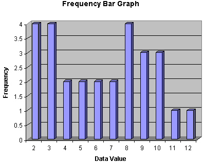
Bar graphs, in addition to adding an aesthetic quality to the display of data, also allow a viewer to quickly assess trends and scale in the data. For instance, we can see in the bar graph above that there is an uneven distribution of values. The statistician examining the dice used to produce these values might be led to believe just by taking a brief glance at this display that the dice in question may be loaded.
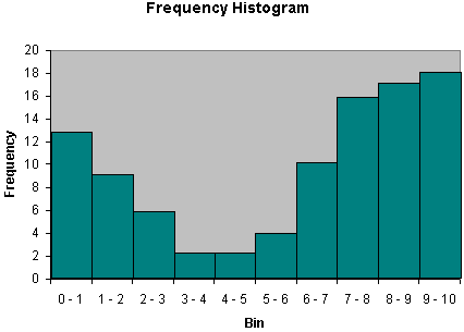
Another similar type of graph is the histogram, which involves bars whose widths correspond to the size of the data bins (histograms are convenient for continuous data distributions). An example of a histogram is shown below.
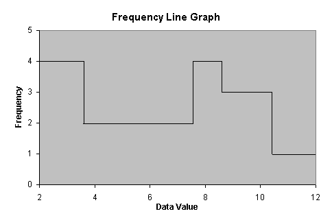
Another visual method of displaying data is the line graph. This type of graph can have several different manifestations, and it is most commonly used with continuous data distributions. Nevertheless, it can also be used for discrete distributions. The line graph shown below is based on the data in the table above. Note that the line graph follows the profile of the bar graph, but it is represented using a continuous line rather than discrete bars.
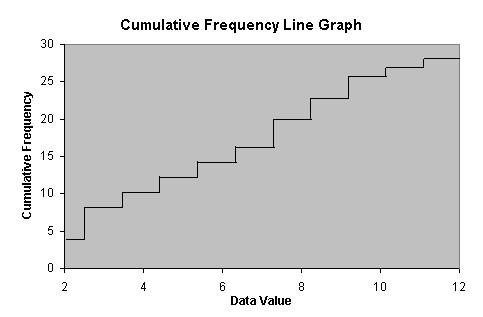
We can also make a cumulative frequency line graph for this data, as shown below.
Obviously, variations on these graphs, as well as other types of graphs and charts, are also possible. Once you understand the concepts behind these examples, however, you should be able to extend your knowledge to the construction and interpretation of other methods of displaying data (such as, for instance, a pie chart).
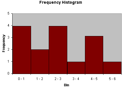
Practice Problem: Create a histogram for the following data set:
{0.01, 2.46, 5.43, 1.22, 0.54, 0.37, 0.67, 2.22, 1.59, 2.91, 4.31, 4.92, 4.76, 3.10, 2.04}
Solution: The data set contains 15 values. Because this data set has more of a continuous character, select bins for the data. Although the selection of bins is somewhat arbitrary, you should choose bin sizes that are appropriate to both the range of data values in the set as well as the number of values. In this case, a good choice would be bins of unity width (0 – 1, 1 – 2, and so on). Order the data as follows.
{0.01, 0.37, 0.54, 0.67, 1.22, 1.59, 2.04, 2.22, 2.46, 2.91, 3.10, 4.31, 4.76, 4.92, 5.43}
Now, create the histogram by binning the data values.