Text Boxes in Microsoft Publisher 2013
Publisher is a page layout program to help you create complex and professional-looking publications.That is why they give you so many tools that help you insert and arrange artwork and images. But let's face it -- the most important part of any publication is the text. The pictures and graphics are only supposed to highlight and enhance it.
The way Publisher handles text is what separates it from simple word processing programs like Microsoft Word. That isn't to say that Word isn't complex, or that you can't create impressive, visually interesting publications with it. You can. But because Publisher is typically used to deliver professional-quality publications to commercial printers, it offers slightly more sophisticated tools for typesetting. For instance, tracking and kerning options are more complex in Publisher than in Word. (Tracking refers to the spacing between letters in entire blocks of text, while "kerning" refers to the spacing between two individual letters. We'll talk more about this later in this article.)
About Text Boxes
Any time you enter text into a publication, you must enter it into a text box. Sometimes Publisher automatically creates a text box for you. You can, for example, open a blank publication and just start typing. In this case, Publisher automatically creates a text box that fits within the margins of the currently selected page.
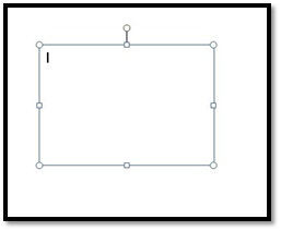
A text box is an object. You can re-size these objects, move them, delete them, and even stack them on top of each other like you can other objects.
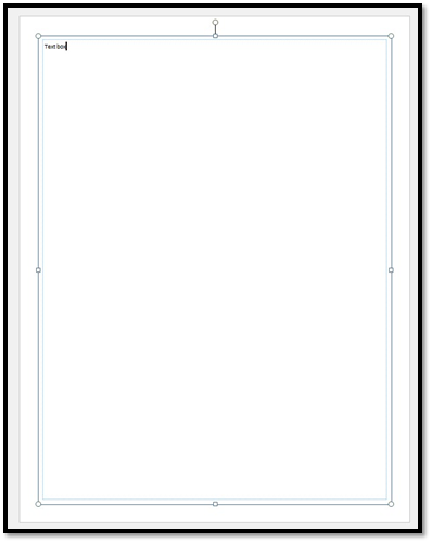
Let's look at a simple text box:
As you can see in the illustration above, the text box is identical in nearly every way to any other object box. It's got the handle at the top, which you can drag right or left to rotate it; it's got the circles at the corners, which you can use to easily expand or contract it, and the boxes in between the corners to drag the sides out. What's more, you can even change the box's border.
Formatting Text Boxes
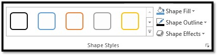
You can format text boxes with color or special effects. To do so, double-click on a text box. Go to the Shape Styles group in the drawing tools Format tab.
The Shape Styles gallery has different formats you can use for your text boxes:
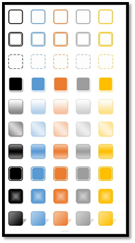
Or you can format your own:
Use Shape Fill to add a fill color. Use Shape Outline to add an outline color. You can use Shape Effects in the same way you added effects to images.
Deleting a Text Box
Deleting a text box is as easy as selecting the box, right clicking on it, and choosing Delete Object, or Cut.
Text Box Properties
Whenever you select a text box or create a new one, the Text Box Tools and Drawing Tools become available to you. You will see these new tabs in the ribbon, as in the following example.
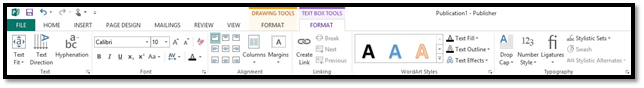
You should already be familiar with the Drawing Tools Format tab. As we learned earlier, from there you can change the border of your box, add a fill and 3-D effects, and wrap other text around it.
So in this section, we're going to focus on the options in the Text Box Tools tab.
The first button on the far left is called the Text Fit button.This tells Publisher how you want text to fit into the selected text box. Let's look at the options and explain them. To gain access to them, click the Text Fit button. A drop-down menu will appear.
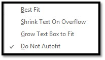
- Best Fit -- This option allows Publisher to determine how to fit the text. It takes into account the size of the text box and tries to guess what your intentions were. For instance, if you were to draw a large text box, type something into it, and then choose this button, the text would expand to fill the entire text box. If you were to then type even more text into the box, the text would shrink until all of it could fit inside.
- Shrink Text On Overflow -- This option is almost the same as best fit, except its focus is on shrinking the text so it stays inside the text box. Unlike the Best Fit button, it will only expand text back to the original font size when overflow text is deleted.
- Grow Text Box to Fit -- Instead of shrinking the text to fit inside the box, this button makes the box bigger to fit all of the text. The size of the text, itself, never changes.
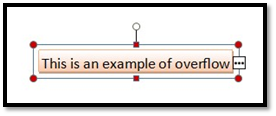
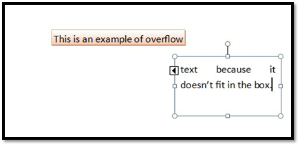
- Do Not Autofit --This option does not adjust either the text or its box. Overflow text, which is text that doesn't fit inside of the box, is simply unseen. Instead, red buttons will appear in the border around the text box, telling you that overflow text exists. An ellipses also appeared in a box near the bottom right corner of the text box, which you can click on in order to "thread" the text to another text box. We'll talk more about that later in this article. You can also drag the box to a bigger size by yourself in order to fit all of the text.
The next button as we move right on the ribbon is the Text Direction button.

The button itself is self-explanatory. It takes horizontal text in a text box and makes it vertical.
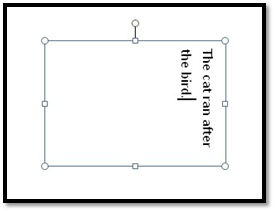
As you can see, it's really not much different than rotating an ordinary text box.
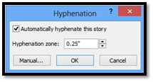
Moving right on the ribbon, we find the Hyphenation button.

This button allows Publisher to automatically hyphenate the text in the selected text box. You might use the hyphenation button to better fit each line of text. Below is the Hyphenation window, which allows you to turn automatic hyphenation on or off, and to configure the hyphenation zone. In this example, the hyphenation is set to .25" of the right margin. That means if the syllable ends within .25" of the right margin, Publisher will hyphenate the word.
Now let's skip over the Font group in the ribbon, because we're going to talk about those buttons in the next section, and look at the alignment group instead.
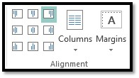
You can use the nine buttons on the right to change the text alignment within the selected text box. The options in the first line include (reading from left to right): left margin flush, centered text, and right margin flush. In the next row, the same options are available for text that is centered vertically within the box, and the final row shows text situated against the bottom margin of the text box.
Use the Columns button to break the text into columns. Clicking the down arrow at the bottom of the button gives you the following options:
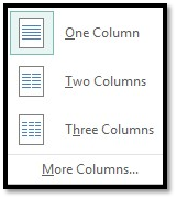
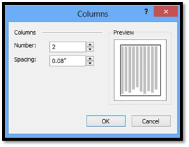
As you can see, your options are one column, two columns, or three columns. To add even more columns, or to configure the white space between each column, click the More Columns button at the bottom. You can have up to 63 columns within a single text box. In the illustration below, we've selected two columns with a spacing between each column of .08 inches. Click OK when finished.
The Margins button refers ONLY to the margins inside the text box. That is, the white space between the edge of text to the border of the text box. It is NOT the same as your page margins, which we talked about in an earlier article.
Clicking the arrow at the bottom of the Margins button gives us a bunch of quick configurations.
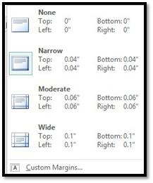
If any one of these are adequate, click on it to apply it to the text box. If you'd like to create a custom margin, click the Custom Margins button at the bottom. This opens a window.
Here you can enter your own values and click OK when finished.
Format Text
To type text into a text box, click on the box to activate (select) it. Once activated, the cursor will appear, and you can start typing.
Formatting the text you type is nearly identical to Microsoft Word, except there are two ways to access the tools. In Publisher, you can go to either the Home tab or the Text Box Tools Format tab. From either of these locations, you can change all of the attributes of your text, from the font style, to character size, to color.
Let's look at some of those tools.
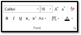
The box above that says "Calibri" is where you will go to change the font. You have access to every font installed on your computer, but you should be aware that not all fonts can be embedded into the publication.
Calibri is a type of font. But when you click that box, a drop-down window opens, allowing scrolling through and even previewing each of the fonts installed on your computer. Select the style you want.
To the right of the font style box, is the font size box. You can click the box and type in a custom value, or use the arrow button to the right to select a pre-set. The smaller the number, the smaller the font, and vice versa. Alternatively, you can click the  button to increase the font size by one value, and the
  button to decrease the font by one value.
You can change the color of the font by clicking the  . The font color of the text in the text box or selected text appears on the button below the A.
The  button clears all character level formatting from the text box.
You may want to select boldface, italicize, or, underline a section of text within a text box. The boldface command in MS Publisher is represented by an uppercase, boldfaced B. Italics are represented by an uppercase, italicized 'I', and underline by an uppercase U with a line under it. These buttons are located directly below the font type window in the Font group.

To add italics, boldfaced, or underlining to any portion of a text within a publication, select the desired text, then click the appropriate button (B for boldfaced, I for italic, or U for underline.)
To the right of these three commands, you'll see two buttons with X's on them.
The  buttons adds a superscript character--that is a character appears above the baseline. The
  button adds a subscript character--or one that appears below the baseline. Both of these characters are usually significantly smaller than the normal font size. E=MC2 is an example of when you would use a subscript character.
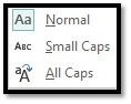
To the right of the super- and subscript character buttons we see the Change Case button. Click it and you'll see a selection of case options.
Tracking and Kerning
Tracking refers to the amount of space between all of the letters of a selection of text. It is usually done to text to change the overall appearance and make it easier to read.
Kerning refers to the amount of space between two individual letters and is mostly commonly adjusted in headlines. Why? Because some combinations of letters may look awkward together, such as AW or VA, and may affect the flow of the eye over the text.
As we mentioned earlier, Publisher gives you some tools to change these values. They can be found in the Font group. When you click the character spacing button  , you will be presented with a series of quick options, as illustrated below.
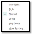
If you'd like a little more control over the character spacing, click the More Spacing button at the bottom of this menu. It launches a window.
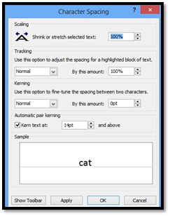
From here you can shrink or stretch the selected text, or change the tracking options. You can also fine-tune the spacing between two characters with the Kerning options. A preview appears in the Sample box. When you are satisfied with your selections, click Apply, then OK.
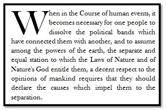
Adding Drop Caps
A drop cap is a simple embellishment that, if used correctly, can make your publications look more interesting and professional. Basically, all it is a letter at the beginning of a section or paragraph that is larger than the text that follows it, but instead of extending upward (which is what it would do if you just tried to increase the font size for a single letter) it drops a few lines down:
Creating a drop cap in Publisher 2013 is incredibly easy. Just go to the Text Box Tools Format tab and click the Drop Cap button  in the Typography section of the ribbon. The cursor should be positioned in the paragraph you'd like to add the drop cap to, but it doesn't necessarily have to be in front of the letter you want to add the effect to.
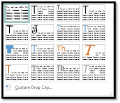
Choose the drop cap style you like.
You can choose to place the drop cap within the paragraph, or in the margins. To exercise a little more control over it, click Custom Drop Cap. You'll then see a dialog box that looks like this:
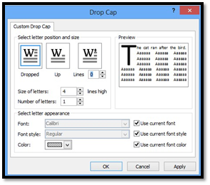
You can have the letter drop as many lines as you'd like, and even choose how much space to put between it and the text that follows.
Text Flow and Connection of Text Boxes
We mentioned overflow text earlier. That is the text that simply doesn't fit inside of a single text box. We also told you text boxes that have unseen overflow text will have red buttons in the border and a bold ellipses in a box in the lower right edge of the text box.
Clicking that ellipses "loads" the cursor with the overflow text. When a cursor is loaded like that, it turns into what looks like a coffee cup with some sparkly, magical substance spilling out of it.
Once the cursor is loaded, you can click on another text box to thread the two text boxes together. That means all of the overflow text from the original text box will automatically fill the new text box. Whenever a text box is threaded, the border around it changes. You will see a black arrow in the upper left edge of it, and another one in the lower right edge of it, as in the next illustration.
Clicking on the left arrow will take you to the text box earlier in the thread, and the arrow on the right will take you to a text box later in the thread � if there is one. It should be noted, though, that either of these arrows might be absent if there are no text boxes before it, or after it. For example, if it is the first text box in the chain, the left arrow will be absent. If it's the last text box in the chain, the right arrow will be absent.
Text Effects and WordArt
Just as you can add special effects to images and text boxes, you can also add special effects to text.
To do this, go to the Text Box Tools Format tab and look at the WordArt group.
You'll see the WordArt gallery to the left in the snapshot above. By selecting the drop-down arrow, you'll see the various formats of WordArt you can easily apply to selected text.
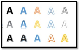
If you see a style you like, click on it to select it.
You can also create your own text special effects.
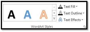
To the right of the WordArt gallery, you'll see these three choices:
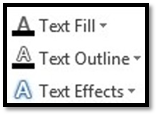
Text fill allows you to choose a fill color for your text.
Text Outline lets you choose an outline color for your text.
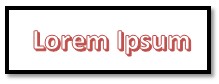
Text Effects lets you apply special effects, such as shadow, reflection, glow, or bevel � just as you can with images. You can turn the word Lorem Ipsum in Calibri font into:
Or you can turn it into:

Text effects are fun to add to spice up a publication. They also come in handy if you're designing a newsletter, brochure, or flyer in Publisher.
Take time to play with text effects and WordArt styles. Get familiar with how they can change the look and feel of text in your publication.
The Format Painter
The Format Painter tool is located under the Home tab in the Clipboard group. It looks like this:  . The Format Painter looks like a broom, but it acts more like a paintbrush. Using it, you can "borrow" the formatting from text and apply the same formatting somewhere else in your publication. It operates a lot like the "copy" function in Word, except instead of copying text, you're copying formatting.
To use the Format Painter, place your mouse cursor in the middle of the text that has the formatting you want to copy.
Now, click the Format Painter button. You'll notice the cursor changes to a paintbrush.
Next, select the text you want to change, to paint it with the borrowed format.
You can also use the Format Painter for objects. Simply click the Format Painter button, select the object you want to borrow formatting from, then brush it over the object you want to share the formatting with the brush (cursor).