A PivotChart is like a PivotTable in that it summarizes the data from a worksheet. However, where a PivotTable is simply a table with data listed in it, a PivotChart is a graphical representation of the data.
In this article, we are going to learn how to:
-
Create a pivot chart
-
Change the fields in a pivot chart
-
Format a pivot chart
-
Change the type of pivot chart
-
Add filters to a pivot chart
-
Hiding the buttons in a pivot chart
-
Moving a pivot chart
-
Deleting a pivot chart
Creating a PivotChart
To create a pivot chart, go to the Insert tab.
Go to the Charts group.
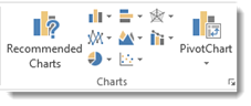
Here you can see Recommended Charts, graphical representations of the types of charts you can add, as well as the PivotChart button.
Click PivotChart to display the dropdown menu, then click PivotCharts again.
You will then see the Create PivotChart dialogue box.
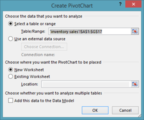
The range of cells should already be filled in for you, just as it was with PivotTables.
Also, just as with PivotTables, you can decide if you want to place your chart in a new worksheet or an existing one. We are going to choose a new worksheet.
Click OK.
We can now start building our pivot chart.
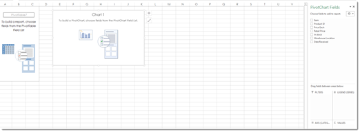
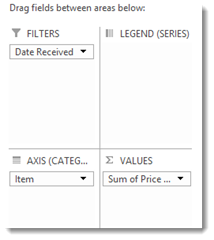
Just as with PivotTables, we are going to go to the PivotChart Fields panel on the right to design our pivot chart.
Drag and drop the fields from the top section of the panel into the sections located in the bottom half of the panel.
These sections are Filters, Legend (Series), Axis (Categories), and Values. The Axis is essentially the row, and the Legend is essentially the column.
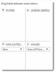
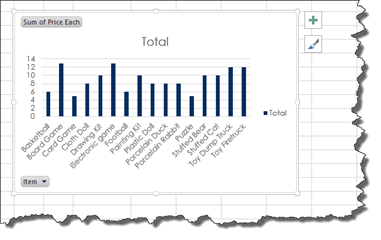
Below you can see the fields that we dropped into the sections.
We can see our pivot chart in the worksheet.
Notice that a pivot table also appears. You can either hide the columns of the pivot table so you cannot see them, or you can move the pivot chart to its own worksheet.
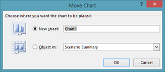
To do this, go to the Analyze tab under PivotChart Tools. Click the Move Chart button.
You will then see the Move Chart dialogue box.
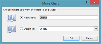
Put a check beside New Sheet, then enter a name for the new sheet.
Click the OK button.
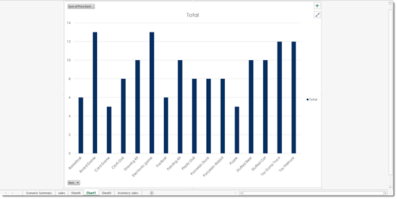
The chart then appears in its own worksheet.
Changing the Fields
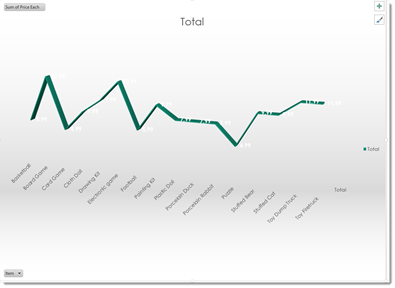
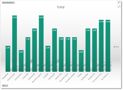
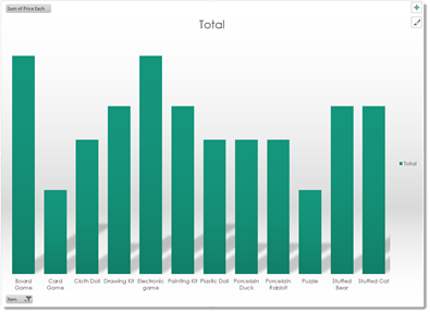
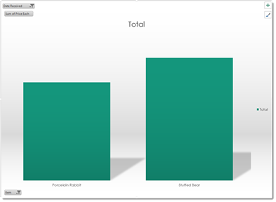
In our current pivot chart, we have the Item and Price Each field.
The items appear across the bottom of the chart.
The price of each item is represented by the vertical bars.
By looking at the bars, we can tell that board game and the electronic game are our most expensive items.
If we want to change the fields that are displayed � or add more fields, we go to the PivotCharts Field panel on the right.
To remove a field, drag the field from the bottom half of the panel to the top half.
To add a new field, drag the field from the top half of the panel to the bottom half. Drop it into the section where you want it to appear.
Formatting PivotCharts
To format a pivot chart, you will use the two buttons that appear at the top right corner of your pivot chart. They are pictured below.
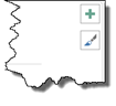
Click on the button with the paint brush on it to choose a style and color for the bars in your chart.
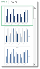
As you can see in the snapshot above, when you click on the Style tab, you can pick a style.
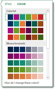
Click on the Color tab to pick a color. Select a row of colors to pick a color scheme.
Click on the button with the paintbrush to close the window when you are finished.
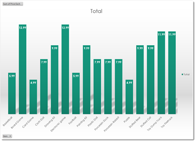
We added a new style and color to our pivot chart below.
Now let's click the button with the plus sign (+) on it.
This shows you the available chart elements.
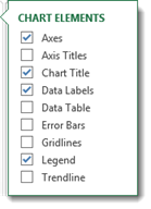
The chart elements that you are using have checkmarks beside them.
Put a checkmark beside any chart element that you want to add to your pivot chart.
Uncheck any elements that are currently checked, but you want to remove.
When you are finished, click the button with the plus sign again to close the window.
Changing the PivotChart Type
The bar chart is the default pivot chart layout. However, you can easily change the pivot chart type once you've created your pivot chart.
To change the chart type, click on the pivot chart so that it's active.
Click on the Design tab under PivotChart tools, then click the Change Chart Type button.
You will then see the Change Chart Type dialogue box.
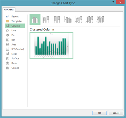
On the left side of this dialogue box, you will see the different types of charts that you can use.
Click on one of these. We are going to click on Pie.
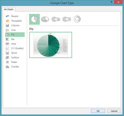
On the top right side of the dialogue box, you will see the graphical representations of the different pie charts that you can add.
Below this, you will see a thumbnail image of how your chart will look.
We don't see anything here we want to use, so we are going to click Line on the left.
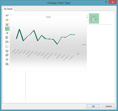
Once you find the chart that you want to use as we have done above, click OK.
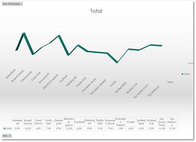
Now that we have a new chart type, we may want to format it.
We are going to click the plus button, and remove the data labels element. However, when we do this, we won't be able to see the actual prices anymore, so we are going to add a data table element.
Adding Filters to a PivotChart
Filtering data on pivot charts is almost just the same as filtering data in pivot tables.
Let's learn how to do it.
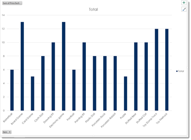
Our pivot chart is pictured below.
Currently, our chart shows us all of the items we have listed, but we might not want all of those items showing in our chart. To filter the data and determine what items are displayed, click the Item button in the lower left corner. Naturally, you may not have a field named Item in your chart, so you will just click the button in the lower left hand corner of your chart.
When we click the button, this is what we see:
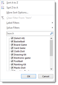
You can see checkmarks beside all of our items. Uncheck the items that you do not want to appear in the chart.
Click OK when you are finished.
As you can see, some items have been filtered out of our chart.
If you look at the Item button in the lower left corner, you will see a Filter icon to let us know the data has been filtered.
We can also use the Item button to sort our items alphabetically, either ascending or descending.
Click on the button.
Choose Sort A to Z or Sort Z to A. You can also click More Sort Options to sort by values.
That said, you may want to filter the data in your chart by fields that do not appear in the chart. We did this with pivot tables.
To do this, go to the PivotChart Fields panel on the right.
Drag the field you want to use to filter the data into the Filter section in the bottom half of the panel.
We have chosen to filter our data by Date Received.
Now go back to your chart. Click the Date Received button (or the button for the field that you are using to filter the data) located at the top right of the chart.
Choose how you want to filter the data.
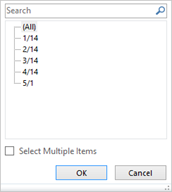
We are going to filter it by all products received in 3/14 � or March 2014.
Click OK.

Making the PivotChart Buttons Hidden
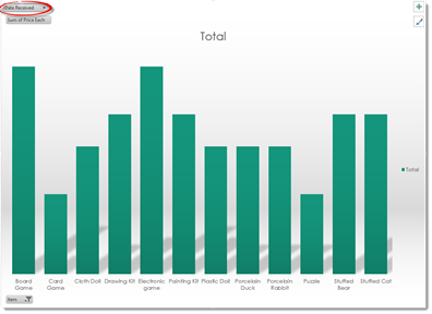
Take a look at our pivot chart below.
As you can see, we have several buttons visible, such as the Item and Date Received buttons.
These buttons are fine when we're working with the chart. However, if we wanted to print the chart, we might not want those buttons to show.
If you don't want the buttons to show when the chart is printed, it's a good idea to hide them.
To hide the buttons, go to the Analyze tab in the PivotChart tools and click the Field Buttons dropdown menu in the Show/Hide group.
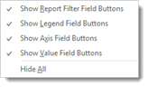
You can choose which buttons you want to hide by placing a checkmark beside them, or you can select Hide All to hide all the buttons.
Moving a PivotChart
Just as with PivotTables, we can also move PivotCharts.
To move a pivot chart, select the pivot chart, then go to the Analyze tab and click the Move Chart button.
You can choose to move the pivot chart to a new sheet, or you can move it to another sheet within the workbook.
Click OK when you are finished.
Deleting a PivotChart
To delete a pivot chart, first select the pivot chart that you want to delete, then press Delete on your keyboard.
If the pivot chart is the only thing on your worksheet, you can also delete the entire worksheet.