of information three days after a meeting or other event).
Other people are kinesthetic, meaning they prefer to learn by doing. This group will benefit more from audience participation and working out a solution for themselves.
Providing meeting attendees with written matter for later reference offers several advantages:
-
You are appealing to the more visual person
-
You are showing that you took the effort to put something together
-
You are forced to organize your thoughts on paper
-
Your attendees will also have a place to refer back to once they leave the meeting and are trying to recall details. For example, they might remember that your new computer software package could make their company 40% more efficient, but their boss might want just a few more particulars about how.
-
Handouts provide an easy reference to your contact information. Even if that one attendee can't use your product, he might leave your flyer or folder lying around in a location where another potential customer could pick it up and possibly be interested.
If you choose to use visuals, there are a few basic guidelines that can help make the process easier.
Example: A professional speaker offers a half-day seminar on memory improvement. It is targeted toward college students, and it is fairly pricey. All attendees receive three-ring binders with printed copies of everything the presenter discussed. Presumably, since the audience shelled out the cash to go to a memory-improvement seminar, they knew they needed help with recall and would appreciate the handouts.
In a meeting or conference where attendees have had to pay a significant entry fee, some sort of substantial handout is usually appropriate. Likewise, with a sales presentation, you will want your client to be able to remember exactly how wonderful your product is, and you might also want to use your print materials to convey an image of stability (through sturdy or custom-made brochures, notebooks and flyers).
However, in an in-house meeting where your department is footing the bill, or if you are trying to highlight ways your organization could cut costs, or if you are discussing ways to be more environmentally-friendly, then killing thousands of trees and paying for ink and paper (plus the investment of time involved in creating quality print materials) may not meld with the message you're trying to put across. In that case, find a way to collect email addresses so you can send out a short synopsis later on--your organization will save on paper and ink, and your attendees will still have a written reminder of what they heard, and your all-important contact information.
The length of the presentation also matters: a ten-minute briefing on your pet project's status may need only one single chart or slide. A half-day course on management skills would require more reference material.
To sum up, always consider the situation at hand, the amount of information involved, and what the audience needs and expects.
The arrangement of words on paper is an entire field of study unto itself. Professional graphic designers spend years in art school and continue to refine their talents throughout their careers.
There are four basic principles of visual design: proximity, alignment, repetition and contrast.
Robin Williams (no, not the actor) has written several excellent books about the topic. One of the easiest to pick up and put into use is The Non-Designer's Design Book. Conduct a search on that title at an online bookseller and you will find a wide range of similar titles for further reference.
As a brief introduction to the principles of visual design:
-
Proximity: Keep like items close together. Think about a business card: name, address, and phone number are usually grouped together to make one unit, and the company name and tagline make another.
-
Alignment: When you put elements on the page, think about how the relate to (or line up with) other elements on the same page. Having elements scattered around randomly makes the page look busy and mentally exhausting before you even start to read.
-
Repetition: Avoid randomness by repeating a single color, shape, font size, etc.
-
Contrast: If things aren't the exactly the same, make sure they're really different. For example, if you use a different font for headings and text, make sure they are distinct enough that readers won't think you accidentally switched fonts in the middle of typing.
Pick up examples of brochures and handouts that you like. Keep them around for the next time you put a presentation together. Borrow the things you like from other successful print matter--improve it and make it your own. In the beginning, you may not know why you like a particular flyer or handout, but with time, you'll be able to analyze what works for you and what doesn't.
Whether you use PowerPoints, handouts, or posterboards and flipcharts, there are a few standard considerations for any kind of visual aid used in a presentation.
-
Are they legible from the appropriate distance?You don't want to have your audience squinting at the front of the room, or worse, breaking up your momentum by complaining that your visuals are illegible. The size of fonts or graphics will depend on the size of the room, the size of the audience, and the light level. Although it would be ideal to test-drive the visuals in a similar space, it's not always possible. Keep in mind that a large meeting (20+ people) is too large to use posters and flip-charts effectively. For that large of a group, slides or PowerPoints on a projector work better. Gathering around a laptop is just fine for a group of 2-3, but it becomes ludicrous with larger numbers.
-
Do the visuals all contribute to the message?Consider this hypothetical example from a manufacturing firm: Fred, the senior engineer, wants to illustrate that, although the plant's gross widget manufacturing numbers are up for the quarter, there are a number of quality problems that could lead to recalls and damaged reputation in the future. In order to illustrate the point, he shows about 500 Excel graphs with multicolored lines pointing in different directions. Some of his slides have four graphs per page. In this scenario, Fred has done a great job of researching the information, but he is overloading his audience with too many visuals that do not directly contribute. Fred would have saved himself a lot of time if he had only pulled up two or three illustrative examples that clearly illustrated the point.
-
Are the visuals simple enough to understand readily?Visual aids should be like a billboard on the highway--large and readily understandable. Although one slide may remain on the wall for 10 minutes while you speak, you don't want to create a situation where your attendees are reading instead of listening to you. Or worse, staring at the slide with a head cocked to the side, trying to figure out what it means. If you use text, pare it back to the bare minimum. For graphs, make them simple and clear.
Remember, a complex graph is fine for a detailed report, and it might even have a place in your handouts, but as a visual aid during a presentation, it can cause your listeners to get derailed--spending more time sorting out the graphic than listening to what you're saying.
-
Avoid excessive clip-art and cutesy cartoonsClip art is another downfall of the presentation planner. Younger presenters, in particular, think a "boring" presentation will be livened up with a few clip-art images. If the presentation is actually boring, the speaker has a larger issue that won't be solved by comic strips. It would be better for the speaker to tailor his presentation to the needs of his current audience, so that it addresses their goals and becomes relevant to them instead of boring.
There is a time and a place for everything, of course, but before dropping in a graphic just for entertainment value, think about the image your artwork conveys--and think about the audience and how the graphics may be perceived. How well do you know the audience? Are they stressed-out and super-serious or relaxed and fun-loving? Will your comic strip make them think you aren't taking the topic seriously, and neither should they?
-
Use standard fonts and templatesIf your company has a standard PowerPoint template, use it. Also use their standard font style. This saves you huge amounts of time making small decisions, and it also reinforces the sense of unity across the company. However, if you have to start from scratch, decide on one simple theme and use it throughout. Use a simple color scheme (one background color, one font color, and maybe one accent color). Make your headings distinctive enough to stand out without being distracting--in other words, don't change font faces for every subhead. Pick one font, use bold for headings. Decide on what size the headings and body text will be, and stick to it.
-
Keep the amount of wording on the visual to a minimumEach slide should highlight one to two points, it should not be exhaustive. Say "no" to PowerPoint novels.
-
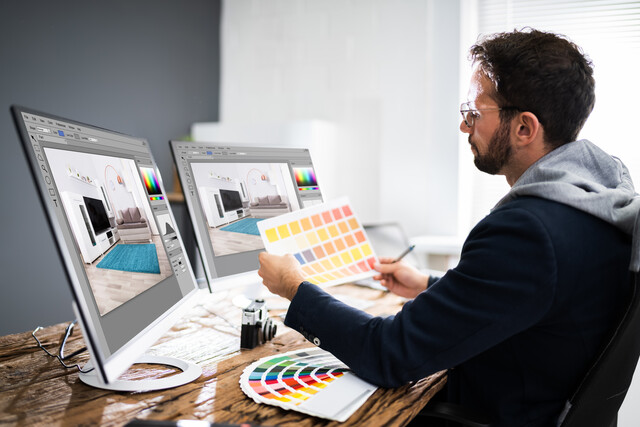
Consider colors carefullyKeep color schemes simple, choose one accent color, one background color, one font color, and stick with these choices throughout. Also, think about the color-blind: one out of ten men has difficulty seeing the difference between colors. To the color blind, red-green and blue-yellow look the same, so a red background with green letters would all look dingy brown, and would be impossible to read.
A word on color theory
Color theory is another whole field of study unto itself. Scientists and artists such as Leonardo DaVinci, Johann Wolfgang von Goethe, and Isaac Newton have contributed to the conversation throughout hundreds of years.
Briefly, color theory describes light and color and its psychological impacts on the viewer. For the presenter, color selection can harmonize with your message or disrupt it.
Example: Not long ago, I received a bright orange flyer densely packed with black text. The two colors working together made my eyes water and I couldn't read any of the text on the page.
Imagine if this flyer had been a template for a PowerPoint presentation, and that bright orange light filled an otherwise dark room, and no one could read any of the text as a result of instant eye-strain.
When planning presentation colors, allow for good contrast (black and white, navy and yellow) but don't overdo. Keep the colors simple and neutral wherever possible.


